2021 Pennant Throwdown

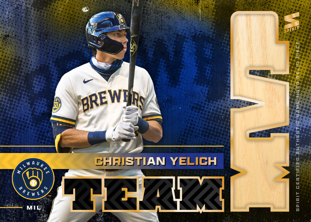
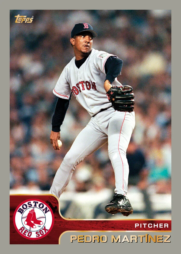
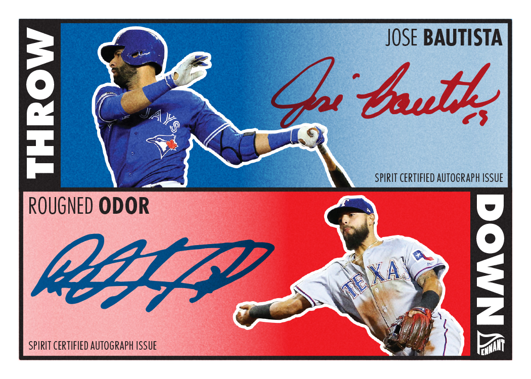
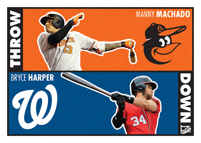
It’s been a bit since I posted the 2021 Pennant base design so I figured it was time to do a Pennant insert. Traditionally, I’ve tackled the Throwbacks insert first since it’s pretty fun and easy but I ran into a slight problem. Due to the COVID-shortened season, there weren’t any “throwback” games in 2020. And while I very well could’ve used some of the early 2021 throwback games, that seemed like a cheat to me. So instead of throwing back, we’re gonna throw down.

I believe this is the 3rd edition of the Throwdown insert, which always features a pair of players who are either on rival teams or have a noteworthy connection between them. The Dodgers and Astros aren’t technically rivals but after the whole 2017 World Series thing, I suppose they hate each other like a rivalry. The Harper/Scherzer card can qualify for both since they used to be teammates and they’re division rivals, too. (Yes, I know Max is with the Dodgers as of this post but if these were real cards on a real release schedule, they’d have been made long before the 2021 trade deadline.)

This is the first time I’ve done a vertical design for these. They’ve been horizontal to allow themselves for an easier autograph parallel but I had a different idea this year. In staying in line with the 2021 Pennant base design, I used the same photo treatment on the players as well as the same fonts and general look. Doubling up on players per card makes the photo tweaking effort twice as tedious. So instead of doing four duos, I decided to keep these same pairs and make the autograph versions a little different.

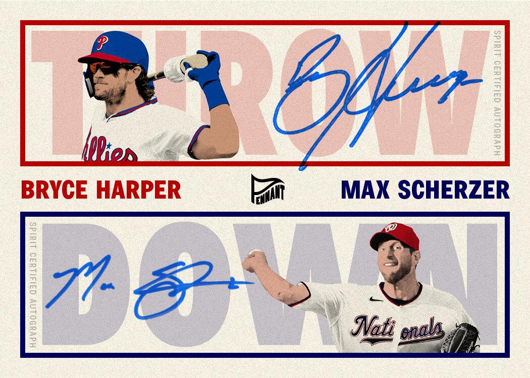
The color boxes get the axe so the autographs can be nice and legible (as far as these particular ones can go). The THROWDOWN title gets split and screened back to add a bit of visual texture and fill in for the solid colors’ absence. Theres some color coordination to help keep the sigs and players sorted together. All in all, I’m pretty happy with both iterations. The autograph versions are a bit similar to the 2017 version but hopefully there’s enough difference to keep them distinguishable in the long run.

2021 Clubhouse All-MLB Team

As a basketball collector in the early 90s, I was a big fan of the All-NBA 1st/2nd/3rd Team inserts in Fleer Ultra. Not necessarily for the designs (some were pretty atrocious) but the logic behind their creation. The All-NBA Teams were a great way to encapsulate who were THE best players for the year. It was more exclusive than the all-star rosters and less influenced by reputation and previous accolades. Needless to say, when MLB started up the practice of naming an All-MLB 1st and 2nd Team in 2019, I was on board.

With my 2020 Spirit project, the All-MLB Team cards were relegated to a subset within the base set. That meant the design didn’t veer too far from the base design. This year, I’ve moved them over to the Clubhouse brand and made them a standalone insert set. I’m sure the first thing that comes to a lot of minds when seeing these is “reject Bowman design,” which is actually kinda what I was going for. The red and blue streaks bleeding into the corners is a twist on the 2021 Clubhouse base design. Then all the tabs, notches, bevels, etc. are my version of what Topps does with a lot of their designs these days, but on a little bit more basic level. I think it’s fairly easy to see that there’s still a good, solid composition here if you were to strip away all the effects and everything extra. This is my way of bridging the old, simplified era of card design to the modern, kitchen sink era. Some superfluous stuff still persists, but the dial is turned way back down.

2021 Spirit Deluxe

I’ve done the “flagship.” I’ve done the “retro.” I’ve done the “low-end.” Now it’s time for the “high-end” set in Spirit’s lineup of releases. Deluxe is back once again, kicking off with the base design.

This is the first time I’ve done a primarily white design for Deluxe. The marble texture adds some interest there and calls back to a fancy set from the past. The colored marble behind the player makes for a good contrast to the both the borders and the player photos. The whole thing is trimmed out in gold foil with it running around the border and also the player name and team name/logo in the upper left corner.

I didn’t go into ornate-overload like Topps frequently does for stuff like Tribute, Tier One and the like. Probably a little more “overdone” than I normally do but I still pulled back a bit from what could have been done. I’ve tried to keep some variety to the Deluxe designs over the years so this year’s look is definitely different from previous seasons. Still plenty of color to catch the eye help differentiate each card. Imagining these with a thick gloss surface and they’d really pop.

Forgive Me Lou Seal, For I Have Sinned

For those of you that don’t know, I live in a town called Rogers in Northwest Arkansas. As far as pecking order goes in NWA, Bentonville is the “sophisticated” town (because of Walmart and all the Walton family dollars spread around town), Fayetteville is the “funky, hip” place (due to the University of Arkansas), Springdale is the “industrial” spot (home of Tyson — the chicken people — and J.B. Hunt). That leaves Rogers as the odd-town-out. All of those labels can apply to us but nowhere near the magnitude as each of the big boys. Personally, I love living in Rogers for precisely that reason. There’s a variety of bike trails all around town for commuting, leisure rides, mountain biking, etc. They just finished building a big park/gathering area downtown with a stage for live music and an entertainment district. It’s humble but exciting.

As part of all this, I’ve been trying to find ways to instill some community pride for Rogers amongst the other towns in the area. Inspiration struck recently and I was sick to my stomach at how good of an idea it was. Even though I’m a DIEHARD Giants fan, I had to make this abomination because it was too perfect…

This isn’t the first time I’ve had the urge to bastardize the Dodgers logo for personal usage. My wife grew up in LA before finding her way to Arkansas and she likes to constantly rib me about the rivalry even though she cares very little about baseball. To keep her from bring Dodgers gear into our home, I made this compromise of a shirt in honor of our doggo, Winston, and gave it to her as a gift.

RogersDodgersDieCut.jpg

I ordered a 100 die cut stickers and actually sold a handful of these suckers at the Frisco Festival downtown last weekend. I only encountered one Giants fan at the booth that shook his head at me. Now I just need to approach a shop somewhere in town that would be willing to sell them in store. And if there’s enough positive feedback, perhaps they’ll make an appearance on some cycling jerseys in the future. I just need someone so on board with the design that they’re willing to pay for the cost of production so I’m not stuck with a bunch of cursed shirts sitting in my garage.

This is probably the first time I’ve created something I’m really proud of that I refuse to wear or display myself. I slapped one on my wife’s back windshield and would actually be stoked to see them on other cars about town or on some sort of apparel in the future. But I CANNOT put something so Dodgers-esque on my person.

2021 Spirit Team MVP

Time for the first insert of the 2021 Spirit set. This has been a longtime inclusion in my Spirit designing endeavor, with this being my 6th entry into the logs.

Like every other year, I’ve made this an all-relic set with the MVP letters housing the relic. That means using a big, bulky typeface for the MVP as well as somewhere else in the design. This year, I carried over some design elements from the 2021 Spirit base design, namely the herringbone-esque texture and the name font. Behind the player cutout is a colorful, textured background image with a zoomed-in look at the jersey script from the photo. It’s a nice contrast to the clean lines on the rest of the design. Also included is the team logo along with the 3-letter shorthand for each club I’ve found myself using a bit.

I’m pretty pleased with the composition here and just the overall vibe. Combining clean and textured into the same design might be a good summation for my personal aesthetic.

2021 Clubhouse

I’ve had these designs in the can for a while but figured I should probably get this posted before the trade deadline. In case you haven’t been following my projects or need a refresher, Clubhouse is the “value” or “budget” line of Spirit cards. Think Topps’ Big League of today or Upper Deck’s Collector’s Choice of yore. These are meant to be fun, colorful and appealing to all ages, not just dudes in their 40s or older.

The design here is pretty simple with rounded rectangles showing off the team colors. Each color gets a pair of tabs going off the edge of the card, breaking the white borders but still keeping everything crisp and clean. I found space for the name at the top, which is something I’ve noticed goes a bit against the grain lately. Even with my own designs, I find myself placing the names towards the bottom of the card. Can somebody pinpoint the birth of that trend?

At the bottom in the center is the team logo, which should be safe to overlap the edge of the photo there and not cover up too much of the action. Flanking the logo is the team abbreviation on the left and player position on the right. The 3-letter abbreviation is a thing I’ve tinkered with on a few designs but it’s definitely a placeholder here. Honestly, I just needed something on the opposite side of the position to keep the symmetry going. I love the rest of the design so much, I wasn’t going to let a little detail like that derail things.

2021 Clubhouse_COLE_BACK.jpg

The back mirrors the front pretty closely with the tabs lining up the same on both sides. There’s more of the primary color here to make room for the player bio next to his mug shot. I trimmed the career stats down to just the most recent 5 seasons. My reasoning here is this isn’t the flagship set and I’d have to sacrifice a lot of other design options just to accommodate more columns of numbers. And really, I don’t need more obstacles standing between me and a finished design.

Overall, there’s something very pleasing to me about this design. Something about the basic-ness speaks to me in a “well duh, why isn’t this already a thing?” kind of way. Big solid colors are throwback to cards of the past, but somehow this isn’t all that hokey (to my eyes at least).

10 Years of Spirit Trading Cards

I’m not sure how it didn’t dawn on me before now but I’ve been doing these fake cards long enough to have made 10 years worth of Spirit base designs. This fake card company has had its ups and downs along the way. Years where I made dozens of unique base, insert, parallel designs as well as years where I pumped out close to the bare minimum to keep this whole thing afloat. A lot of that has to do with life in general as well as the ebbs and flow of my passion for baseball and the collecting world. Lately I’ve found myself spending more time tweaking other stuff rather than spending time on wholly new designs. Perhaps the inspiration tank is running low. Nevertheless, I still love designing cards and plan on doing it in some capacity so long as I have the time.

That said, I thought it’d be nice to have all 10 of the Spirit base designs in one place to see the journey a little more clearly.

Seeing the progression from the 2012 Belt to the 2020 Margot, I can honestly say that none of them are embarrassing (which was definitely a fear). Is there room for improvement? Oh, most definitely. Are a few of them similar and/or derivative? You betcha. Could you rearrange the order without them looking drastically out of place? Probably. Am I proud of them? Without a doubt.

I’d love to see these ranked like one of those polls/lists/tournaments that pop up from time-to-time discussing Topps and their 70 different base designs. It would definitely be more objective since there aren’t biases like childhood nostalgia or print technology advances to cloud people’s choices. Maybe I’ll take the time put something like that together.

Power Alley Oop

While baseball and MLB is basically my only connection to the greater sports landscape these days, back in my youth in the early 90s, I was just as plugged into the NFL and NBA. So in addition to a ton of junk wax baseball cards, I had a good number of basketball and football cards. Even as I got older and my free time shifted from collecting to…other things, I was still a big NBA fan and hung around the hobby in that tent a little longer. Since my return to the hobby as an adult, I’ve been a 99% baseball collector, buying a pack of NBA or NFL cards here and there mostly just to check out the designs and such. And while those sparks haven’t been enough to reignite the flame in collecting other sports, I will forever hold a soft spot for that early 90s era of collecting.

A while back, for no reason in particular, it crossed my mind to make a baseball version of the 1991-92 NBA Hoops design. Unlike my project to redesign the Topps cards from the 00s, this was purely an exercise in mimicry. Bringing it to baseball was enough of a change for me. It came about so effortlessly, I decided to move on to 1992-93 Hoops. Then backwards to 1990-91 Hoops. Then I couldn’t stop.

Other than changing the NBA Hoops logo (MLB Hacks…like swings…), these are as precise as I could recreate the designs. There’s something about the progression from year to year that really gives me the warm fuzzies. No huge shifts between years, just building off of what came before and making changes/improvements to set them apart. It’s something I’d LOVE to see with Topps flagship designs these days.

I’m not sure how much of it is nostalgia, but I consider all four of these designs to be really solid when looking through an objective lens. Even something as simple as having a shape mimicking the basketball lane/free throw area is perfectly suited. No need for shiny effects to compensate for less-than-solid composition.

Where NBA Hoops had really hit its stride on the design side and figured out what exactly the set was year after year, the opposite could be said for Fleer. Just like on the baseball side, Fleer put out one of the most notoriously ugly designs in 1991. Not much can be said on its behalf. But man, nostalgia is a hell of a drug.

After tackling the Hoops suite, that 1991-92 Fleer design came calling and I could not resist that siren song. Reconstructing the design was a fun little exercise — one I thought may soften my criticism and warm my opinion of the set. Alas, my assessment remains hard and cold. I still enjoyed the hell out of it. So much that I took care of the less-offensive 1990-91 Fleer design. At the time, I had considered the Hoops and Fleer sets that year to be equals. Looking back now, I can see how the 90-91 Fleer was a quasi-knockoff of the 89-90 Hoops look. I wonder if they heard that feedback at the time and the 90-91 move was a drastic one to establish a difference between the two sets. Or maybe they were just rollin’ differently at Fleer back then. As you can see, the following year’s set is a solid argument that was the case.

I did have to make a change to the 1992-93 Fleer design since one of the prominent elements they used was the pimpled basketball surface. The closest I could come for baseball was a really leathered baseball texture. I think it fulfills its purpose here. Seeing the chronology of all for designs side-by-side up there, it really accentuates how abruptly Fleer turned the page for the 1993-94 design. After going ALL OUT the previous two years, they came with a “less is more” approach in 1993-94. Even as a kid, I could perceive the shift from loud and almost childish to something more cool and confident in its restraint. As a designer now, I could call it lazy as it almost exclusively leans on Photoshop’s “outer glow” effect. But I’ll instead give them credit for knowing when to say when. And honestly, there’s something to be said for another designer doing something I would shoot down in the brainstorming processes and having it actually turn out pretty successful.

I should probably make a note about the Flipz name I went with to replace Fleer on these. Trying to stick with an f-word that wasn’t much longer presented a bit of a challenge. Between bat flips and glove flips, there’s enough baseball parlance to sell me on it. Plus we’re flipping sports here. Hate me for the Z if you want, but it was better than “Flips” to my eyes.

So after doing four cards for two different product lines, I feel satisfied enough to not delve any further into this exercise. For now. (I mean, Skybox….)

2021 Pennant

Now that I’ve finished wading through Topps’ designs from the Aughts, it’s time to reveal some new original designs. After posting the Spirit flagship design and cards for each of the 30 teams, I’m scaling back a bit going forward, offering just a few cards per release. So, say hi to the 2021 Pennant design.

The Pennant release has been the “retro” Spirit set, calling back to design styles of the past without ripping them off wholesale. I’ve bounced around decades and eras so as to not be too repetitive. Honestly, I can’t pinpoint the era I’m going for here, just more of a general “old” feel. The key is simplicity as I’ve kept the “design” to a minimum with plain but bold text at the bottom for the name and team. In the corners at the top are corresponding pennants with the Pennant logo and the player position. The most notable feature of the design is the photo treatment. What I’ve done is ramp up the contrast, remove the actual colors from the photos and replaced it with painted simple, solid color shapes. There is still some noise and black values to fill in the details, keeping it from looking quite so illustrated. Of the three here, the Brandon Lowe card is the best in my eyes, mostly thanks to the solid green background.

Here’s the back of the Lowe card. They’re black-and-white with the design mimicking the front. With just 3 seasons under his belt, I was able to fit Lowe’s full career (simplified) stats on here, though that probably wouldn’t be the case for a more seasoned veteran. This is also an opportunity to include the new MLBPA logo for the first time for me.

00s Topps Remix Project: 2009

I’ve been waiting a bit on the 2009 remix because I think it’s actually pretty close to perfect as-is. Not that it’s the best design or anything, just that it accomplishes what it set out to do and doesn’t have any huge issues that need “fixing.” Nonetheless, I need to put my spin on it anyway.

The changes are probably a bit subtle since the construction is basically the same as the original. I thickened up the bottom angular shape so there’d be room to have the player name start in the bottom left corner. One of the few issues on the original was the black bar and the text in foil on top of it. So I changed that to white text over team color. As you can tell from the Delgado up there, it makes a big difference when it comes to adding color to the whole card. With the name shifting to the left, I slid the position to the little color spot in the opposite corner. Enlarging the whole bottom block enabled there to be space there below the home plate.

The last thing to tend to was the little foil dots. I debated ditching them completely but decided it’s a nice little quirk that’s some depth to the design, so stay they must. The upper left corner is basically the same, so the bottom part is where things change. I had to move them to accommodate the position. So I decided to get rid of the redundant team name to the left of the plate just stretch the dots across there, like little marquee lights or something. It breaks up the stretch of solid color without muddying it or anything.

Well, it looks like we’ve come to the end of the road on my 00s Topps remixes. I hope you enjoyed the journey.

00s Topps Remix Project: 2008

Nearing the end of the decade, Topps rebounded after the disaster of 2007 with a pretty good design for 2008. There seems to be a pretty good consensus that this was a really good, nearly perfect design — except for one huge flaw. The uvula I’ve heard it called. The little tab at the top of the photo for the Topps logo to sit. Honestly, it doesn’t bother me that much but I can see the issues other have with it. Udder-ly unnecessary. (sorry)

So that’s the starting point. Make the photo frame an actual rectangle (with round edges) and move the Topps logo to the corner like they’ve done time and time again. Once that was done, I really had a hard time finding things to change. I made the double-stroke frame team colors instead of just black. I also did away with the foil for the names and just made them team colors as well so I could add in the position at the end of the name with the opposite color. Maybe not my most inspired remix but the need wasn’t necessarily there to do a lot of reworking.

00s Topps Remix Project: 2007

We’ve come to probably the biggest stinker of the the decade for Topps flagship designs: 2007. I’m not really sure what was going on in the hobby at the time but surely there’s something than can explain the total of effort behind that year’s design. Dull black borders, tiny dull squares, illegible foil text. The only thing I can come up with is they were going for simple and classy but they fell quite short there.

When it came to tackle 2007, my first move was to swap out the black borders for white. This may be a bit of cheating since that’s exactly what Topps did for the Opening Day product that year, but the results speak for themselves. Black borders are pretty notorious for showing any imperfections to the edges, so doing away with them is a big help there. And from a design standpoint, they really overwhelm and deaden any surrounding color. For 2007, the little bit of team color came from 4 sets of 4 tiny squares in each corner. Against white, those dots start to shine. My remix here took that same principle and expanded it for impact, turning 16 small dots into 4 big dots, letting the color pop.

The rest of the card is pretty much the same with just plain text on the top and bottom of the card. I did add some lines to each side of the team name and player first name just to inject a bit more color and also hammer home the square/geometric feel of the card. I also ditched the foil of color, including the Topps logo. It’s satisfying to see one color up top and the other color on the bottom. Finally, I kept the facsimile sigs from the original but changed them from black to white so they’d fit with the borders and also be easier to make out on darker photos.

These cards are still miles away from anything I’d call '“good,” but they’re definitely less bad than the originals.

00s Topps Remix Project: 2006

Oddly enough, 2006 was the first remix I did for this project. I can’t remember specifically what spurred the idea of doing the whole decade or what compelled me to remix 2006, but as soon as I was done with it, it seemed like a no-brainer to tackle all ten designs.

While I don’t “get” the black bar on the foil curve that’s at the top of the original, I decided to keep it pretty close to the same. I suppose this is back around the time banners and ribbons started showing up a lot in the broader design trends, so maybe it was an attempt at that? I did tighten it up a bit so it doesn’t extend as far left-to-right and also shortened it up so it doesn’t dip below the foil arch at the top of the photo. Even though I’m usually a sucker for photo elements breaking borders, I didn’t think it was a good look here since the first border around the photo is foil. I’m sure you’ve experienced some wacky foil-stamping misalignment over the years. In this instance, the nice, smooth border is a must.

For the color bars, I kept them pretty much the same at top, with both bars the same thickness but added a think black stroke to help keep them separated. Where they stretched down to the bottom, I decided to make the primary bigger and have it house the player name. I ditched the banner where it used to live for a couple reasons: a) I didn’t like the shape of the flag edges folding back along the edges; b) it was too small and made the player name tiny to fit the space. Ditching the banner gave me more space to make the name bigger and legible and got rid of that little sliver of photo peeking through. The bottom bar has just enough space for the player position and also got rid of some of the extraneous black that Topps was in love with for that period.

Again, I went back-and-forth with how much to keep and how much to ditch, but since getting rid of the banner at the bottom was DEFINITELY going to happen, I decided the team name foil treatment had to stick around. In the end, I’m pretty happy with this remix.

00s Topps Remix Project: 2005

Working through these remixes, 2005 was the one that gave me the most trouble. I didn’t do them in chronological order, so I had already tackled 2004 and 2008 when I got around to 2005. My biggest issue was that those 3 original designs have one very similar element: big text at the top of the card against a white background. True 2008 has the color dots, but there’s still a enough of a similarity that I always kinda clump them together. Given the opportunity to change these designs and differentiate them a bit, 2005 kinda forced my hand. But I’m satisfied with my solution.

Since there’s symmetry with the design on a left/right basis, I did the same top/bottom. The black bar at the bottom of the original underwent meiosis and found home at the top as well. Now the big last name text is in white so it’s nice and legible. I kept the team color tabs on the left and right sides to house the team name and player name. On the original, the two colors do a criss-cross move in the middle that always bugged me. I decided to just have a sharp gradient instead to get rid of the double lines around the whole photo. Topps has a hard time figuring out that if you stack these team color lines so close to each other, they visually meld into a mess, making either color hard to discern. No such issue here.

On the bottom, I went with the primary team logo instead of the script logo on the original. This is mostly because a lot of the team scripts are meant to go over white, not black, making it really hard to read/make them out. The logos are more stand alone and have white keylines to easily offset them from any background. In the bottom left corner, I switched out the year with the player position for two reasons: a) Topps never has the year on the front of the card, so I’m just keeping that consistent; b) the player and team are both identified on here twice, so it seems like the player position should be on there to justify doubling up on those two.

This is strangely the most I’ve matched from an original but also the most drastic change thus far.

00s Topps Remix Project: 2004

After a run of 6-straight years with colored borders, Topps started off a new streak in 2004 with white borders on their flagship design. In other words, don’t expect any more border color changes from my remixes.

The biggest change here is probably the dismissal of the silver foil for the team and player name stuff. I really have no issue with foil on white but I decided it was an opportunity to inject some more team color into the mix. I simplified the color border around the photo so it’s now just a solid thick color instead of…. whatever Topps did. I also rounded said borders because having some hard and some soft just didn’t work for me. I tried them all as sharp angles at first but It was too harsh.

Though I had some initial internal resistance, I decided to soldier on and keep the little player figures in the bottom left corner. These are arguably the defining design characteristic of this set, so I felt compelled to keep them. Luckily it’s hard to tell how poorly they’re drawn at such a small size. Inside the little figure box, I switched out the uniform number on the original with the player position. That allowed me to make the name a bit bigger, which was definitely an issue with the original.

All in all, I think this is probably one the best examples of fixing something up without really changing the spirit of the design. More than anything, Topps needs an editor to chip away at some of the extra-ness they’re prone to deploy.

00s Topps Remix Project: 2003

I don’t think I have any actual 2003 Topps cards in my possession. That makes it hard for me to make a fair assessment of the blue borders. Digitally, they appear sometimes a vibrant, royal blue while also veering towards a lighter navy in some images I see. The results are thrown even more askew when factoring in the team colors of a particular card. For all the blue & red teams across the league, it looks pretty great. For any team that doesn’t have blue as part of its color scheme, it’s very jarring. So, once again, we’re turning the borders white.

There’s a good reason why more Topps flagship designs have had white borders than have not. (Okay, the real reason is probably because no-bleed borders are more cost-efficient when it comes to printing…) It makes the success of the design less conditional on the particular player or team. Just on these 3 cards here, the blue borders would look good but still different on the Colón and Bregman (royal vs. navy). And definitely bad on the Hudson. If you take that variable out of the equation, the results are going to be more consistent.

Moving past the borders, I decided that thickening up the line between the color box and the diamond photo would be a good way to introduce the secondary team color along with adding enough space for the team name to make an appearance. I kept the gold foil as a nice separator or elements and even let it stay for the player names. I think there’s probably enough contrast between those color boxes and the foil that it should be readable no matter what color (so long as it’s not black). The names have been right aligned so they line up with the new team name as well as to balance out the side of the card opposite the portrait and position. The last little tweak was adding a small color stroke around the photo to make the borders look more intentional and less like they’re just margins.

00s Topps Remix Project: 2002

My 2002 remix brings the first drastic change from the Topps original (though probably not too drastic if you follow me on Twitter….). BUT, even if you saw that preview back then, there’s still something new for you here.

The most obvious change is the mustard yellow borders are gone. I don’t think they’re as notorious as the 1991 Fleer yellow borders, but they seem to have a bad reputation. That’s probably going to be the biggest no-brainer in this whole project. Against the white borders here, the ribbon motif is actually kinda fun and old timey without being cheesy. I redrew them a bit so the white edges make their way to the card borders. I change the font and put the names in white so they pop off the color banners and match the overall cleanliness of the design now. The last move was to replace the redundant “2002 Topps” text at the top edge of the photo with the player position since that was absent. It’s a better use of the space left up there to accommodate the ribbon on the left side.

With those tweaks, this easily shoots up towards the top of the list of best Topps designs in my book. They’re bright and colorful without being obnoxious, touch on some standard baseball imagery without being cliché, and do a good job of straddling the modern and vintage eras. Feel free to chime in if you think I’m going a little overboard with that praise.

00s Topps Remix Project: 2000

The Aughts were a bit of a lost decade for me when it comes to collecting. I didn’t buy a single card from the turn of the century until sometime in 2010. Though I dropped out of the hobby in the mid 90s, the early half of that decade found me VERY involved. Upon my return in 2010, I found myself checking up on what I had missed and became very overwhelmed. It was like trying to process an ancient book written in Latin, Aramaic, Mandarin and Klingon all at once. As a kid, I wasn’t all that interested in cards from the past (mostly because they were inaccessible to a kid) and just dove into what was current and upcoming at the time. I followed mostly the same tack as an adult. Though with the monetary barrier no longer in place, I did sample a few things from the previous decade. A lot came from random stuff in those retail repacks or whatever happened to be leftover for clearance at Walmart or Target. Just enough to get a taste but nowhere near comprehensive.

Thanks to the internet, I’ve been able to fill in the gaps here and there in the subsequent years. Whether stuff popping up on my Twitter timeline, random sale/trade threads on forums or simply just on the Cardboard Connection chronicle, I’ve seen enough of the decade to know that I missed out on a LOT of ugly designs. Being one who rarely misses out on an opportunity to pick apart card design, I felt compelled to put my mouse where my mouth is and do some “remixes”. I’ve done this in the past on my old blog and randomly on Twitter when the mood struck me. Here, I’m doing an organized stroll through the decade of Topps flagship designs I missed out on their first time around.

There are no hard-fast rules as to what I’m changing/keeping with each design. Foil, colors, fonts, structure, etc., are all open for reinterpretation. I will say that the aim is to not do anything radically different but to keep with the spirit and point of the original design (so much as I can determine a point exists). This isn’t a Project 2020 or Project 70 thing. I’m not looking to futz up everything to the point it’s nearly beyond recognition.

With that introduction, here’s my first entry: Topps 2000.

If you need a refresher on what the original 2000 design looks like, here you go. I kept this one pretty similar with the border color and basic construction the same. I decided to make the weird color shape a little more logical, leaving a uniform shape in the bottom left corner to better accommodate the team logo. One of my bigger beefs with the original was the tiny little tacked-on logo floating up above a color block that served no purpose other than to house “TOPPS 2000,” which is redundant since the logo already exists in foil in the upper corner. On the OG, the player name is in foil on top of a semi-transparent block, allowing a bit of the photo to show through. Unfortunately, that causes some legibility issues on some cards where that part of the photo is dark. To fix that, I extended the solid border so it’s behind the name, providing plenty of contrast to be read. I did keep the overlay element but shifted it to the team color bar. The original has colorized brushed metal texture there which I didn’t think was compelling enough to keep around. The team colors leave enough contrast for the player position in white, no matter the background photo. I kept some of the foil flourishes but now the add emphasis to the other elements instead of having to do much on their own.

Overall, this one’s not too different. Just a little tidier and more “purposeful” if that’s the word. Honestly, the original 2000 design was probably one of the better ones of the 00s. Stay tuned for 2001.

Welcome to 2021

In honor of the first Spring Training games of the (pre)season, I figured today would be a good day to share the Spirit 2021 designs. I’ve decided to scale back from last year and just make a card for each team here instead of making one for every single card on the checklist. This means I’ll have more time to tackle other designs like inserts for this set as well as some of the other releases I’ve done in the past (Clubhouse, Pennant, Deluxe). I also tackled just a couple of the backs — one pitcher, one batter — since those may get a little boring looking at 30 in a row.

As I try to do with the Spirit line, the base design features full-bleed photos with team colors and team logos as well as the player name prominently featured (and easy to read). The home plate shape for the logo took me in the direction of these diagonal elements for the team colors and name plates. The idea is for the design to add some visually interest and give the info room to live without getting in the way or overpowering the photo. Ryan Mountcastle and Dylan Carlson have the standard RC logo I’ve been using on Spirit cards for years, tucked into the top corners to balance the design as a whole and not crowding the bottoms.

The backs are full-color with the same colorful diagonals from the front. I pared down the bio information so it could fit in the secondary bar and leave room for a fuller career stat record. I also reintroduced a feature from previous years where a player’s accomplishment from the previous season can be easily highlighted (Maeda’s All-MLB 2nd Team honor, Solano’s Silver Slugger award). Obviously every player won’t have such a notation but the space will still work if empty.

As 2020 taught us, plans are futile and we’re all living in a nonsensical simulation, but my intention is to have a good number of card design posts in this space throughout the upcoming season. Even as the hobby and world have made some huge shifts in the very recent past, making and sharing these cards is something that brings me joy, so hopefully there’s plenty more to come.