Opening Day is officially here! This is the most excited I’ve been for a baseball season in a few years, thanks to the Giants looking optimistically ok. That and it’ll be nice to have something else filling my social media feed besides the daily horrors of the despicable human feculence current running our country…
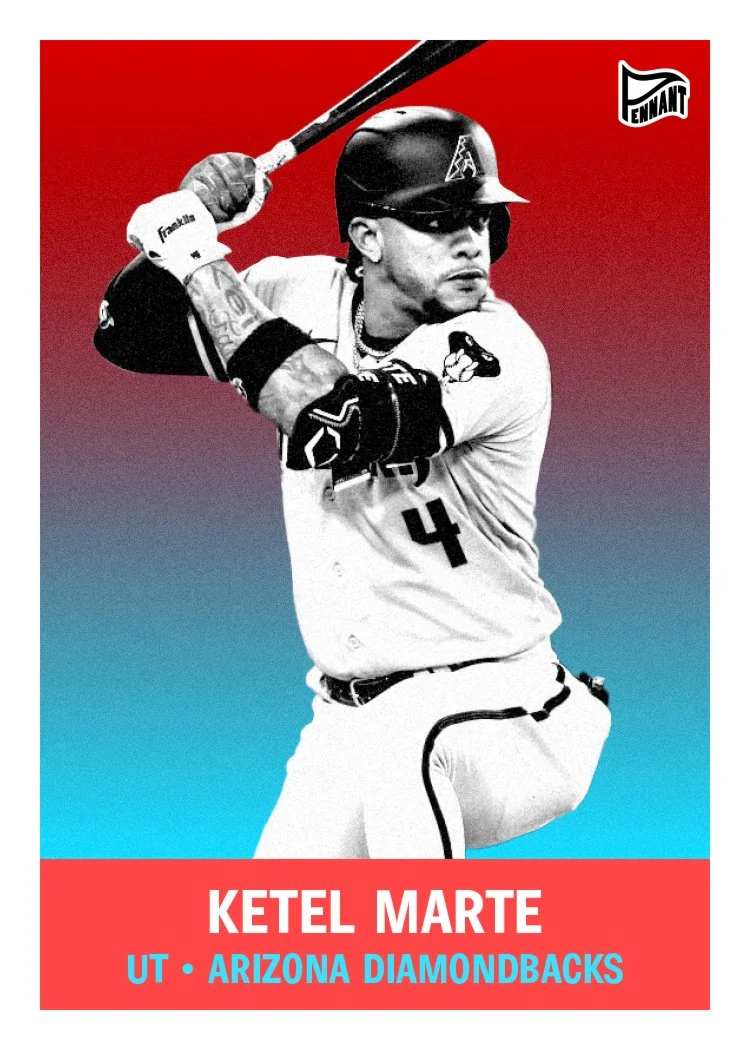
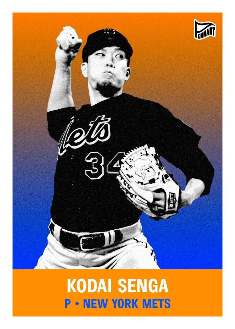
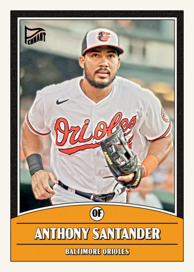
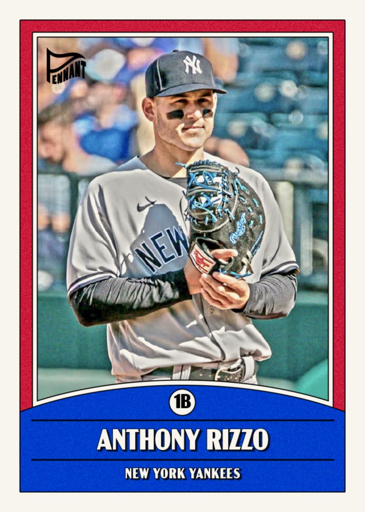
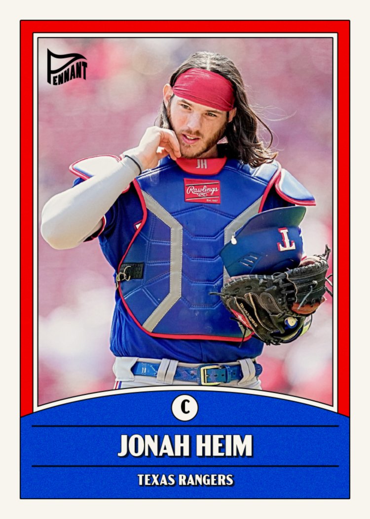
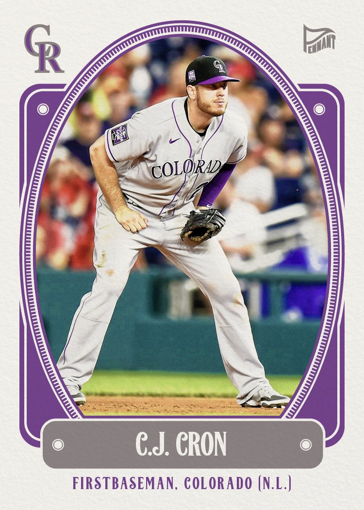
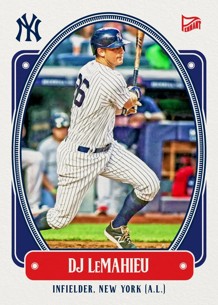
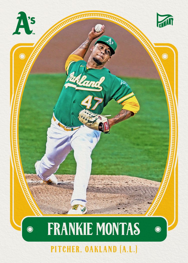
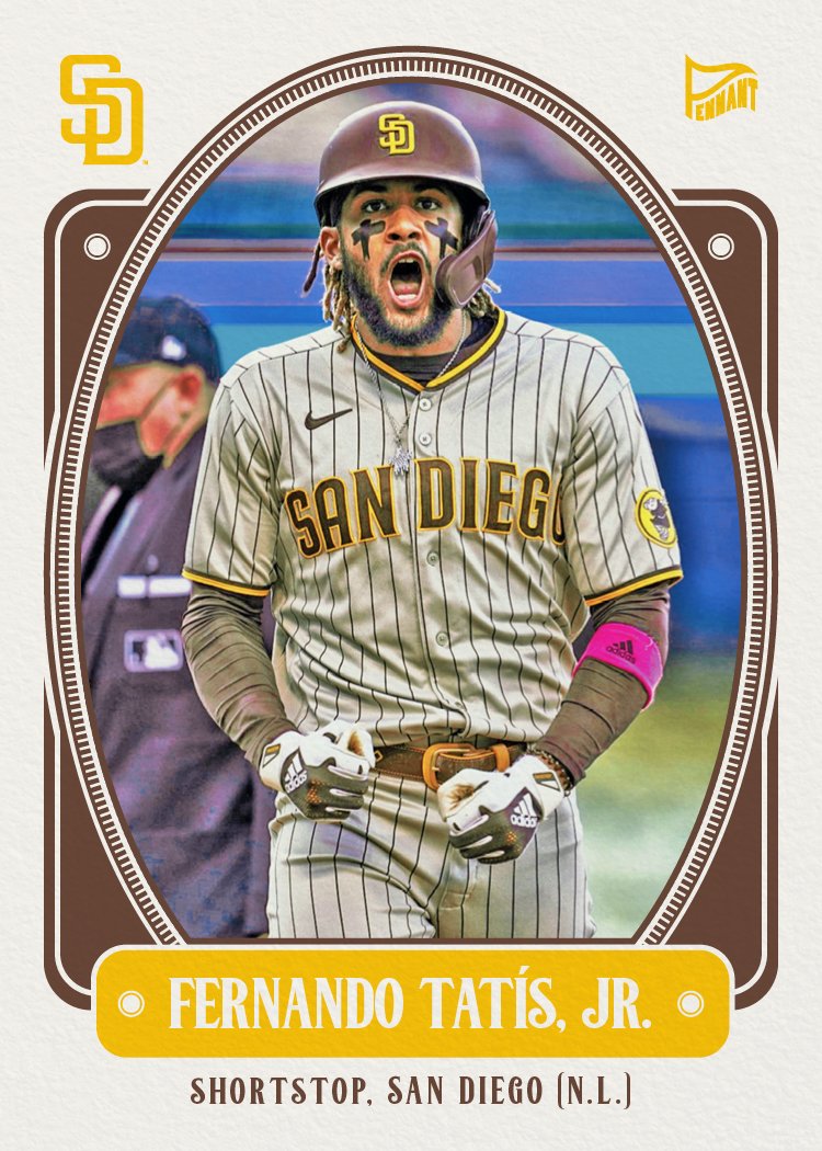
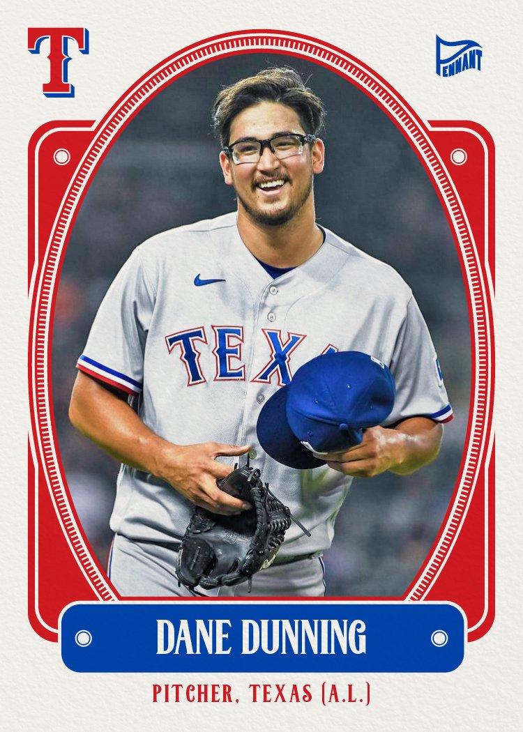
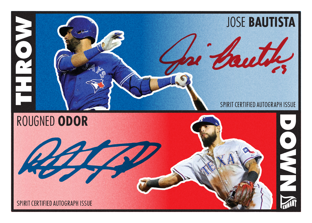
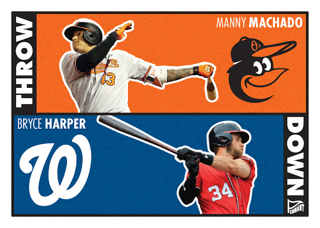
Sorry. Let me climb out of that well of despair and share my 2025 Pennant design.

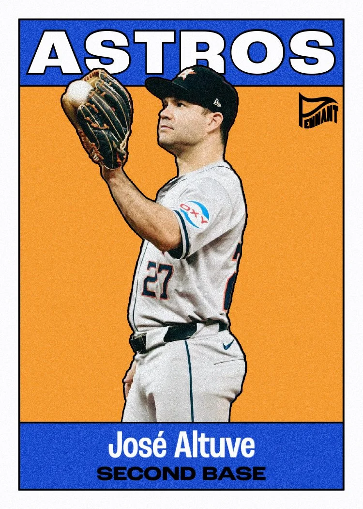


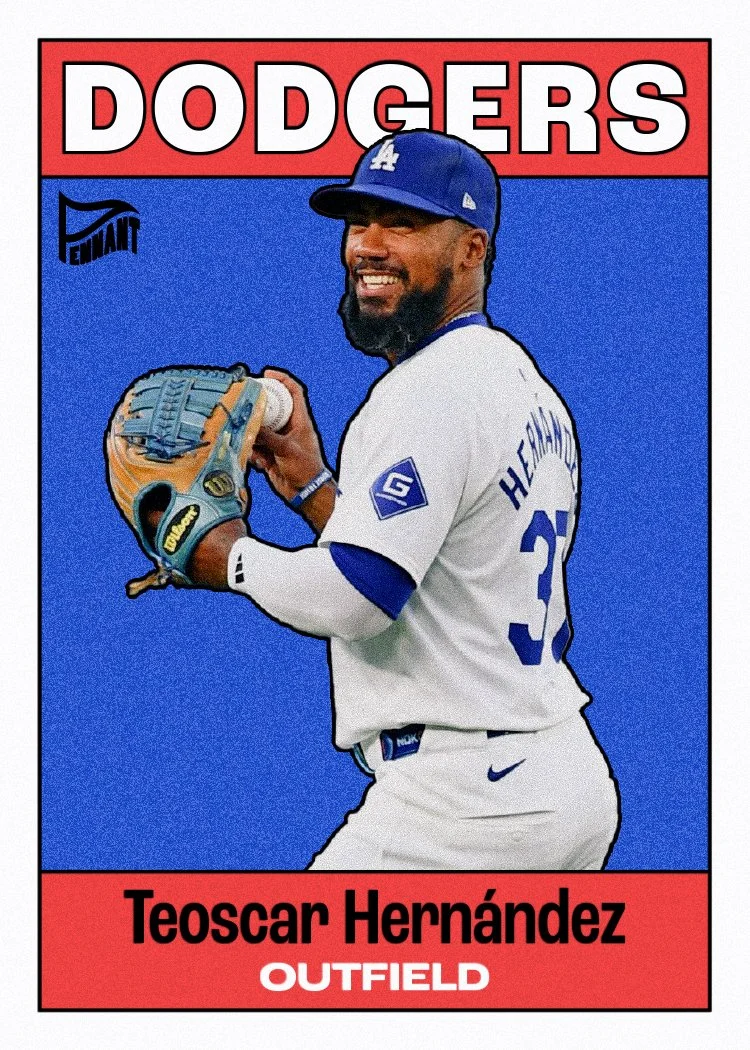


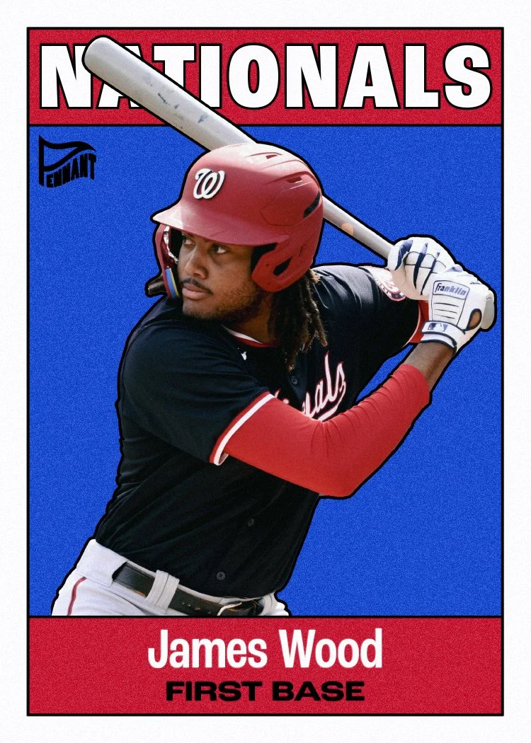


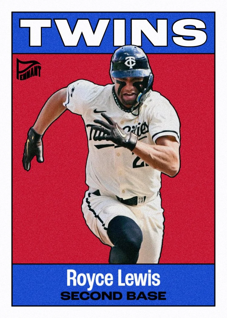


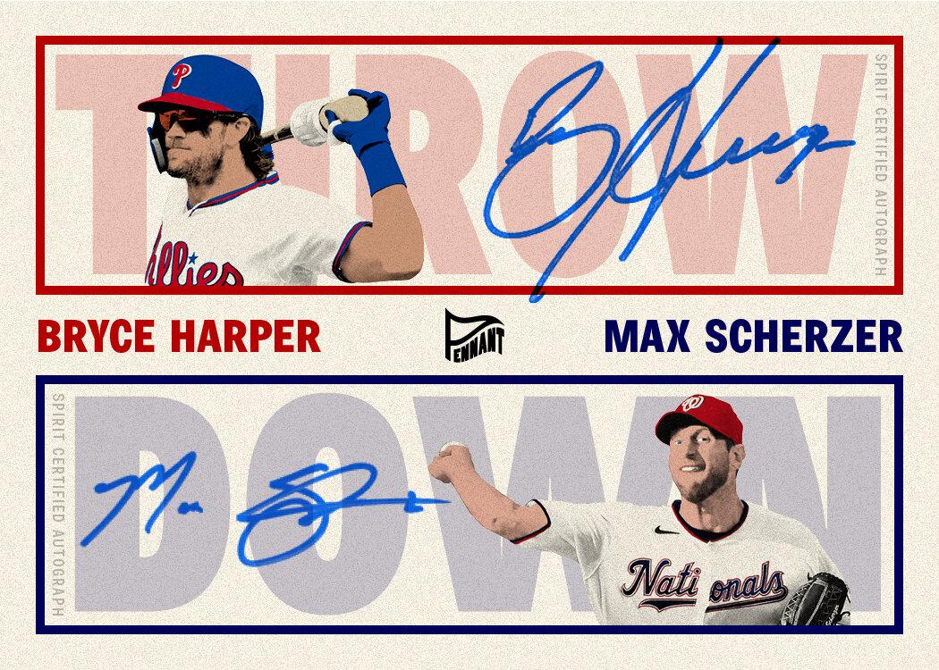
The design is a pretty obvious riff on Topps’ 1958 and 1964 designs. Once again, I’ve gone with a limited color palette rather than true team colors. Having a black stroke around the text, color boxes and then the player images adds a bit of a comic book-y feel I like. Inserts to come as the season goes along. Happy Opening Day!


