It’s almost a month into the season and I’m already releasing my 3rd set design. Perhaps the surprising success of the Giants is motivating me to get things done. Anyway, here’s a look at the design for the “fun, youth-focused” set, Clubhouse.


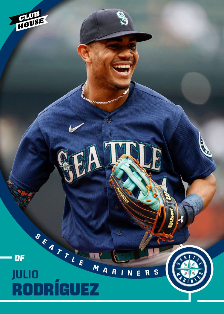


This year’s set is even more colorful than usual with no white borders and very little white overall. There are a lot of circles, however, with the player photos surrounded by a secondary color ring and then another circle for the team logo in the bottom right corner. I tried to use a team’s primary color for the big color portion of the bottom though the red/blue teams are always a bit hard to sort out the primary. The player names are big enough I decided to use the secondary color rather than adding white. There are some where it’s kinda iffy but I think there’s enough contrast for them all to be legible.
There’s something satisfying about the simplicity here. Circles are subconsciously comforting and the solid colors (no effects or textures like I often add) pack a big visual punch. I had a fun time finding photos that fit well within the circle frames. The Cease and Jones ones stand out in particular.