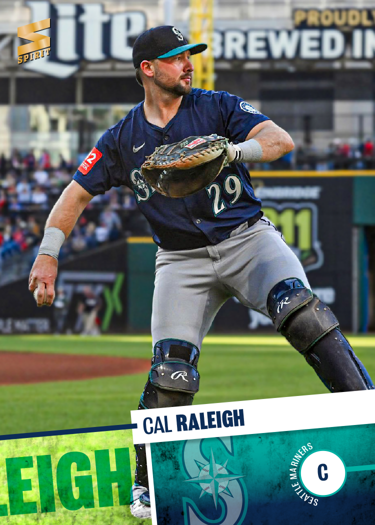
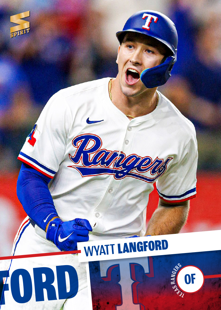
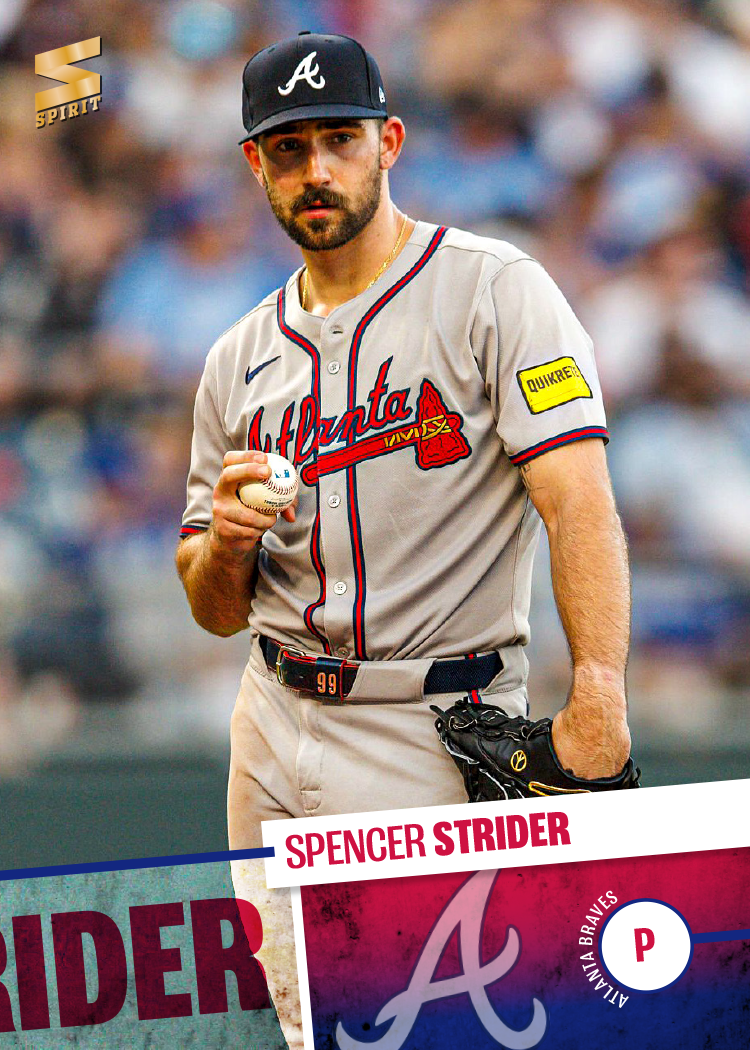
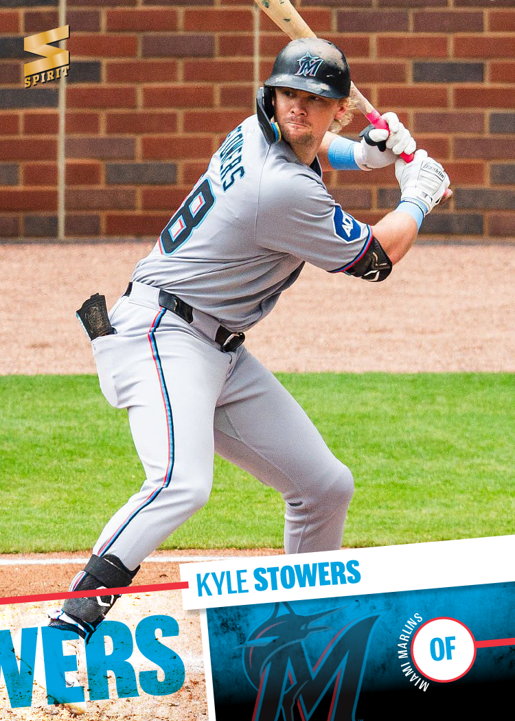
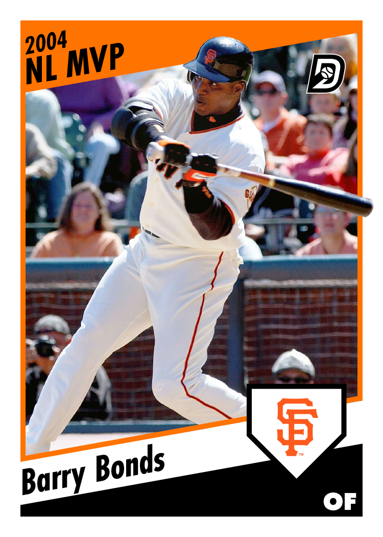
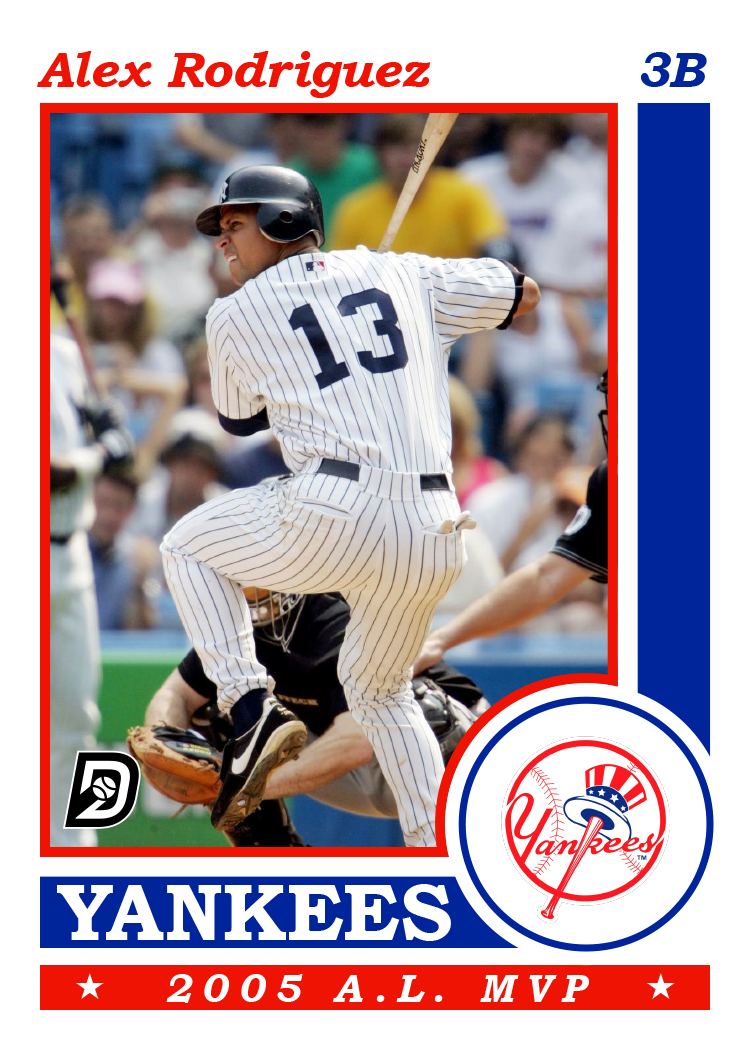
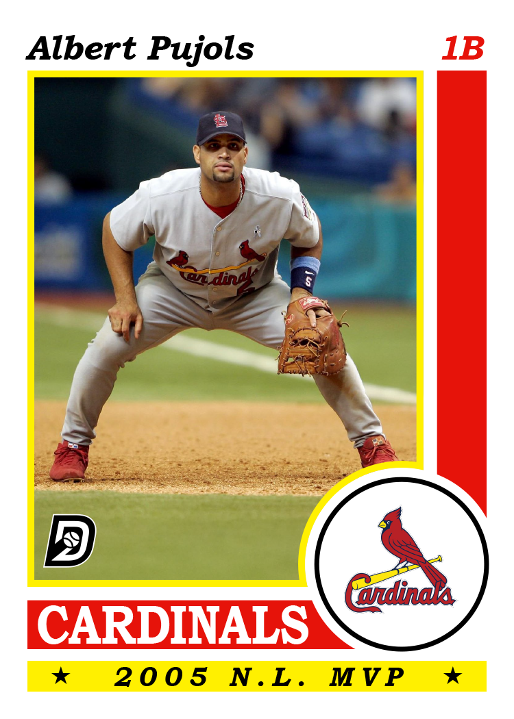
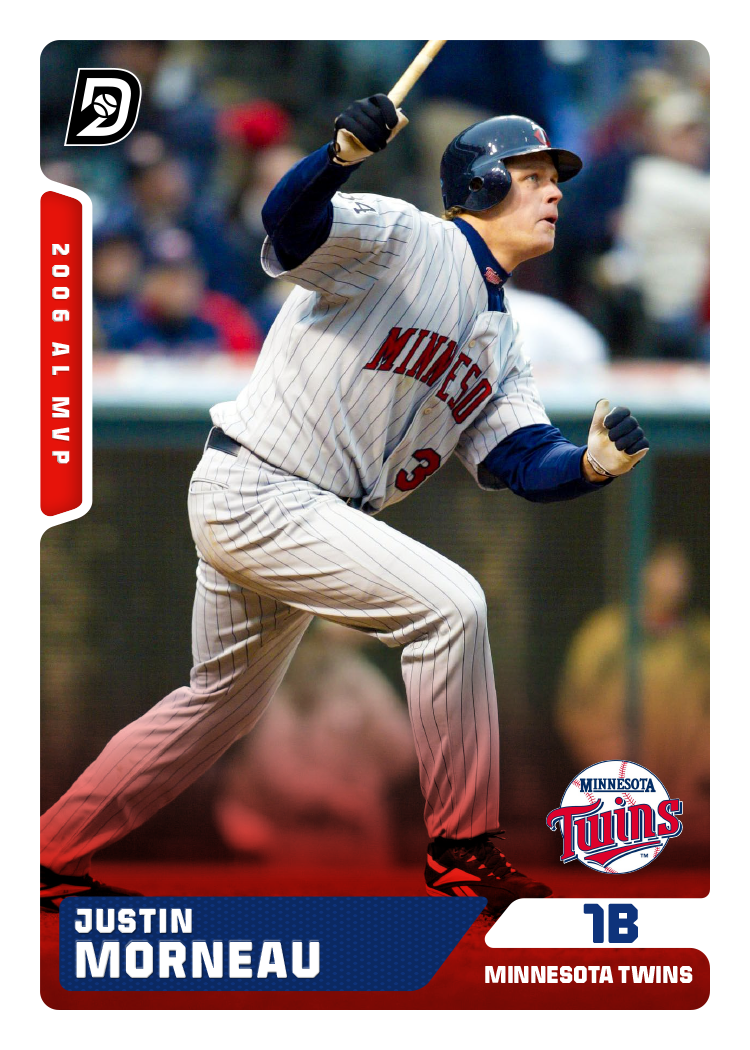
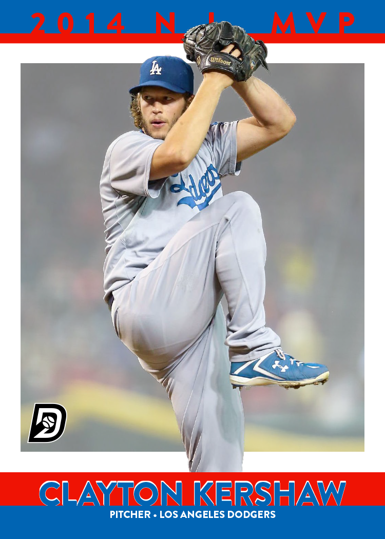
Now that I’ve got the ball rolling, let’s move on to the next set in the 2026 Spirit line-up: Clubhouse.
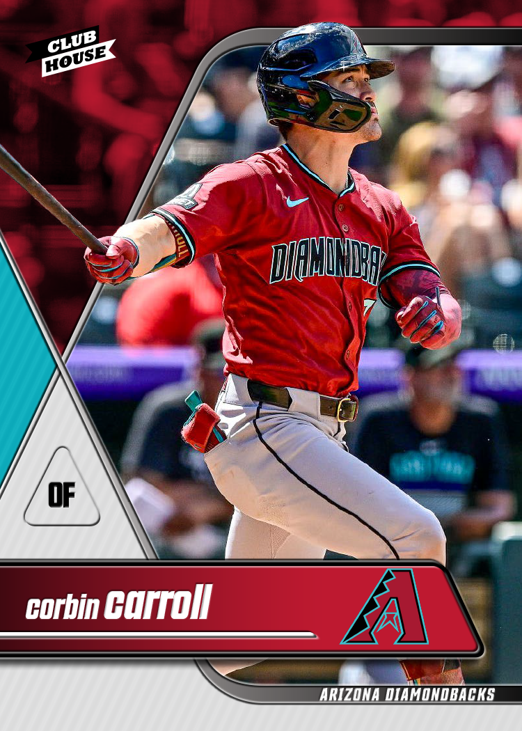
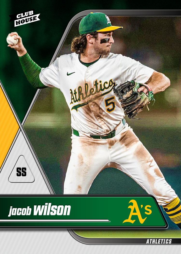
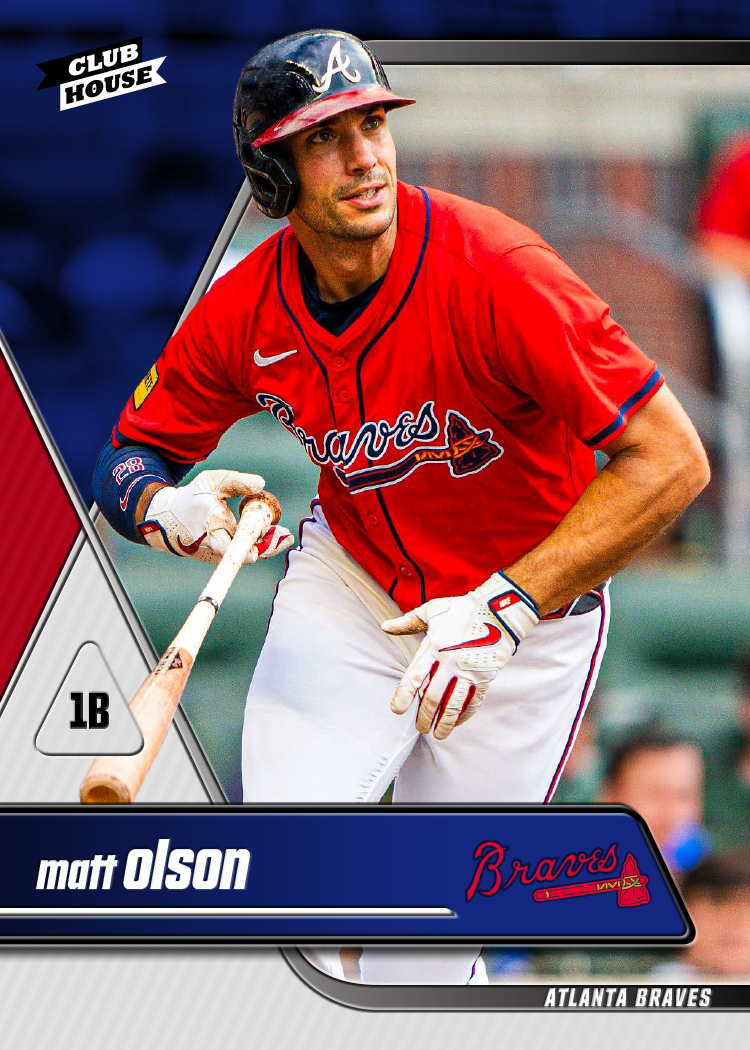
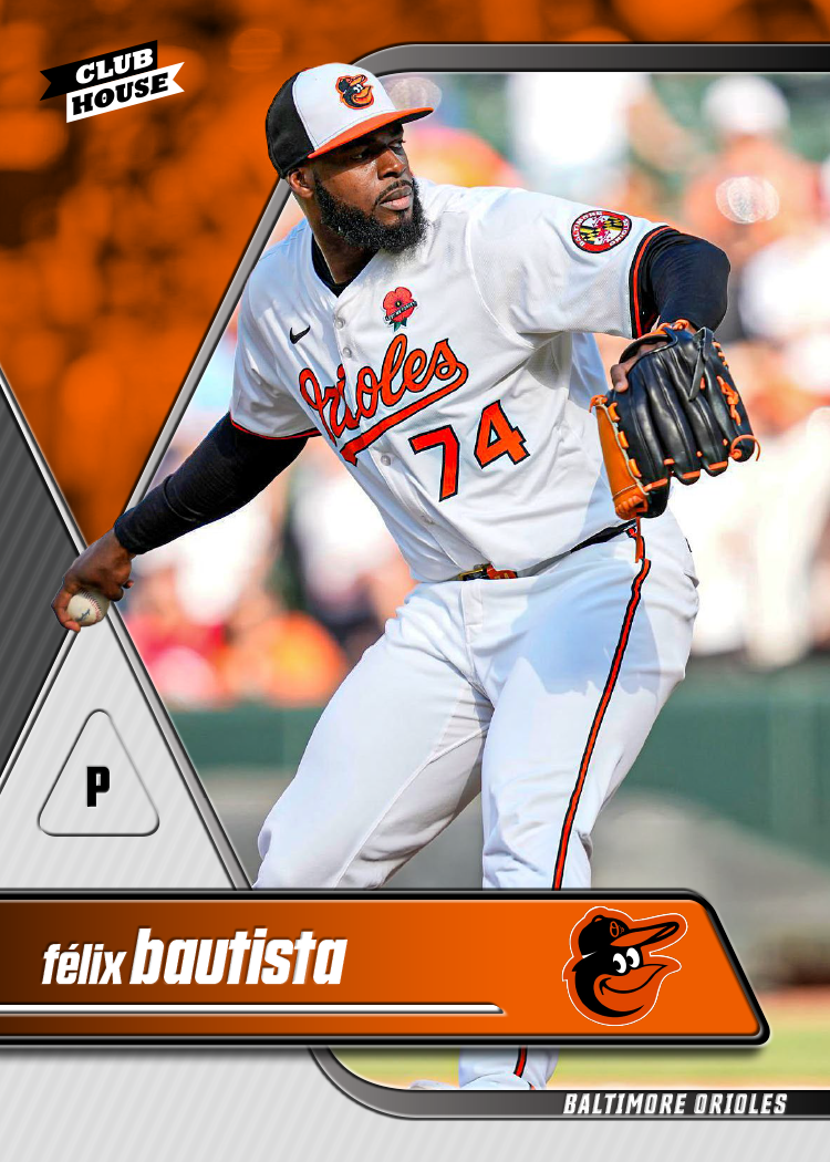
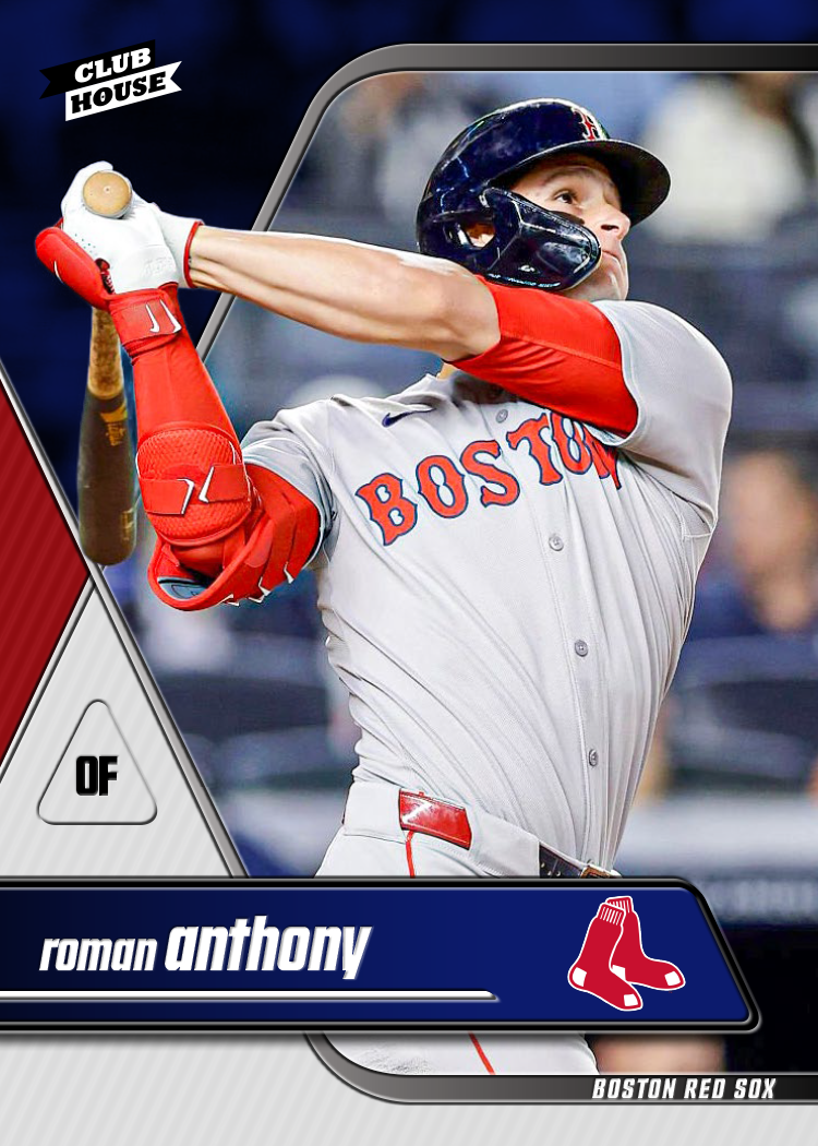
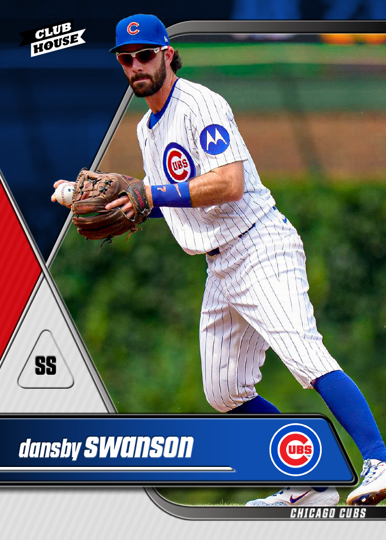
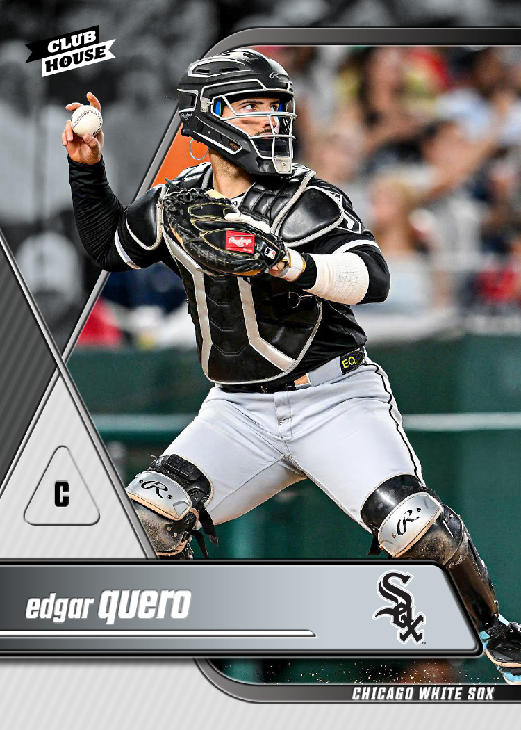


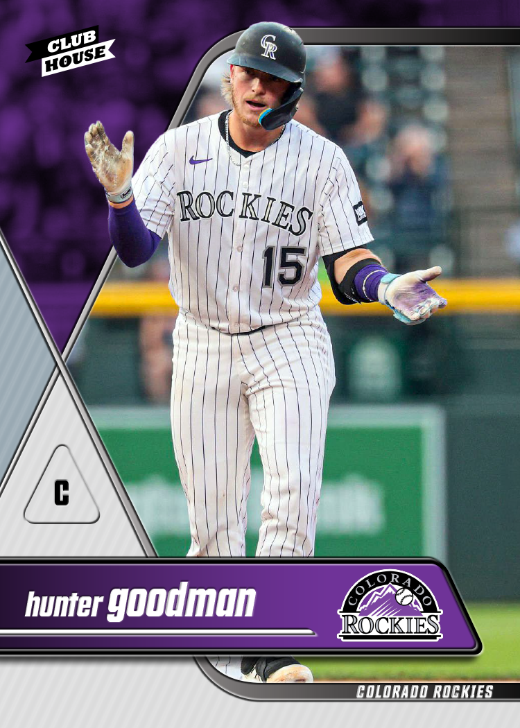
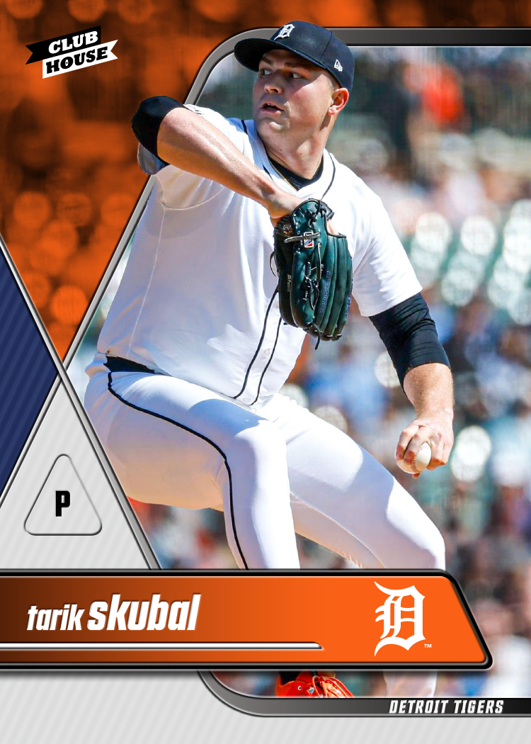
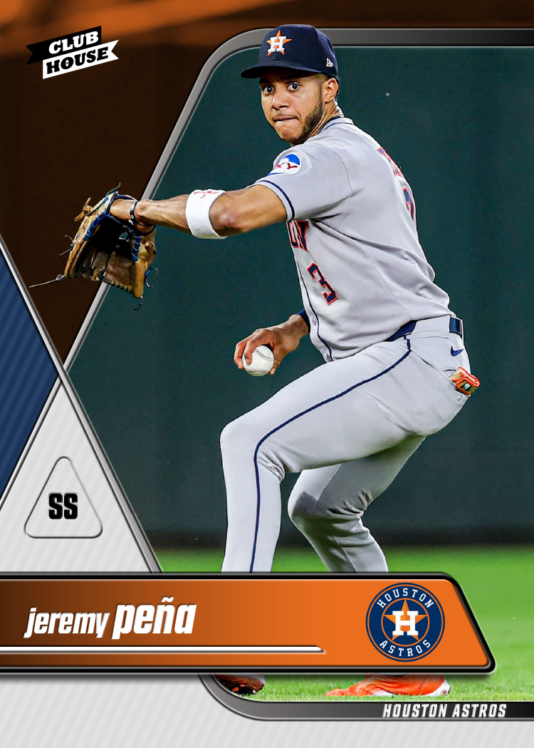

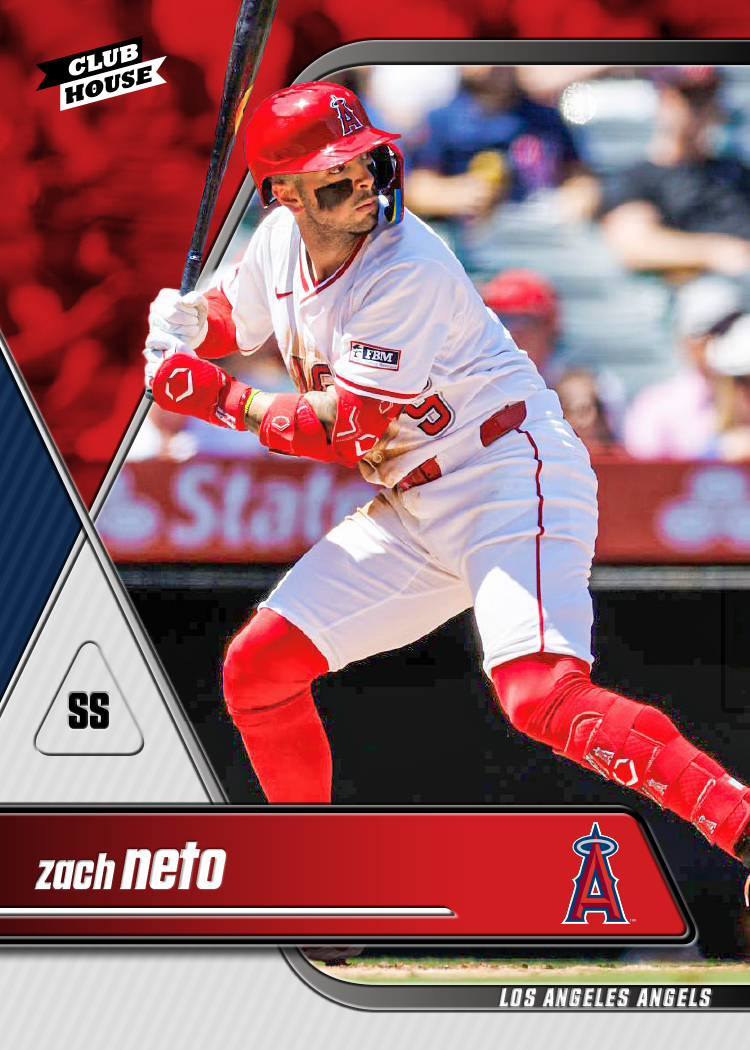
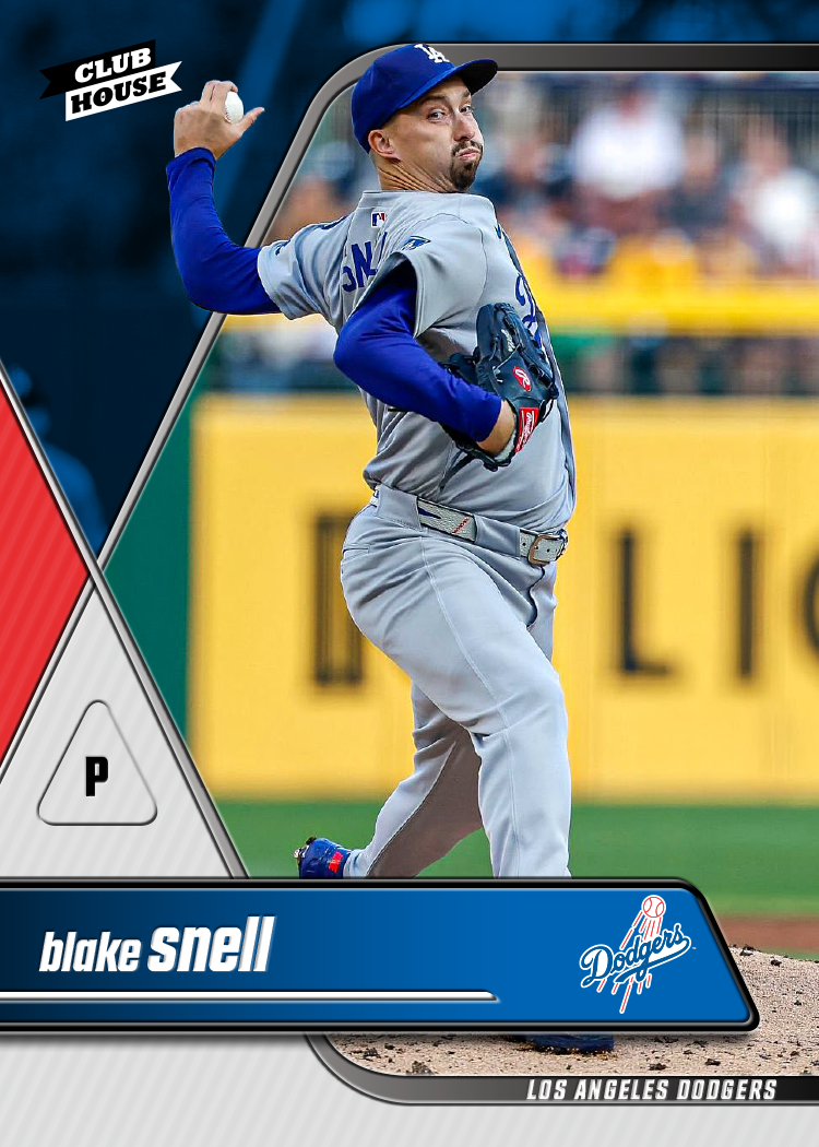
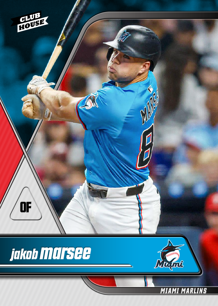
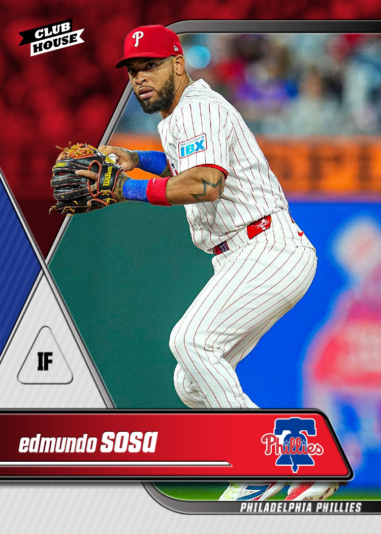
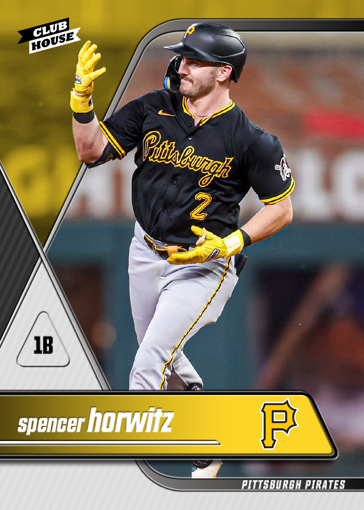
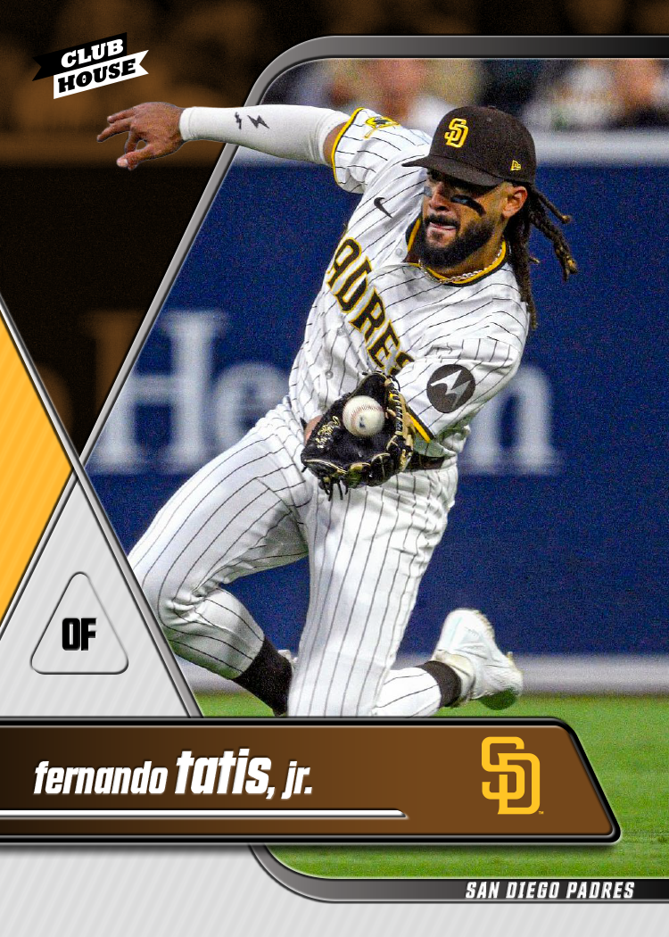
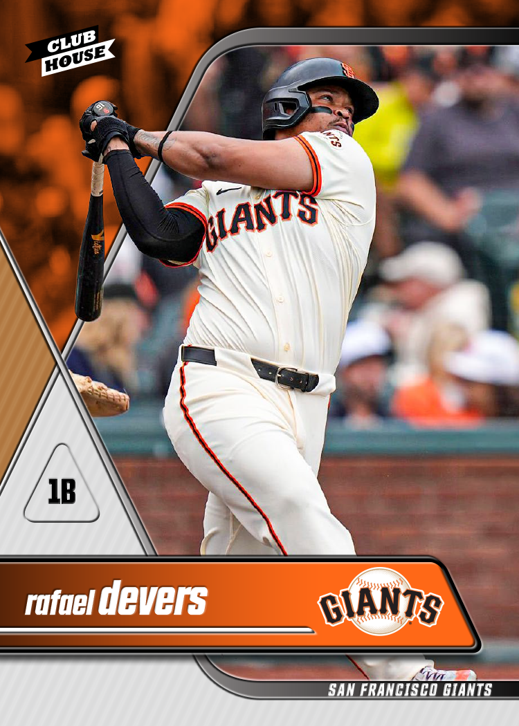
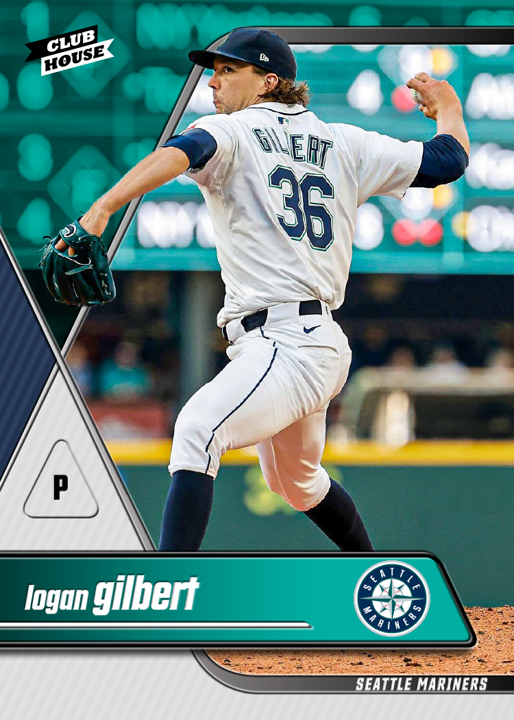
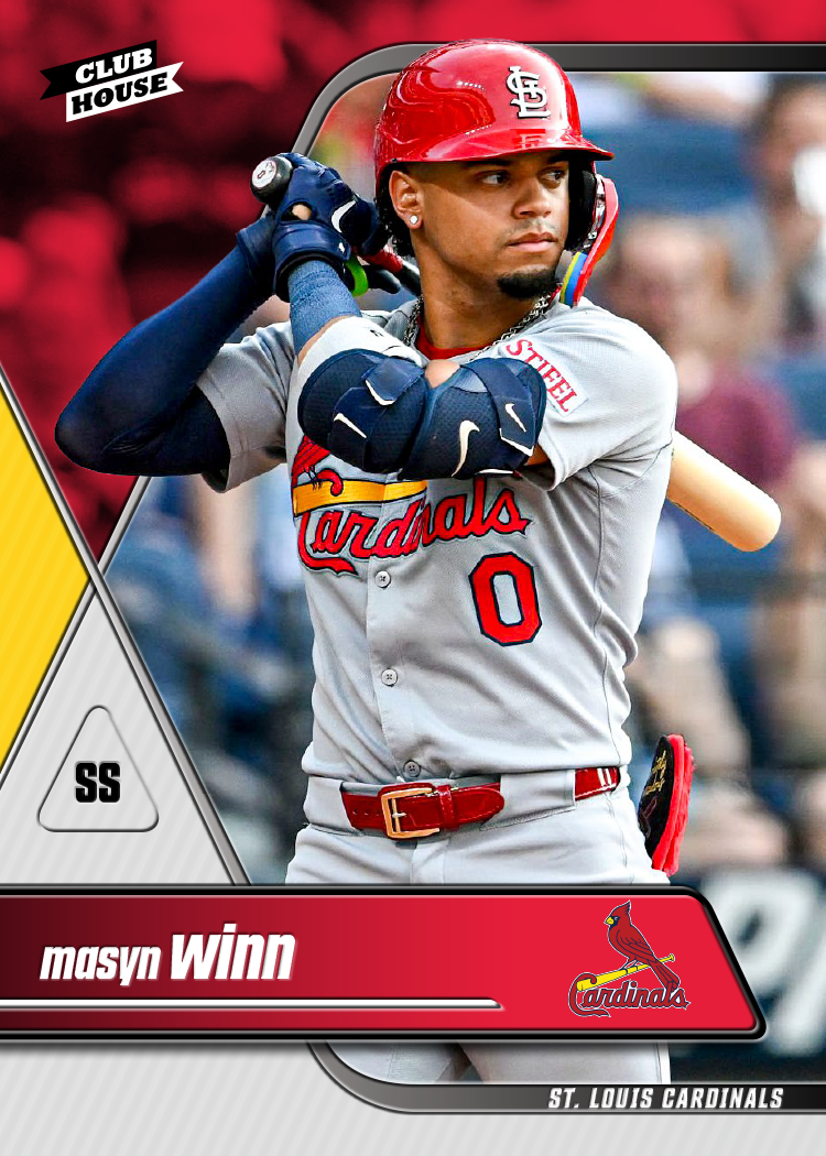
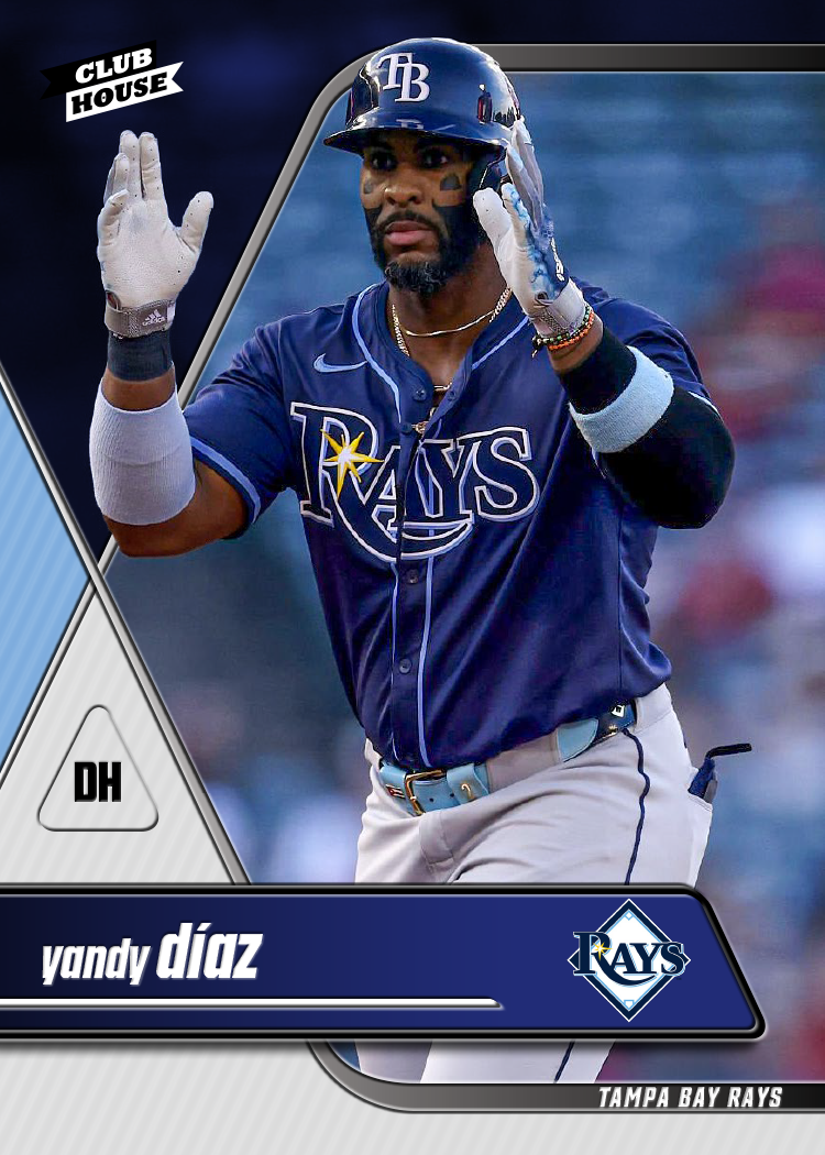
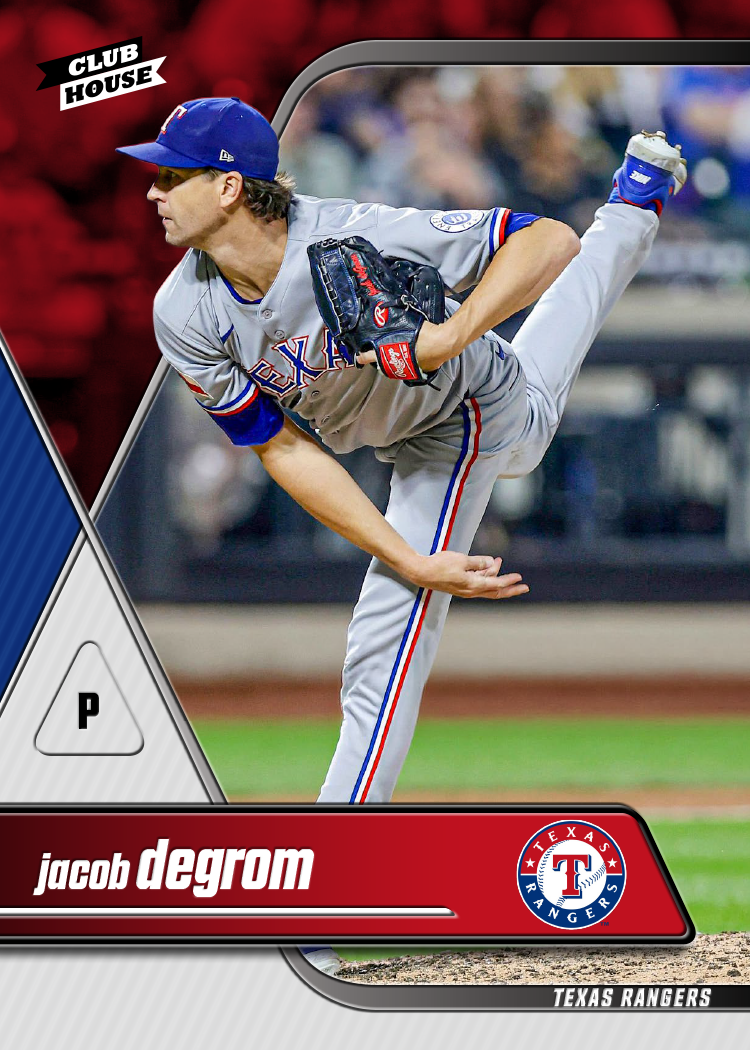
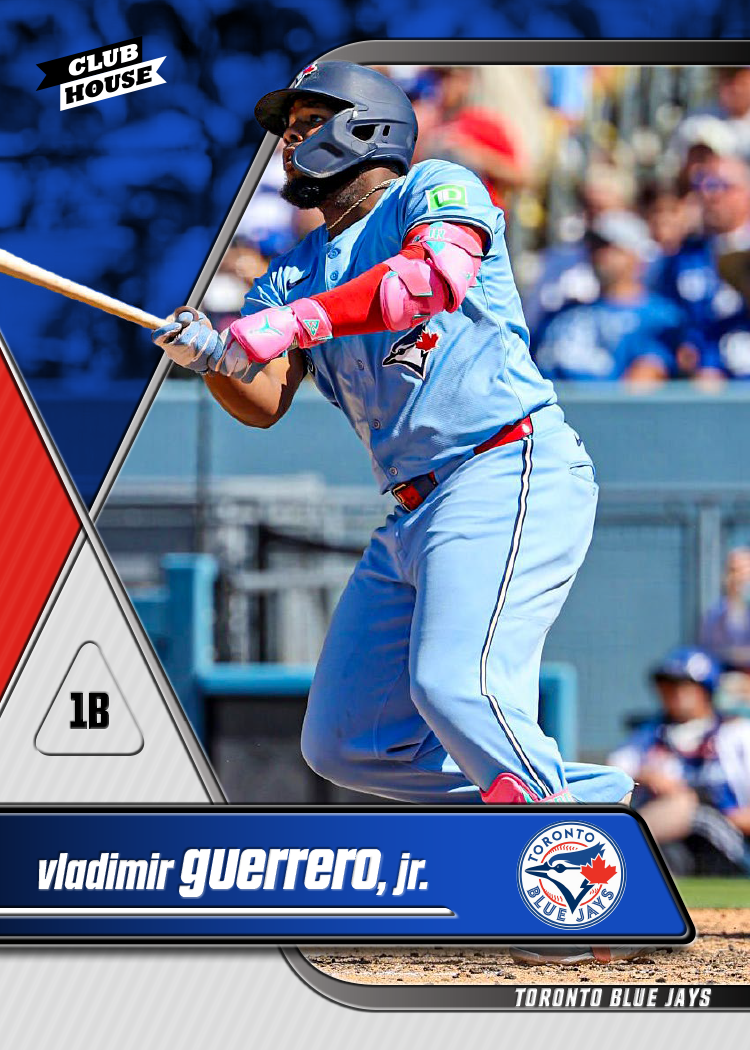
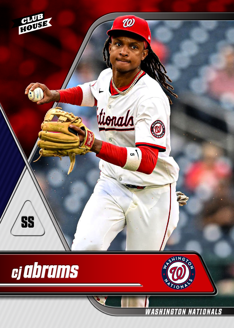
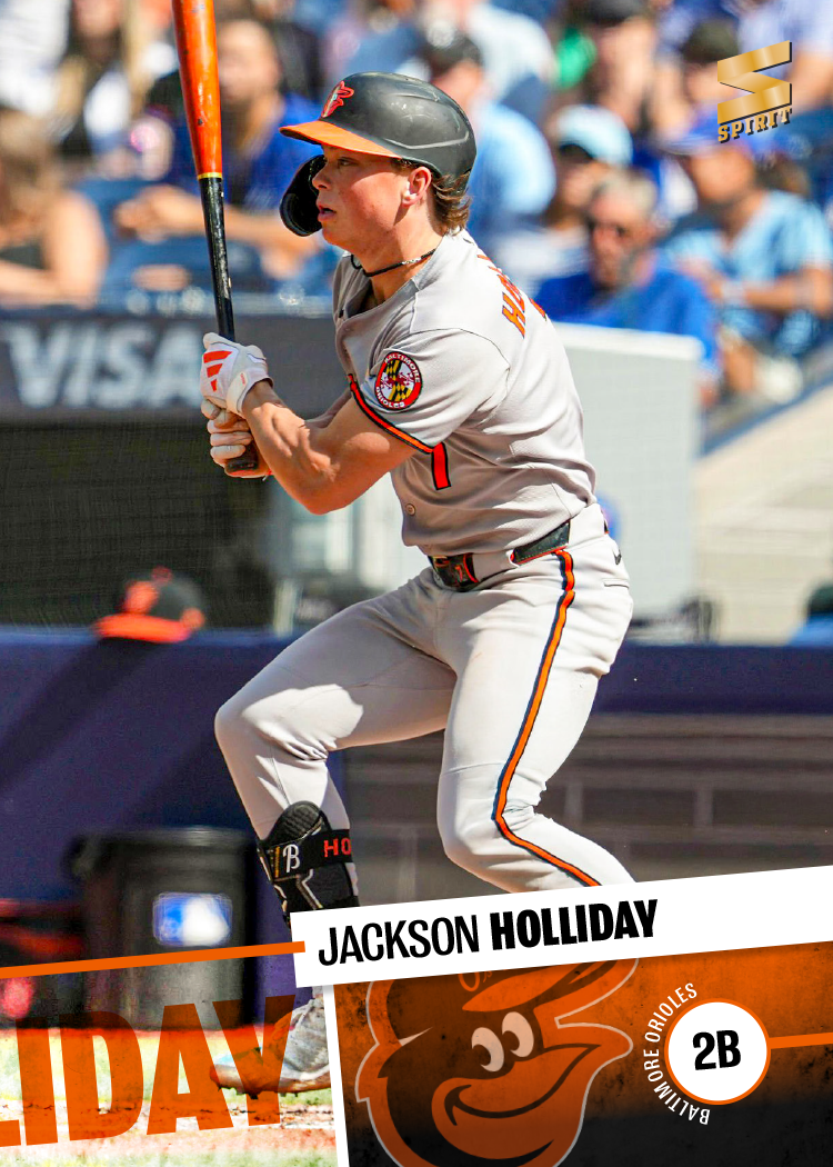
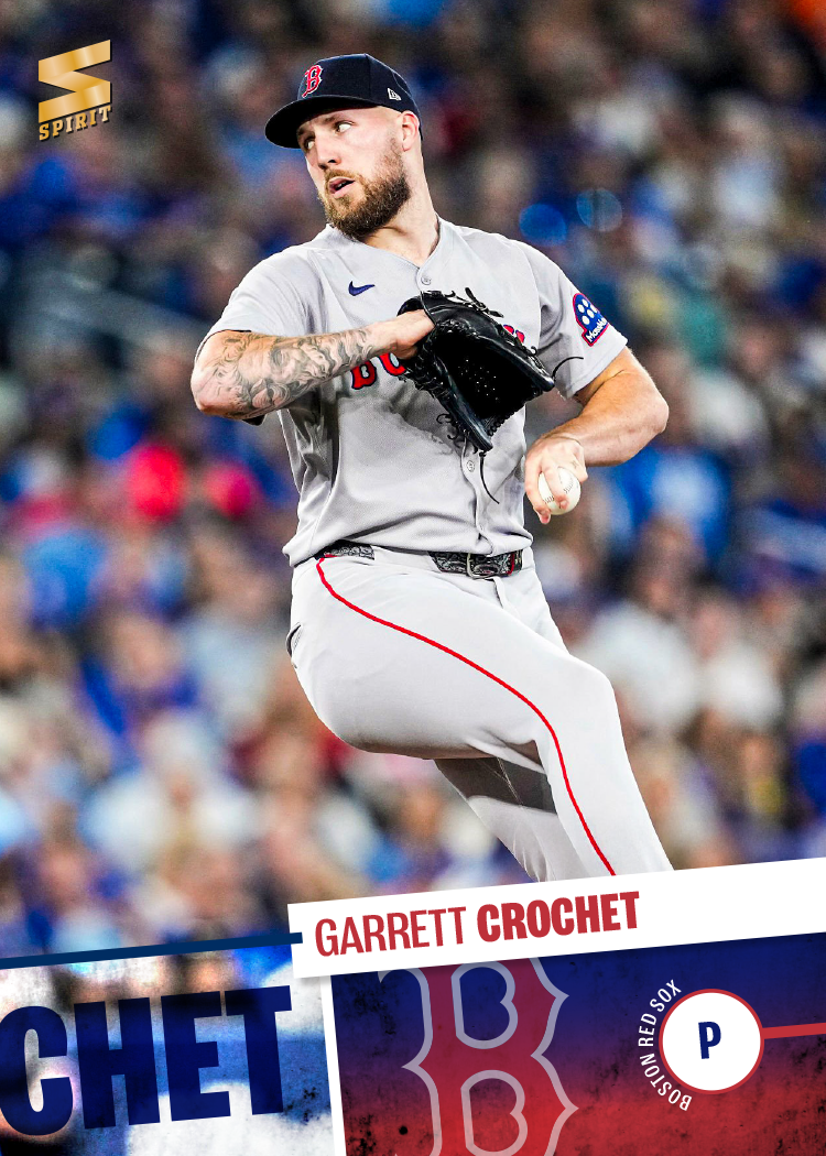
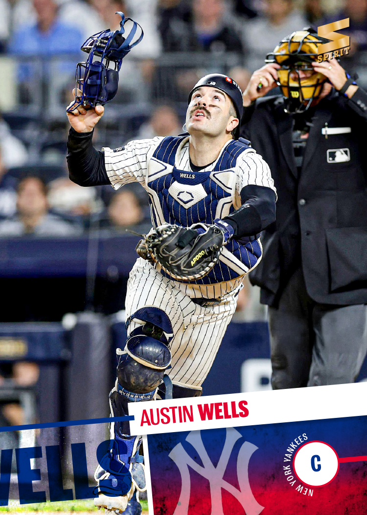
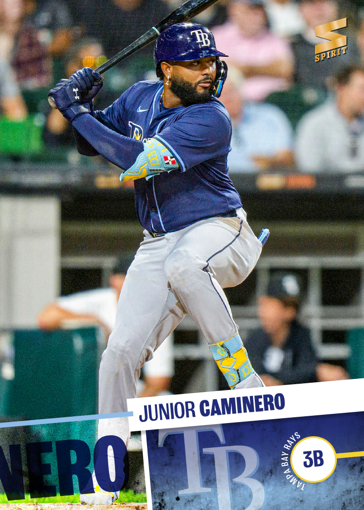
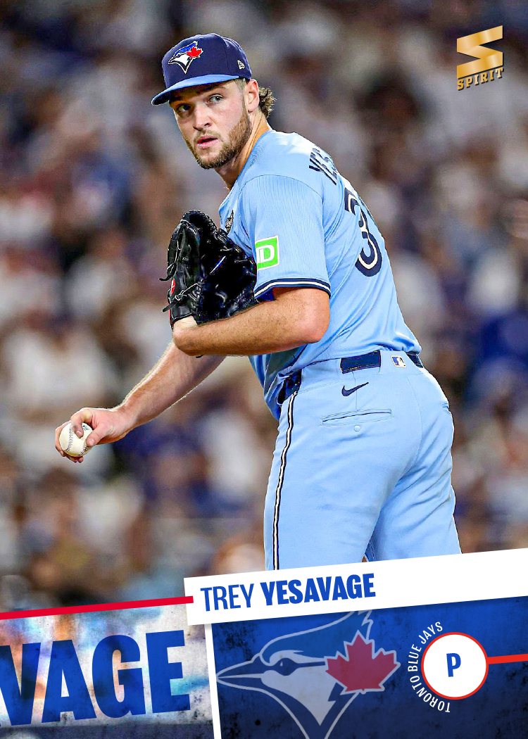
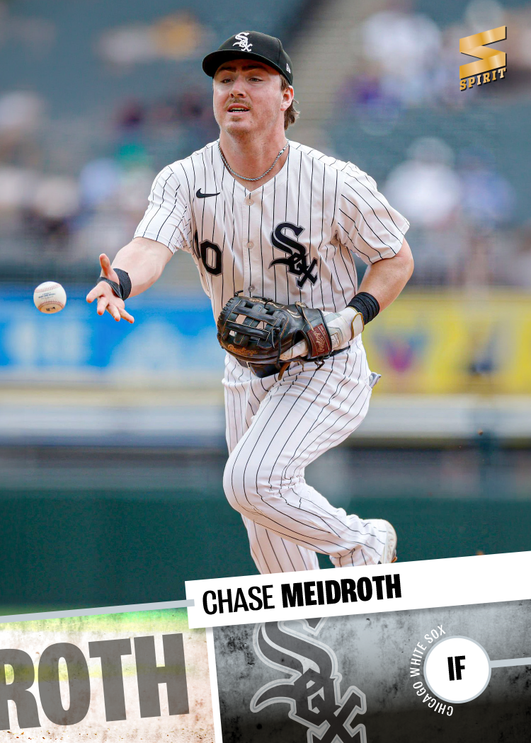
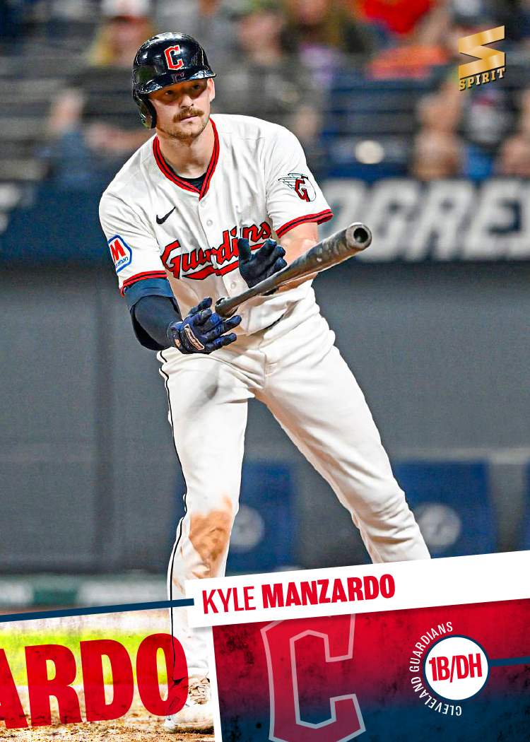
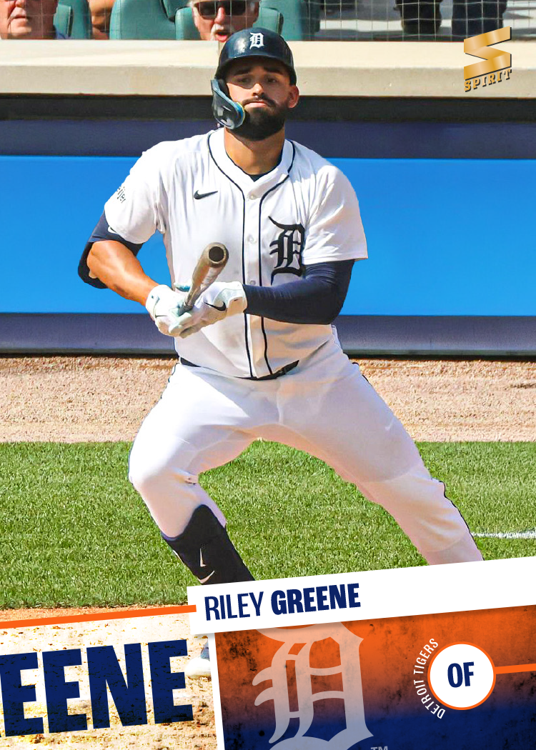
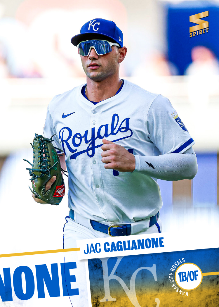
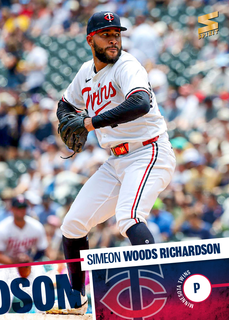
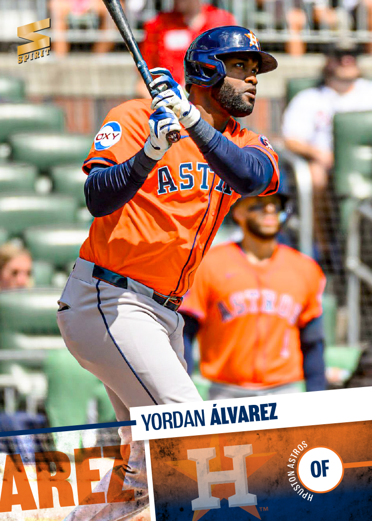
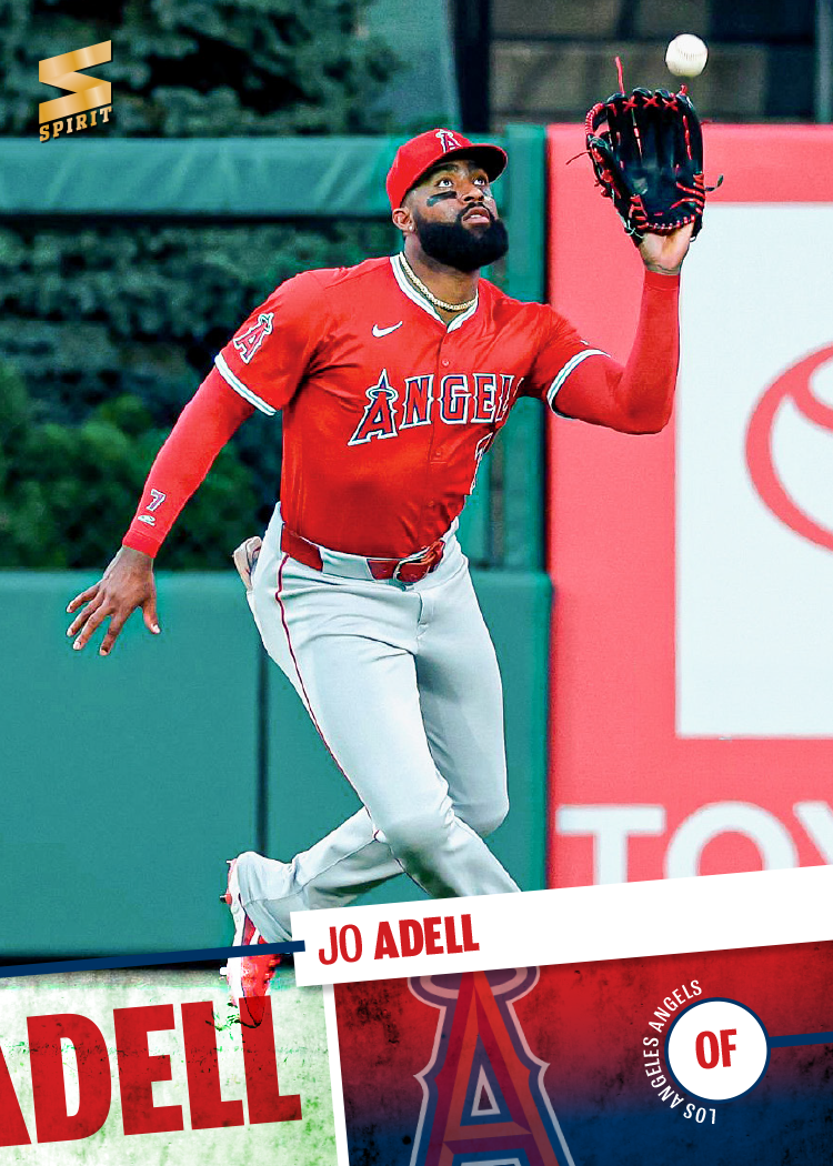
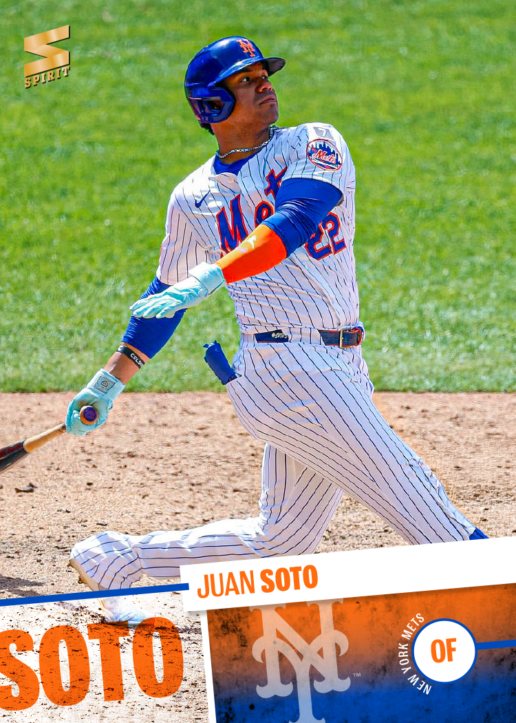
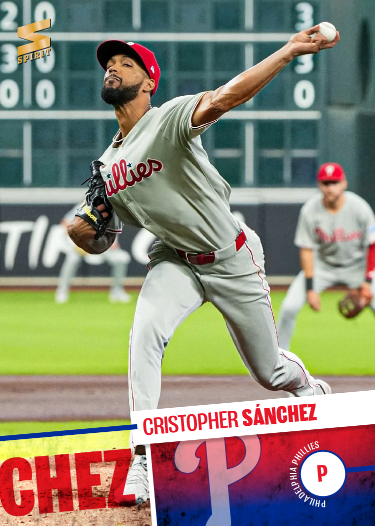
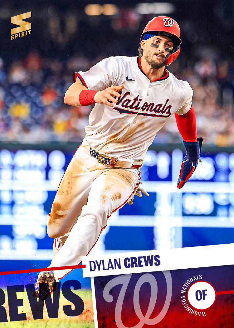
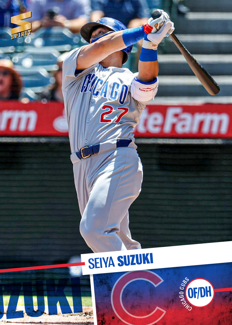
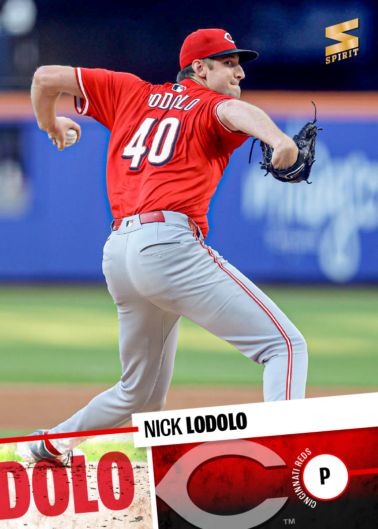
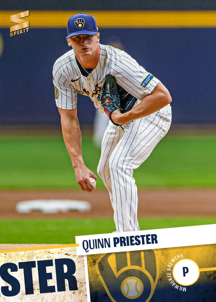
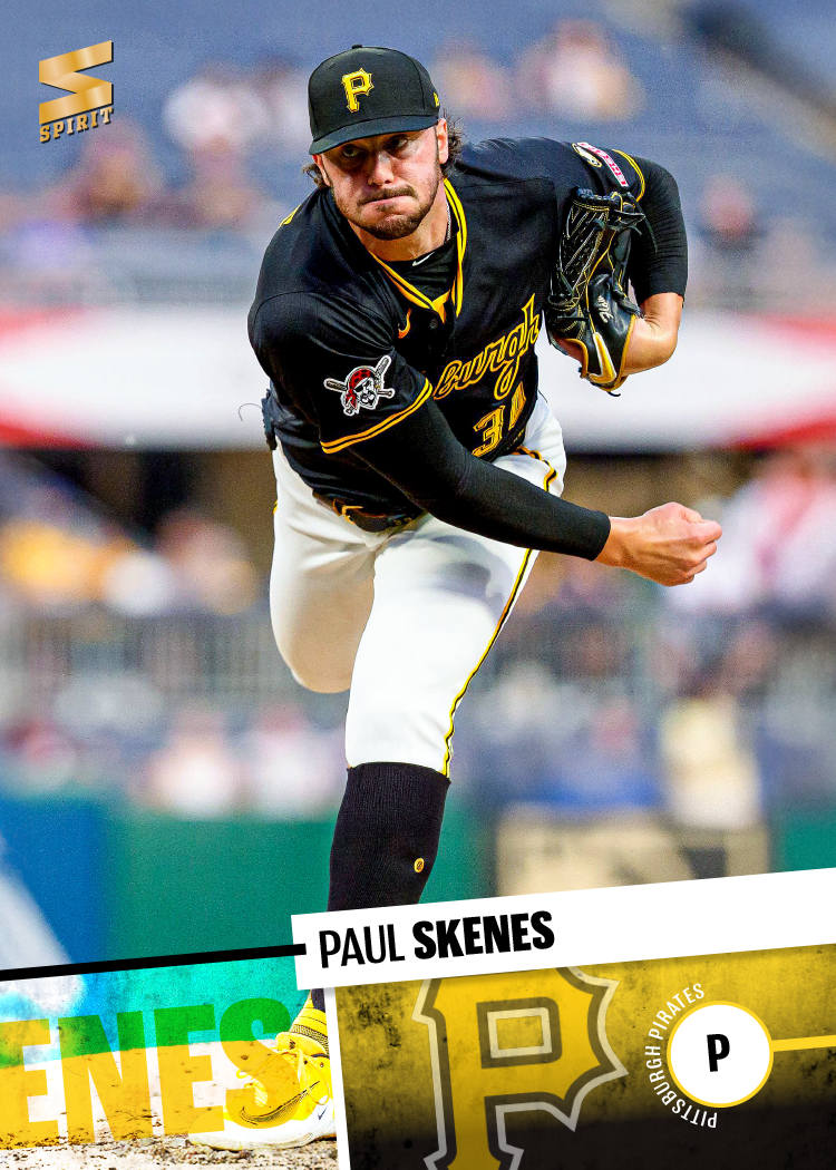
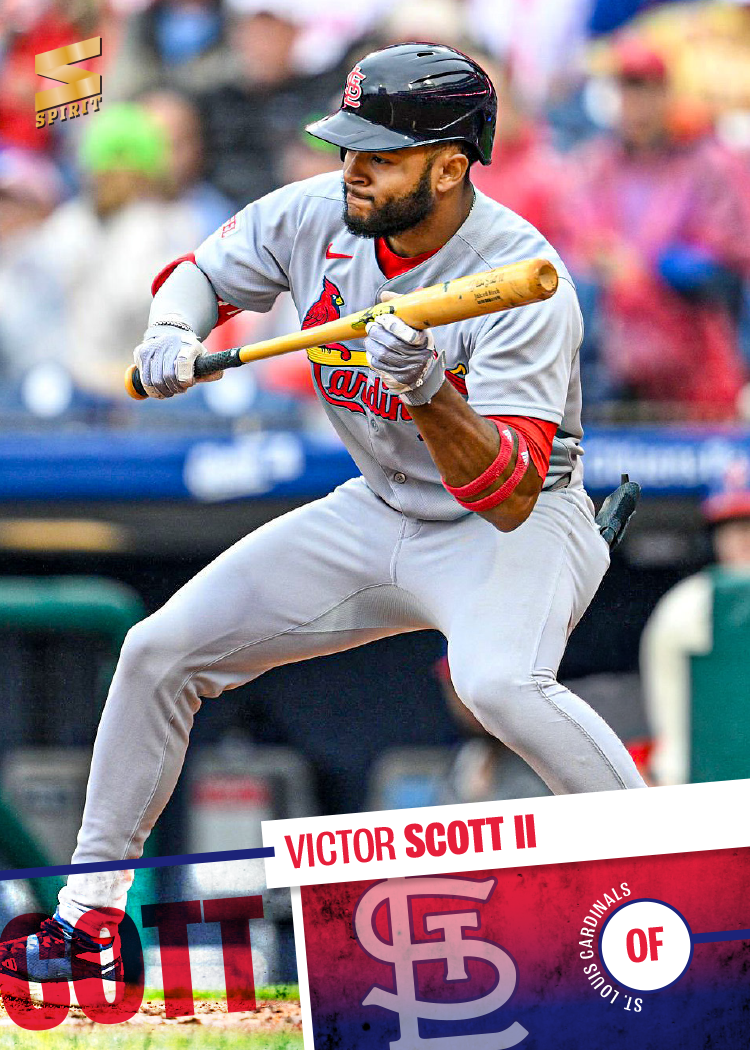
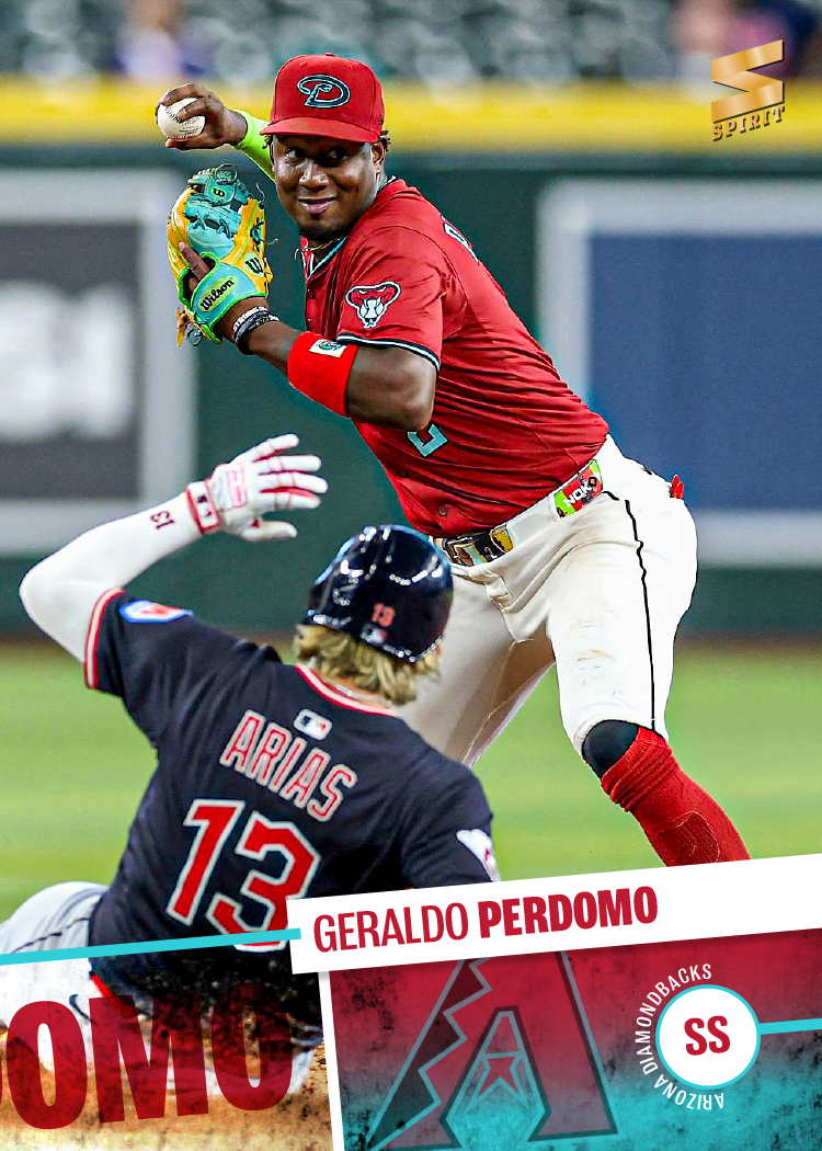
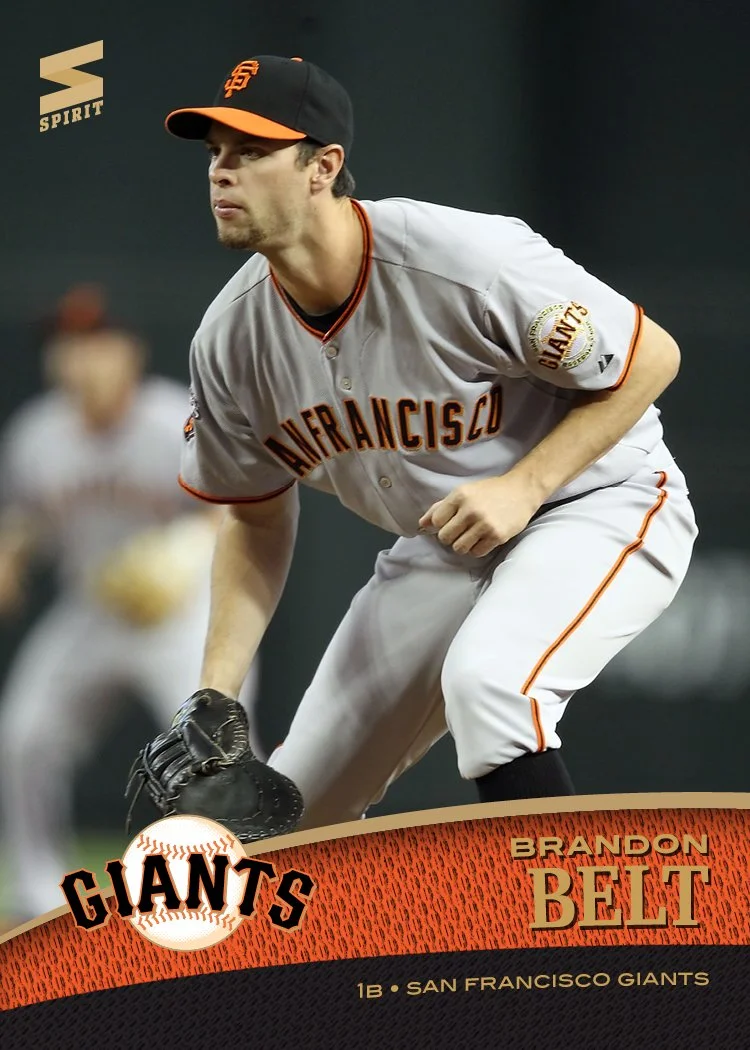
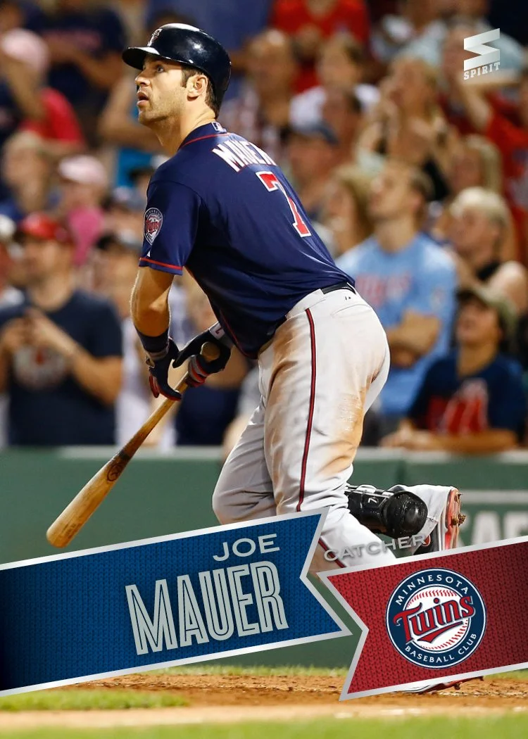
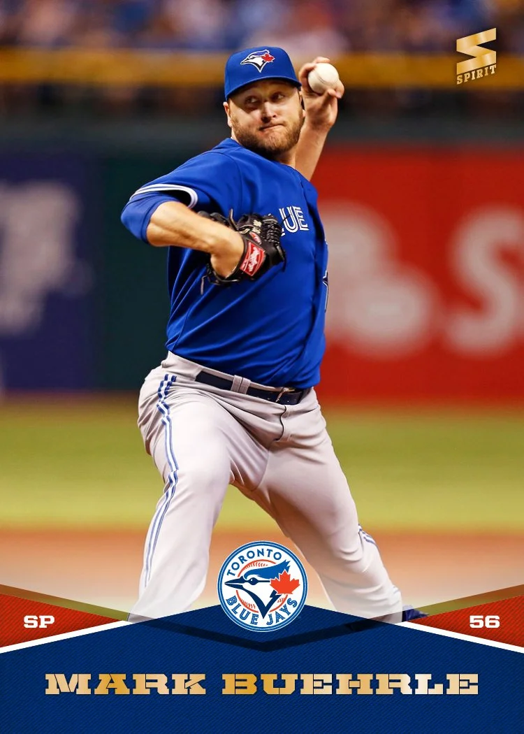
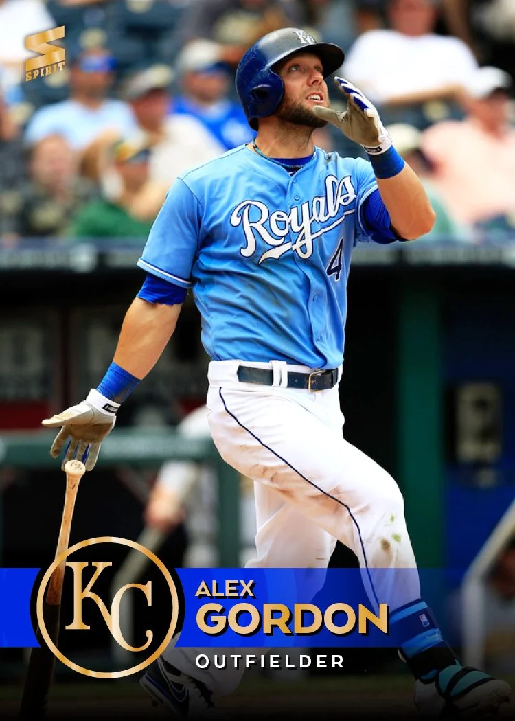
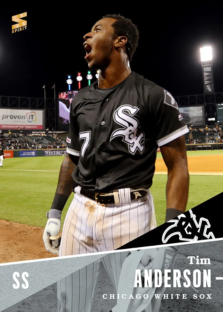
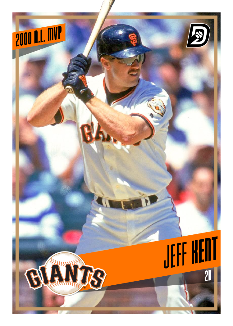
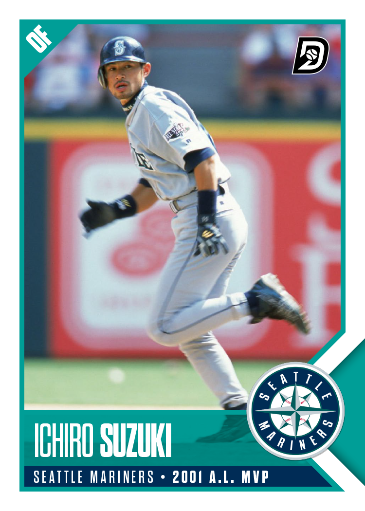
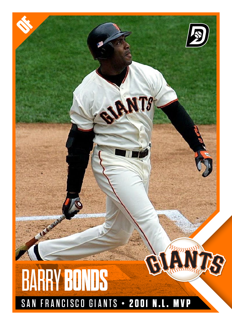
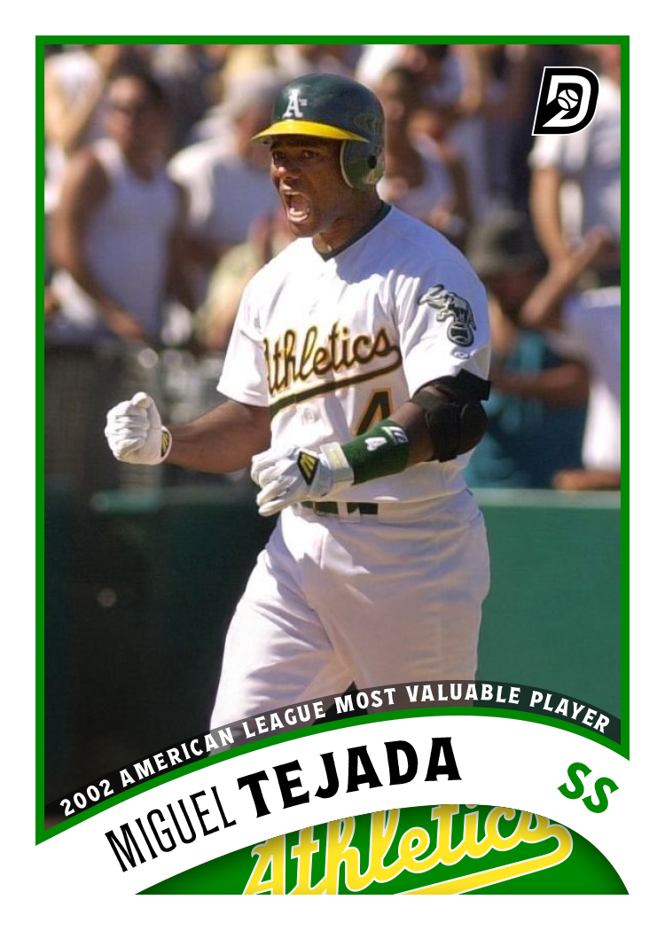
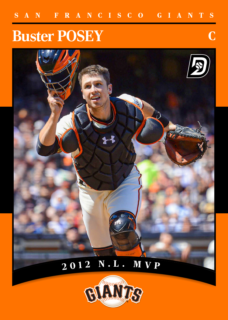
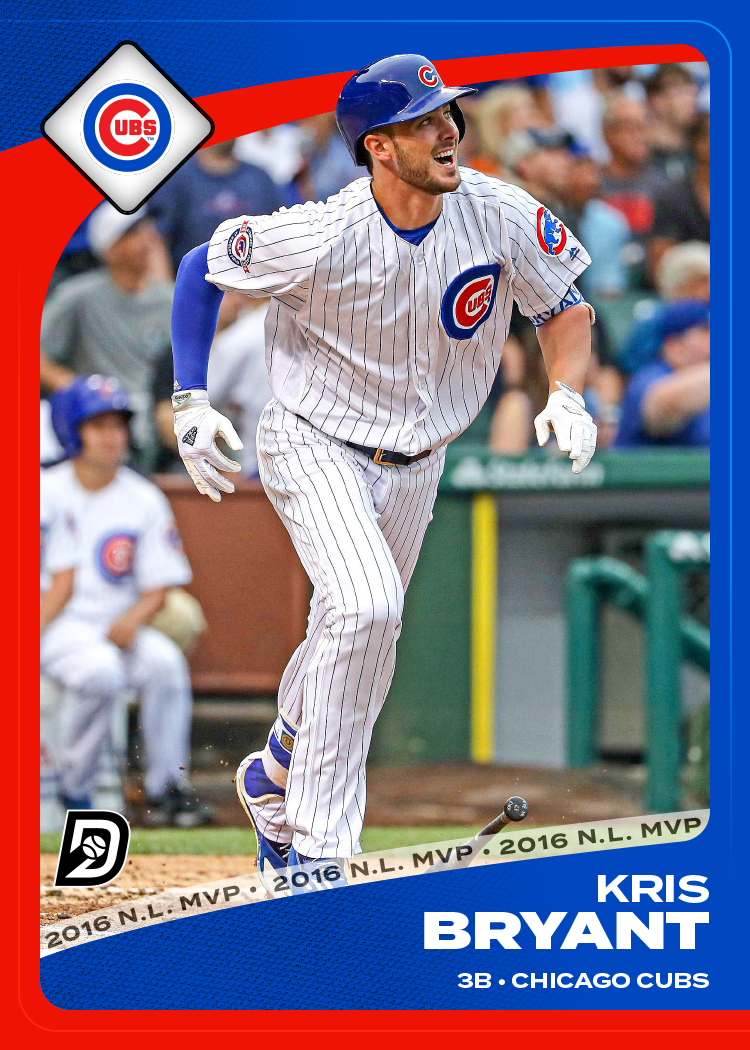
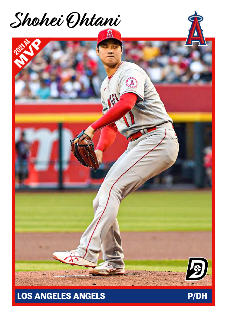
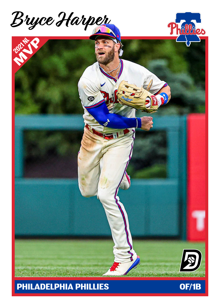
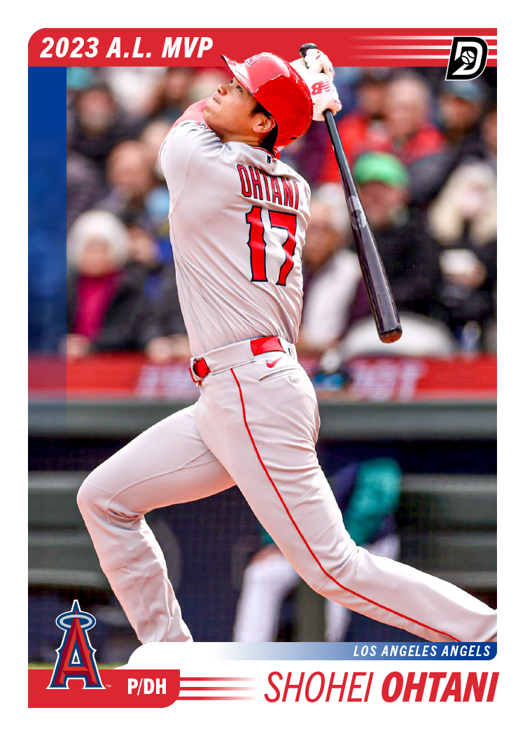
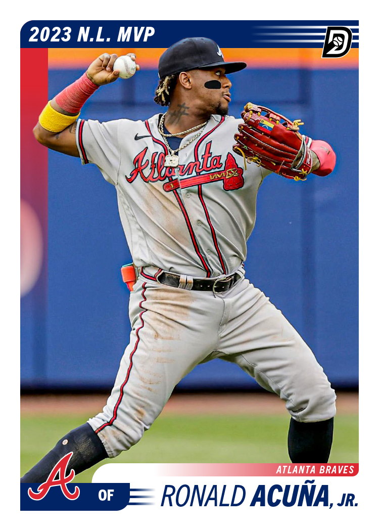
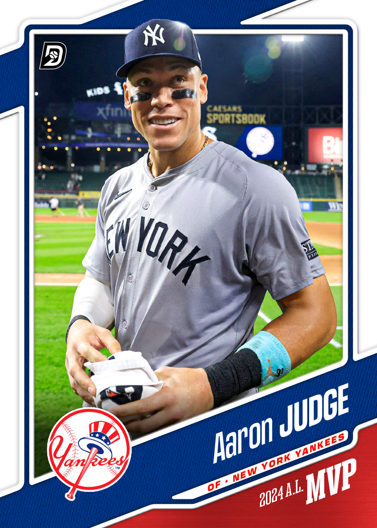
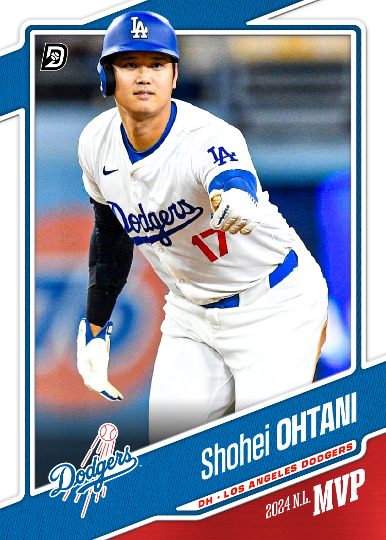
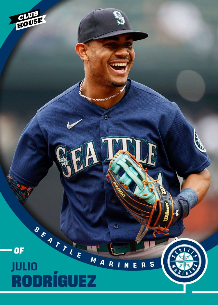
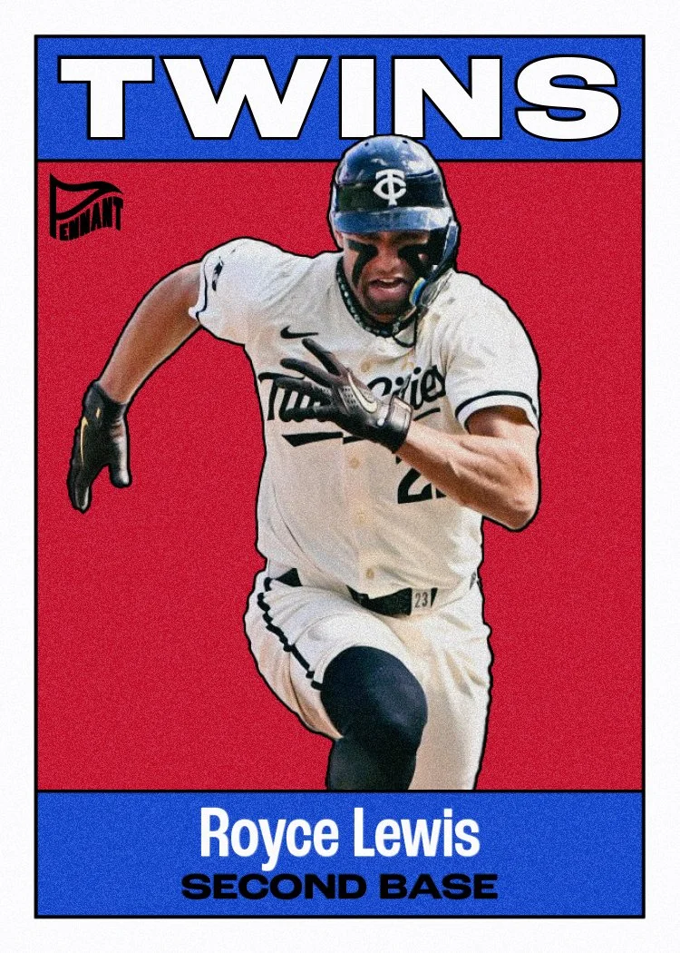
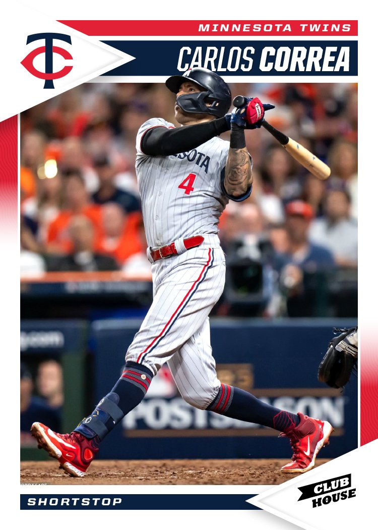
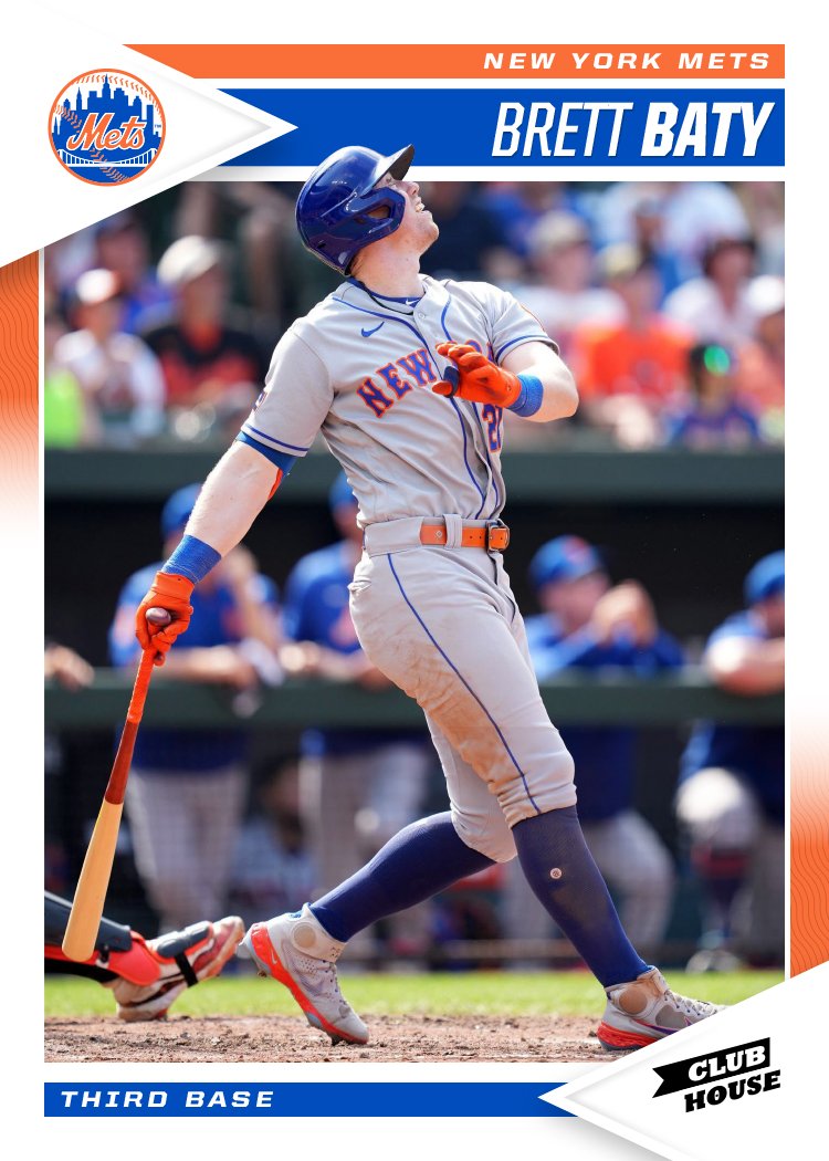
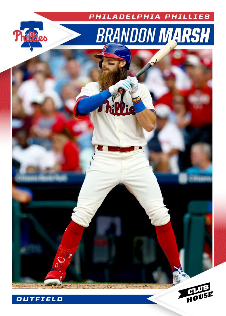
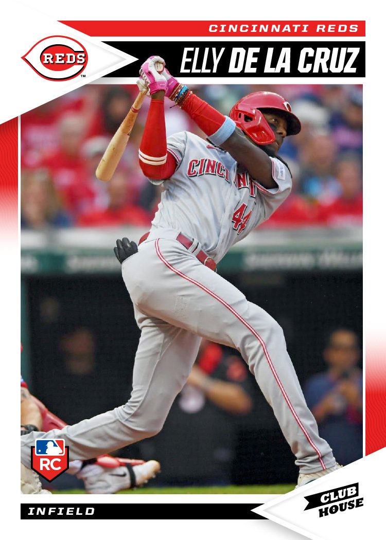
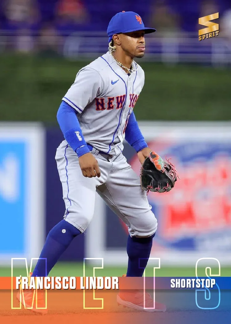
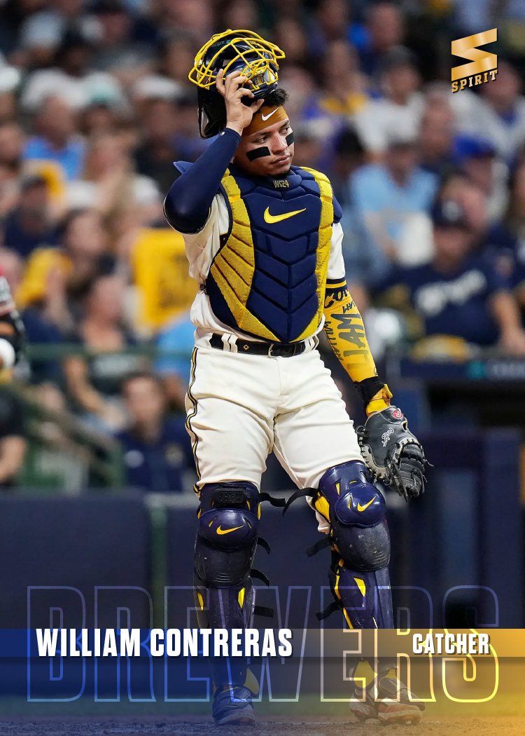
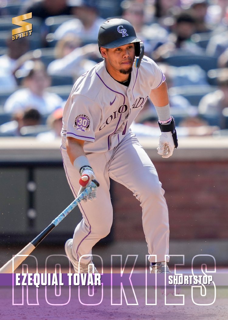
The design here is a bit “extra” but in a good way, imo. The big crossing panels on the left side set the tone colored panels framing the player image. Having some part of them break the edge over into the color field in the upper left corner was essential for maintaining balance. Plus it’s always fun when the player interacts with the design. The name and team logo lives in a colorful bar along the bottom. The position rests in a little bubbly triangle just above that. Like on the Matt Olson card, it has the opportunity to interact with the player cutouts if needed.
Since the Clubhouse designs are always a bit “fun” and colorful, I felt like some of the extra stuff here was appropriate. It was a challenge finding images that fit into the open space but also overlapped into the left side without making the whole thing unbalanced. Overall, I think I did a good job of that.