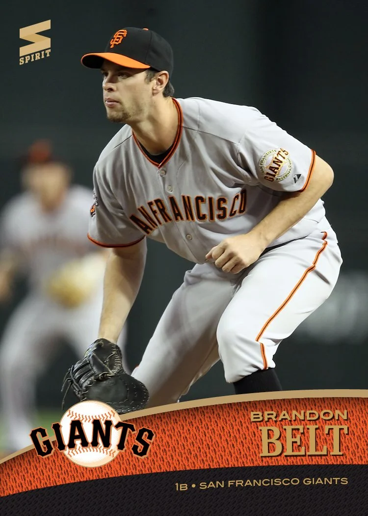
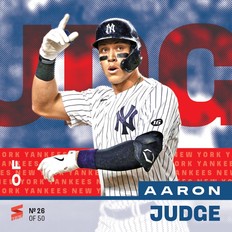
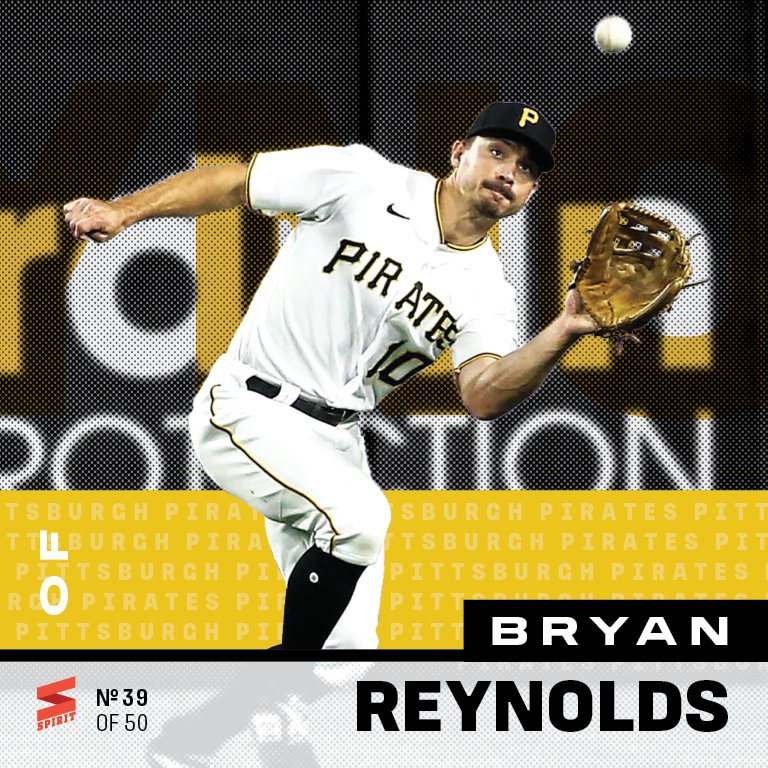
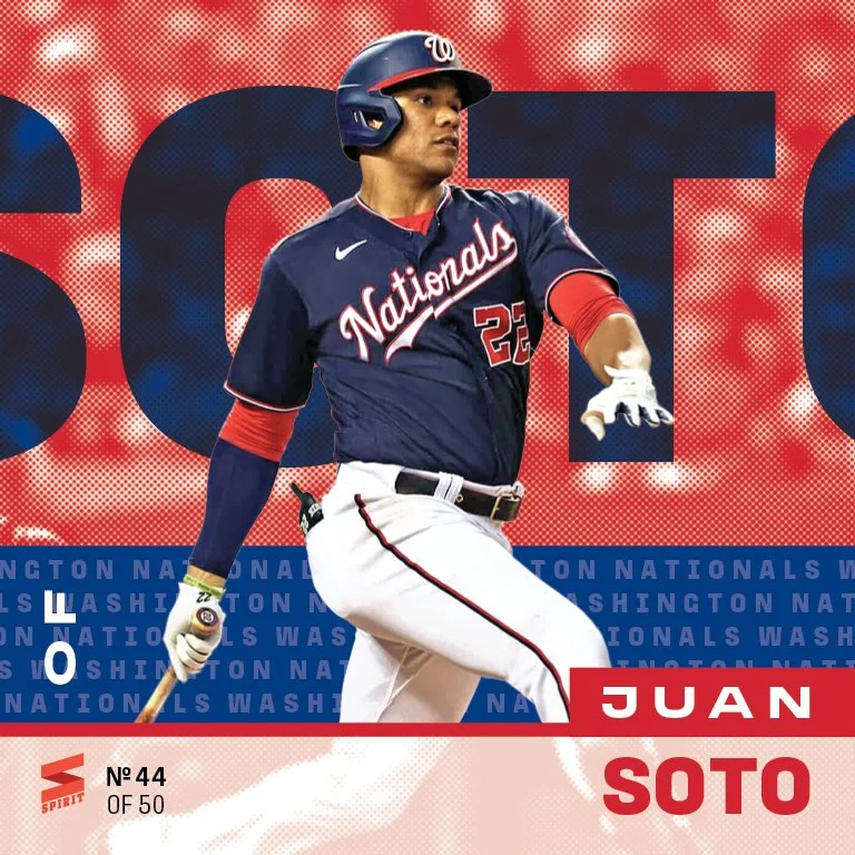
Pitchers, catchers, and everyone else have all reported to Arizona and Florida. Topps Series 1 has hit the shelves. It’s officially baseball season. While Topps is celebrating its 75 anniversary this year, I’m celebrating one of my own: this here is the 15th year of me doing Spirit cards.
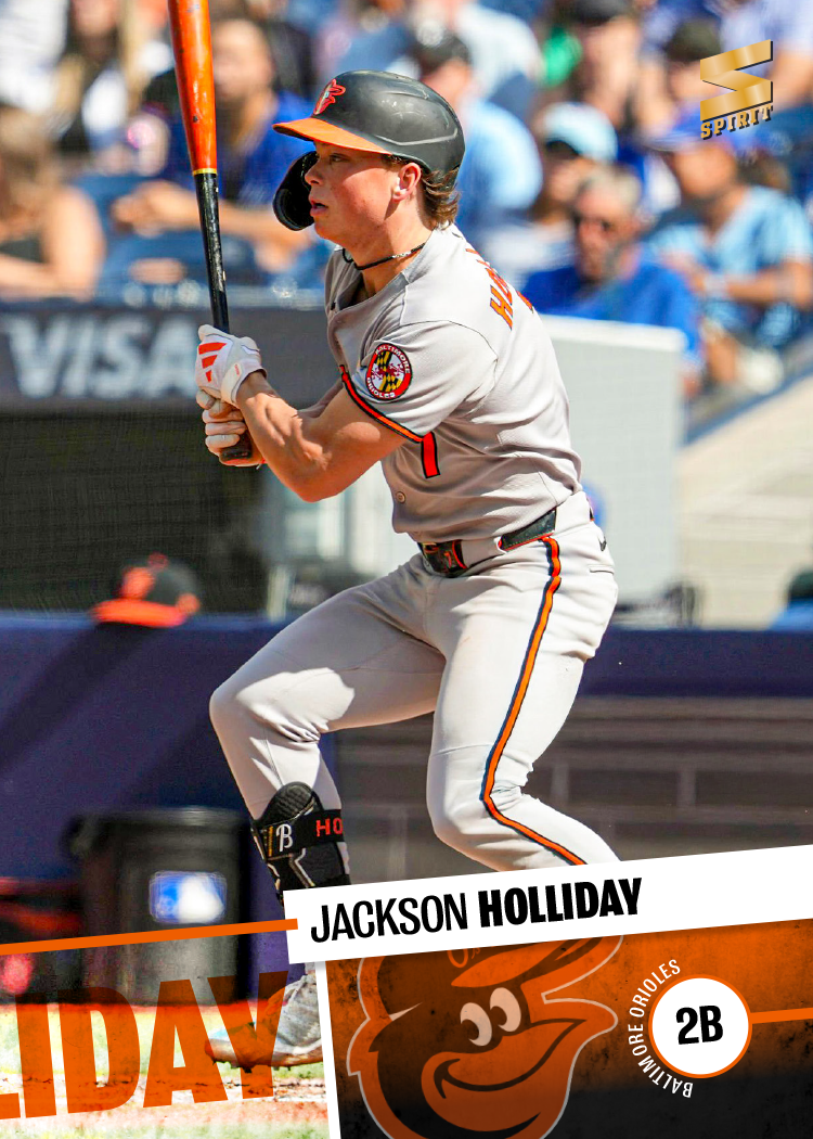
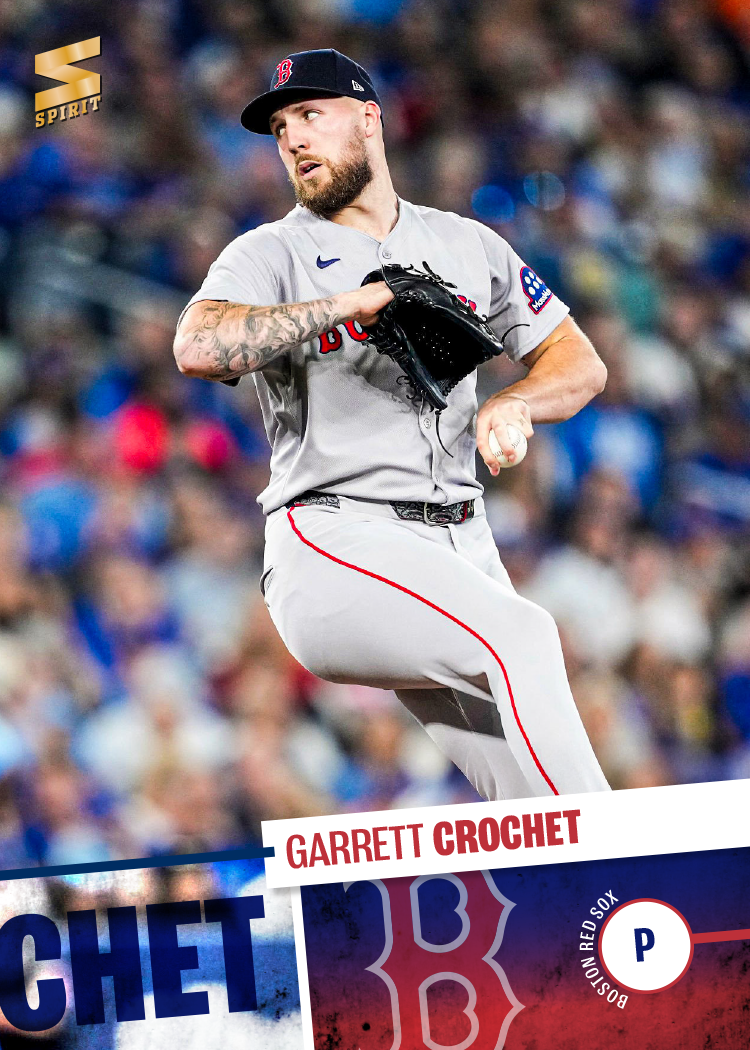
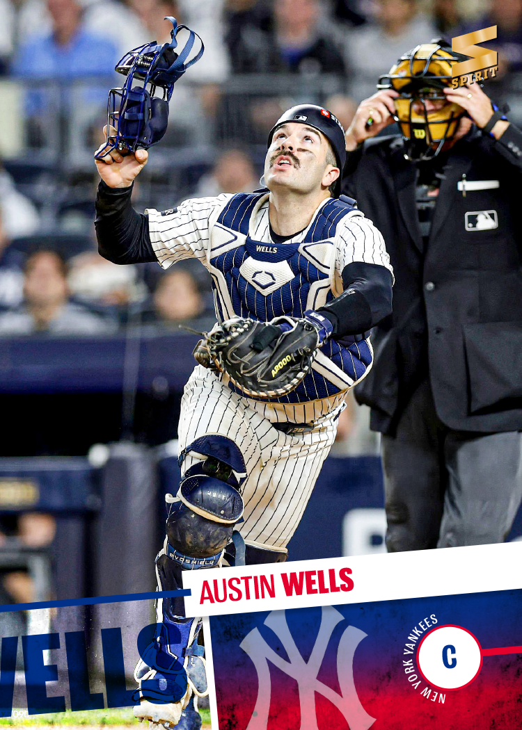
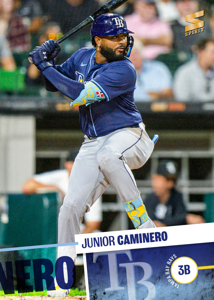
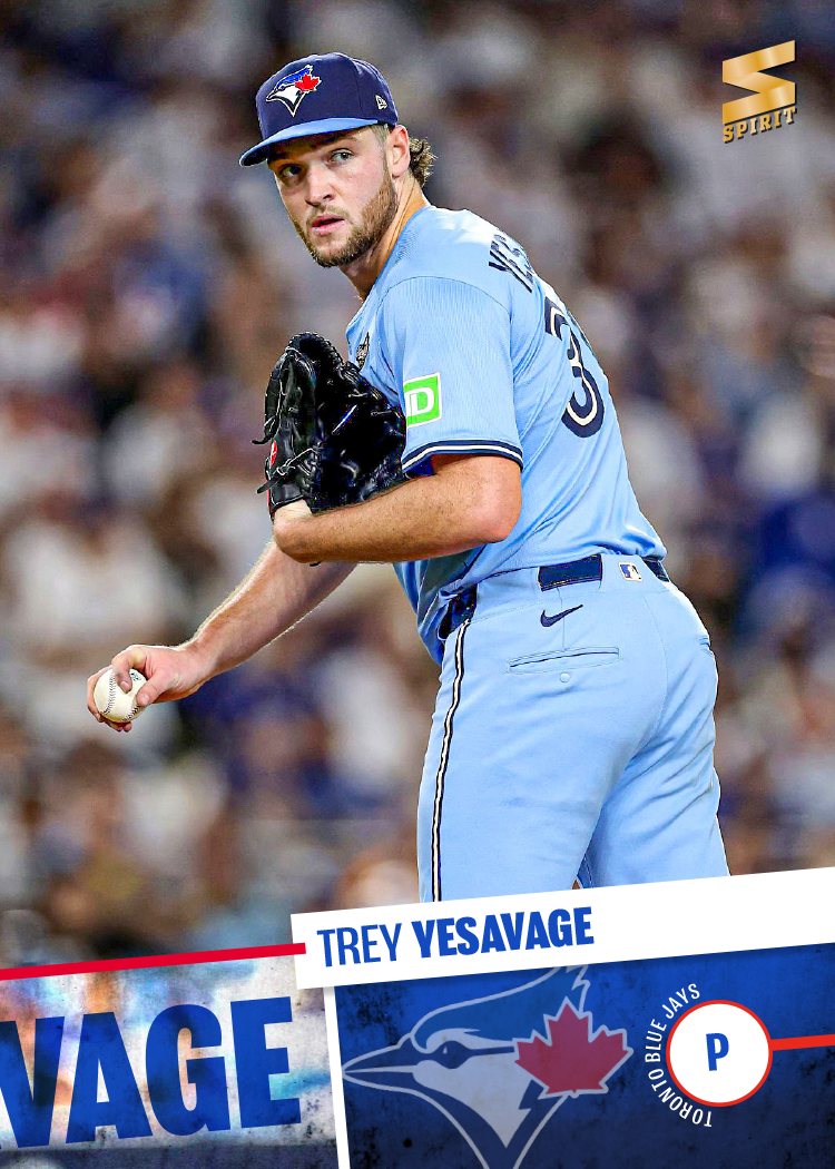
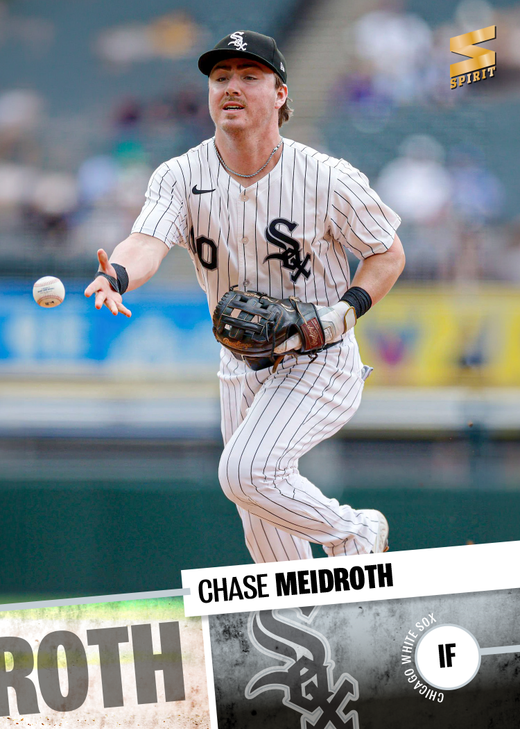
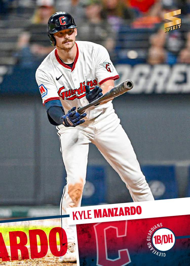
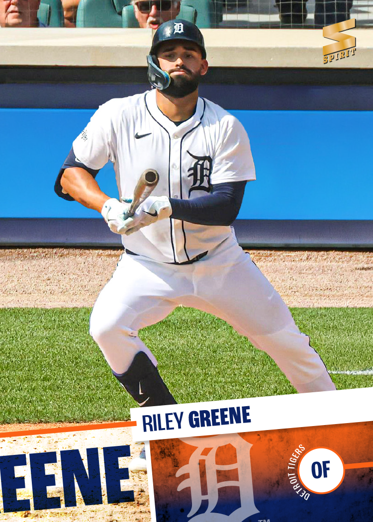
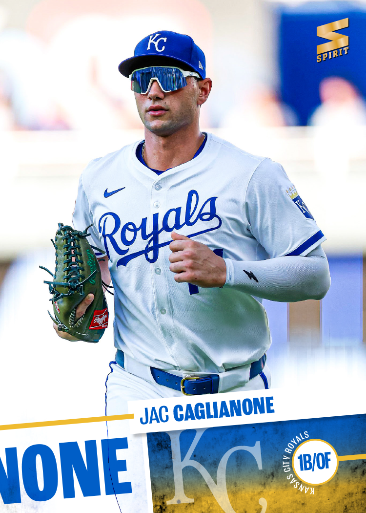
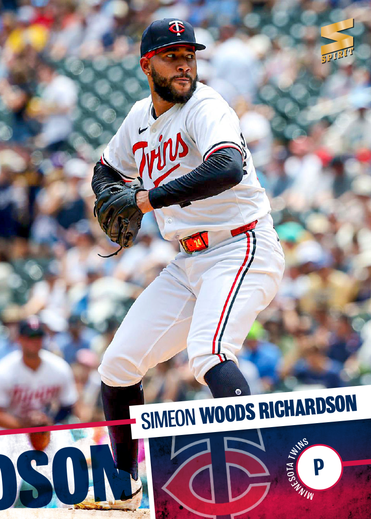
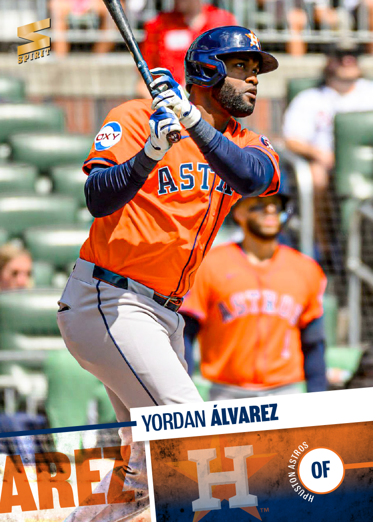
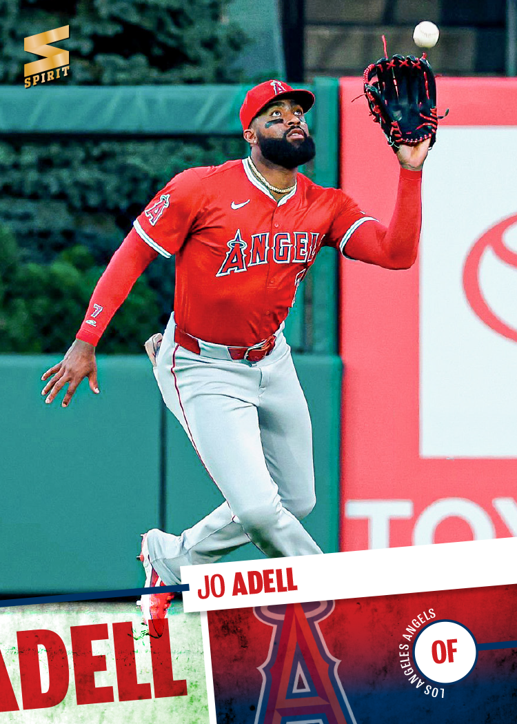

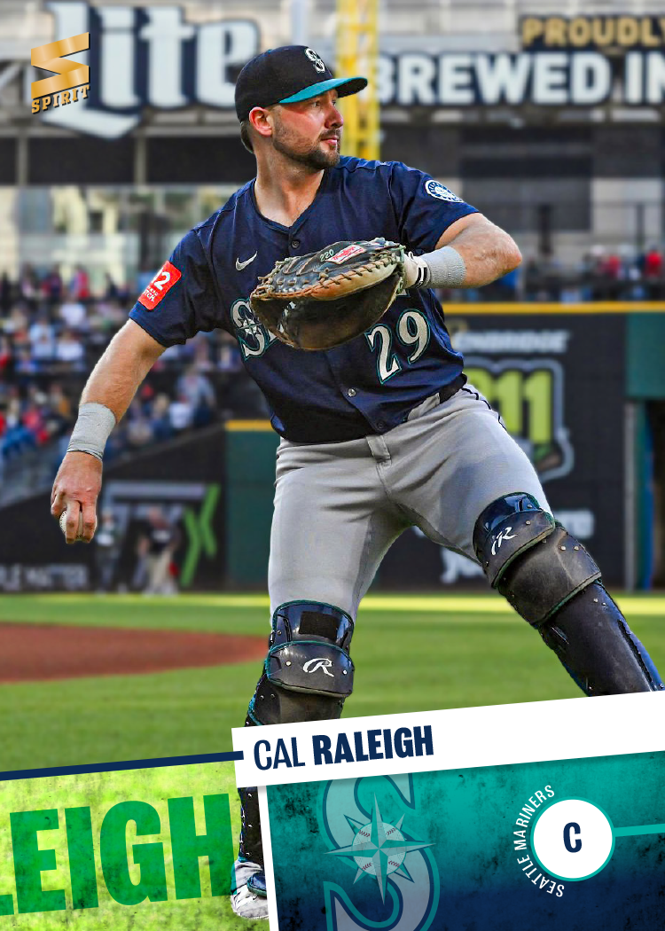
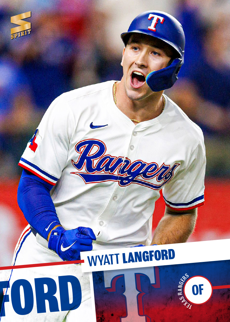
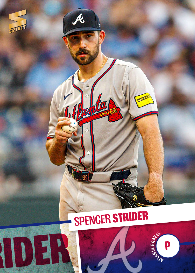
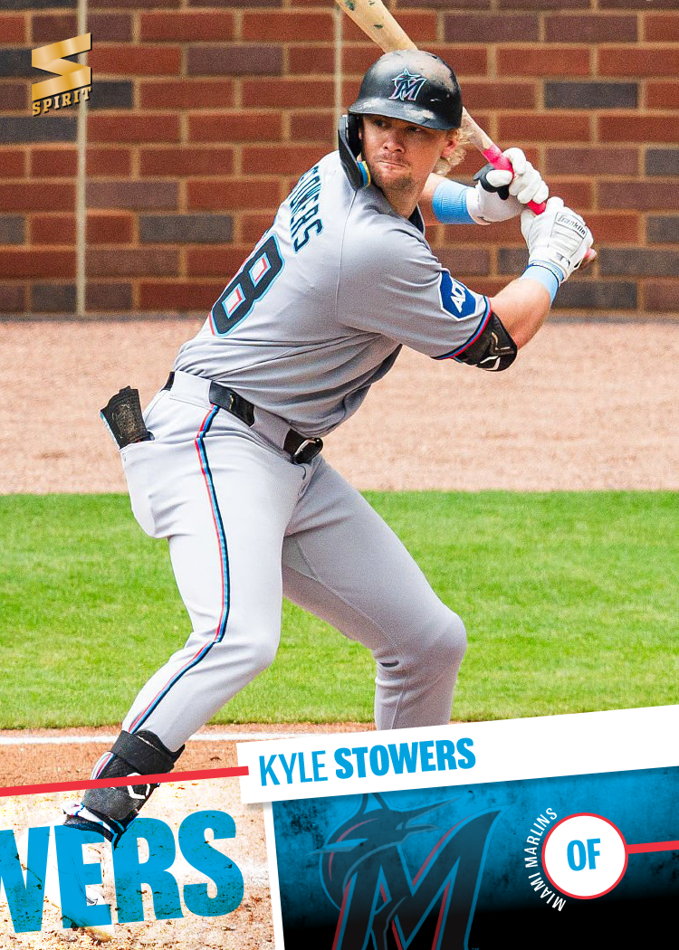
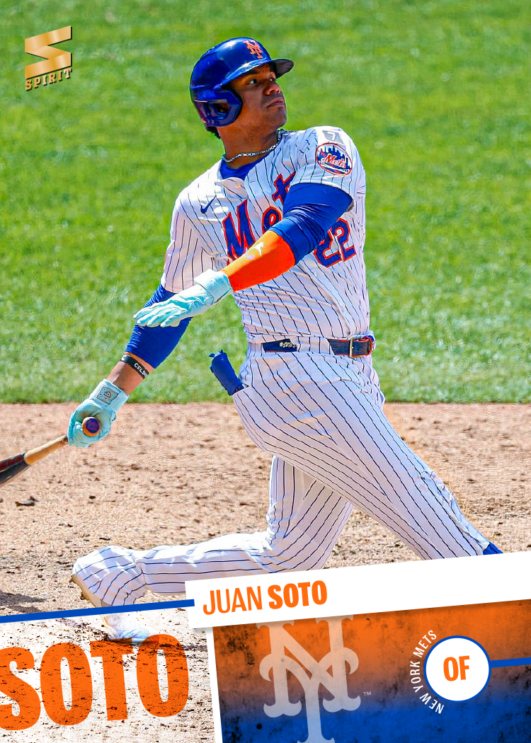
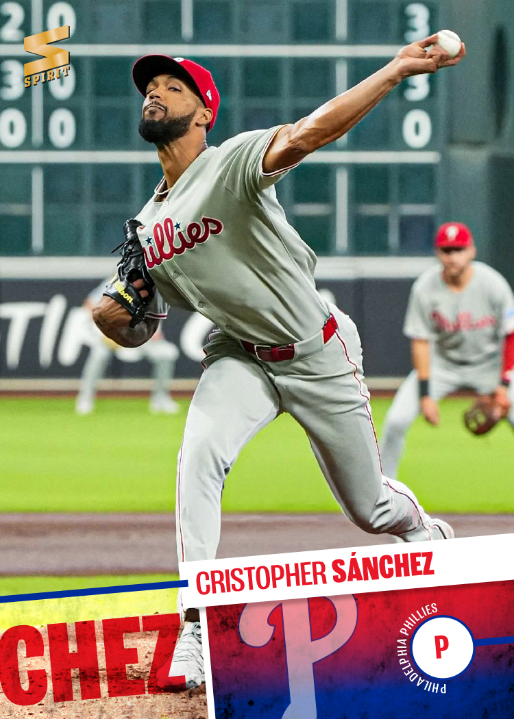
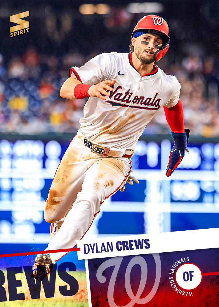
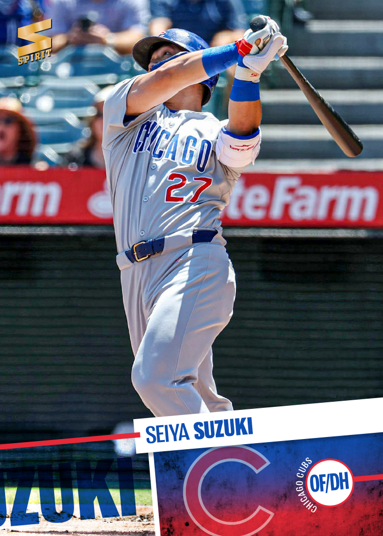
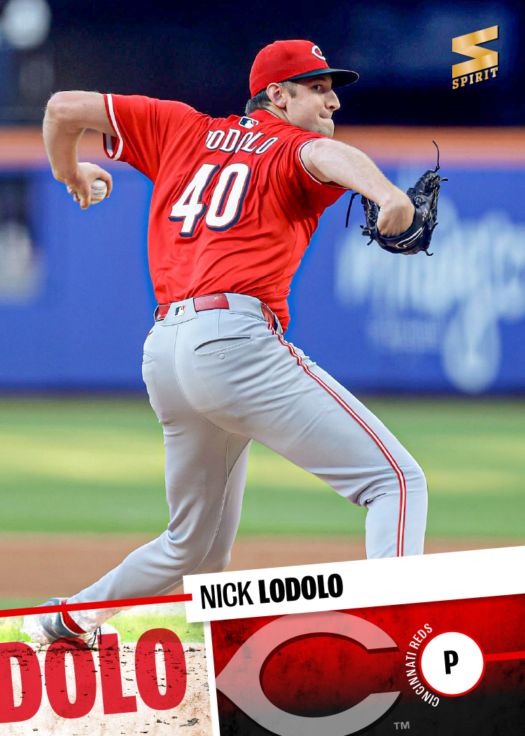
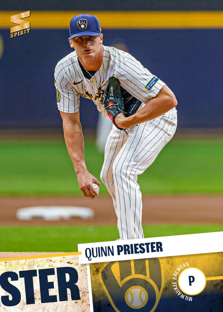
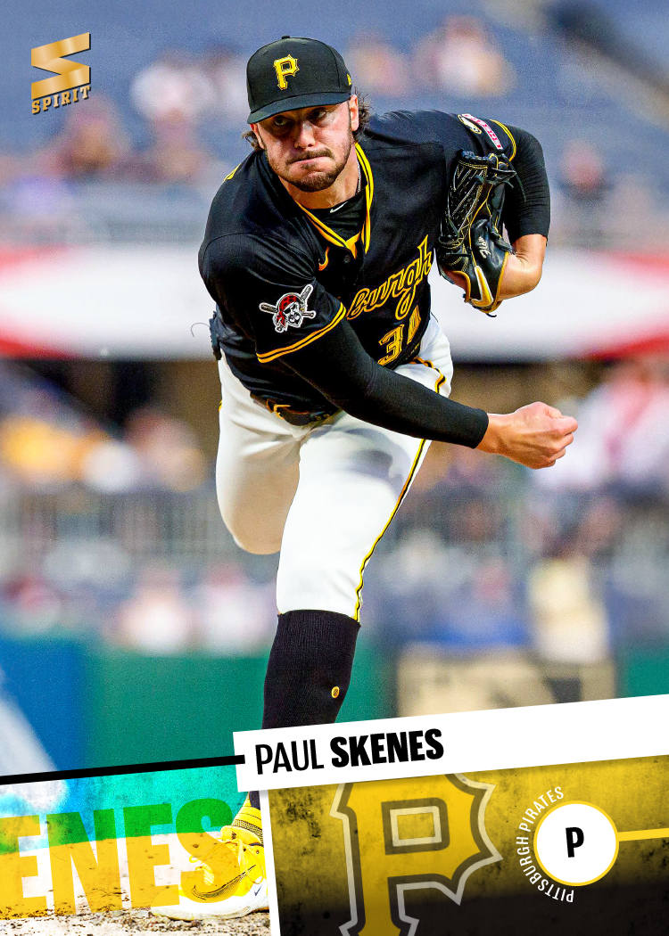
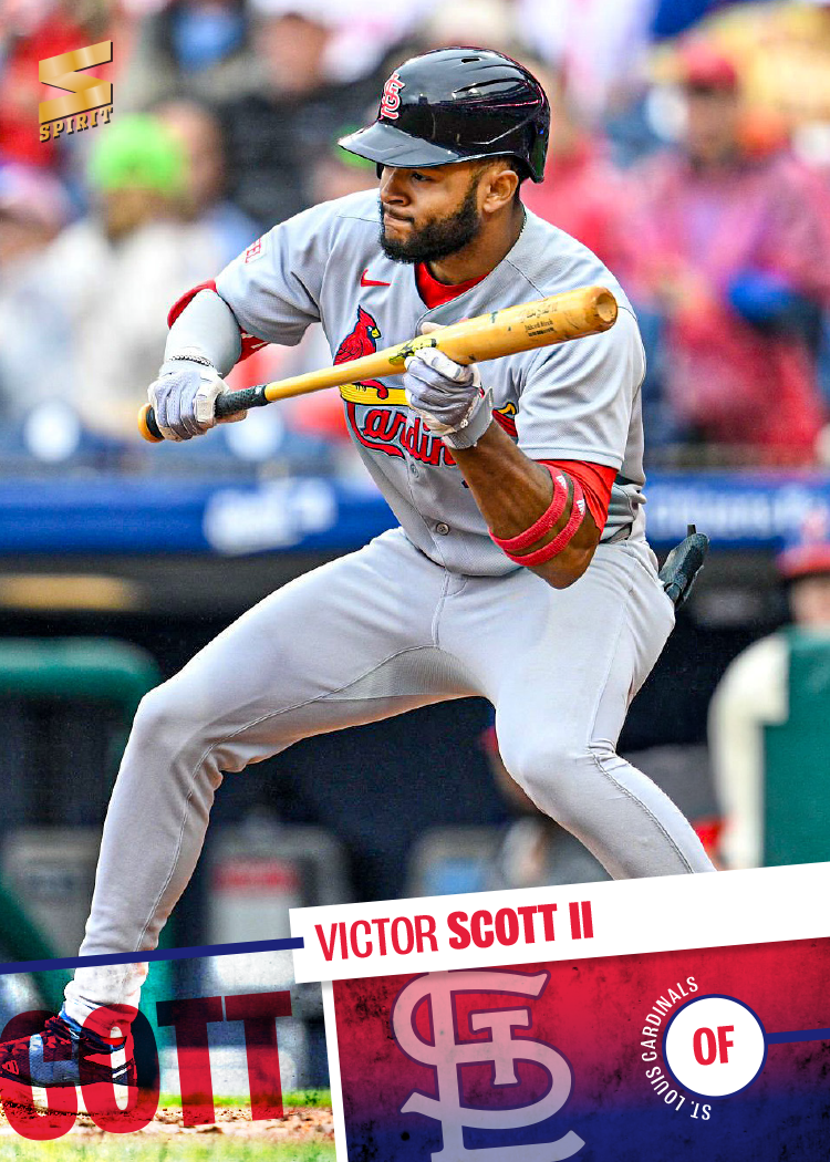
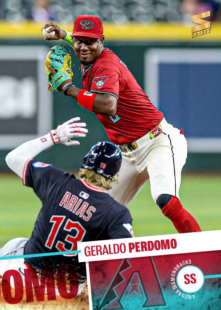
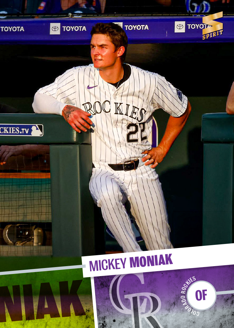

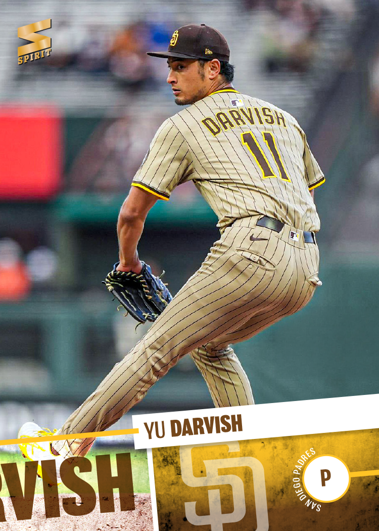
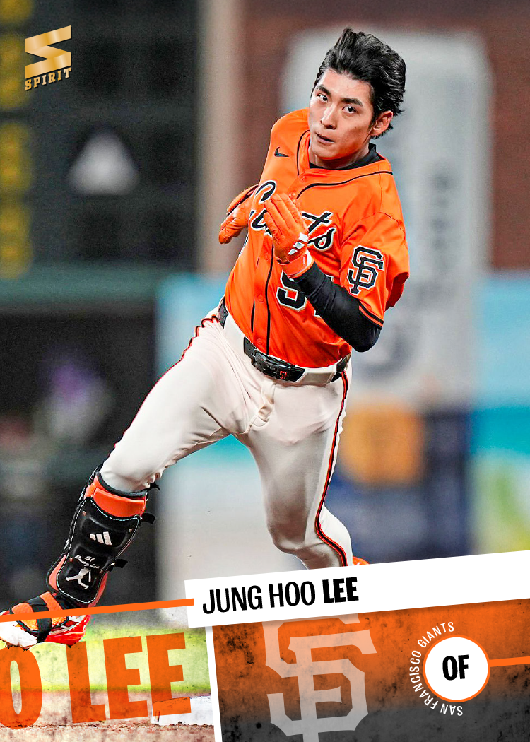
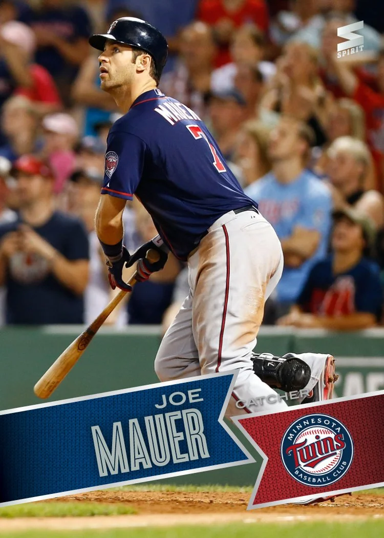
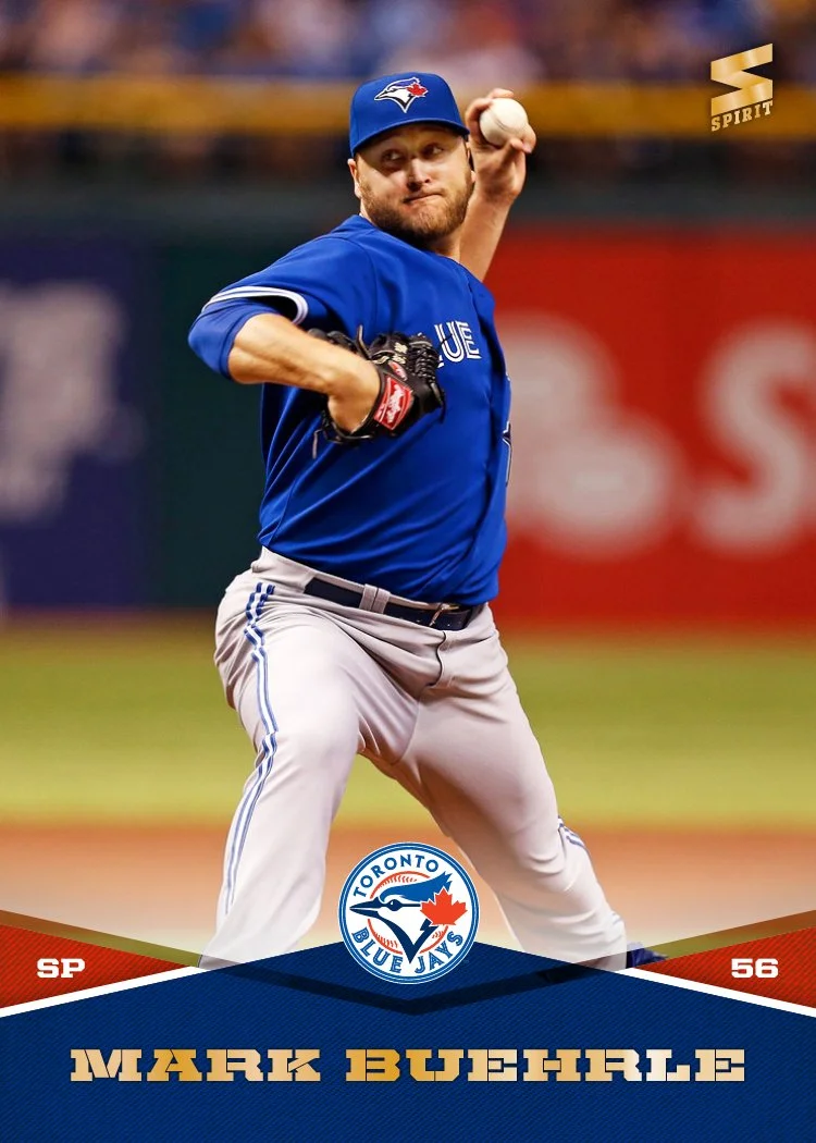
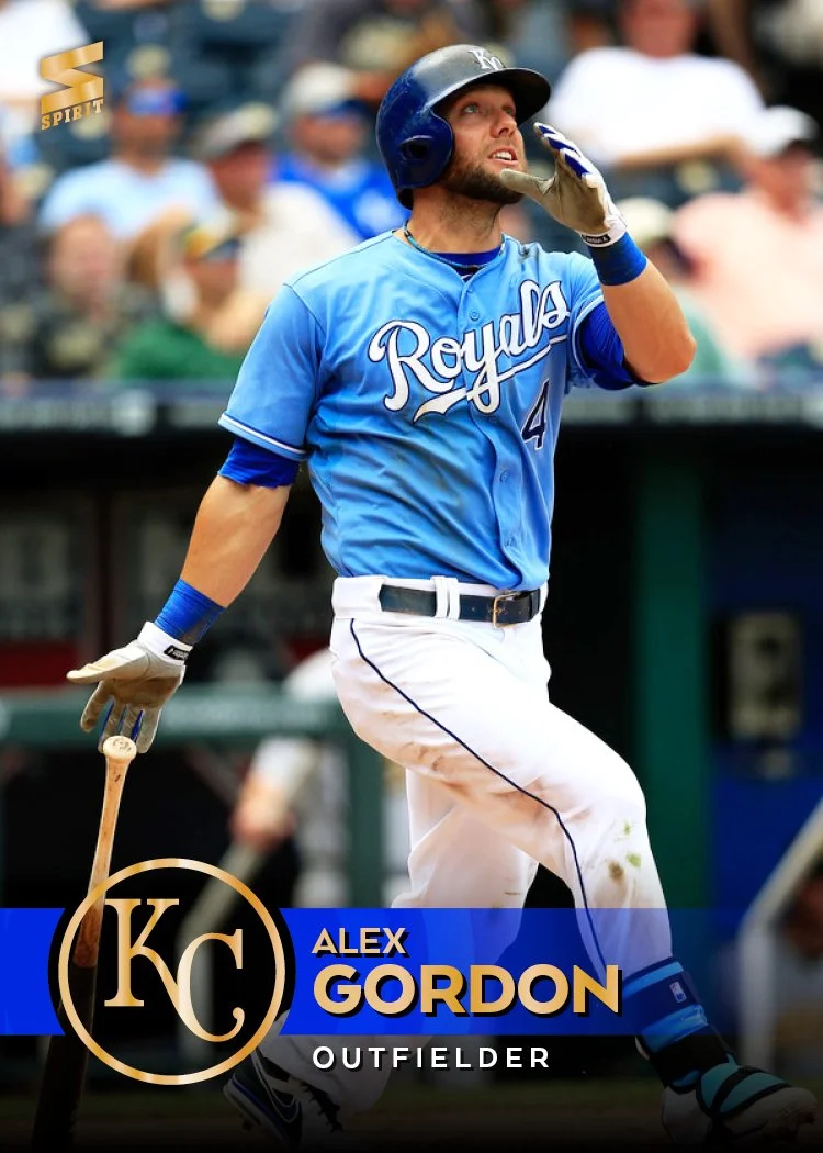
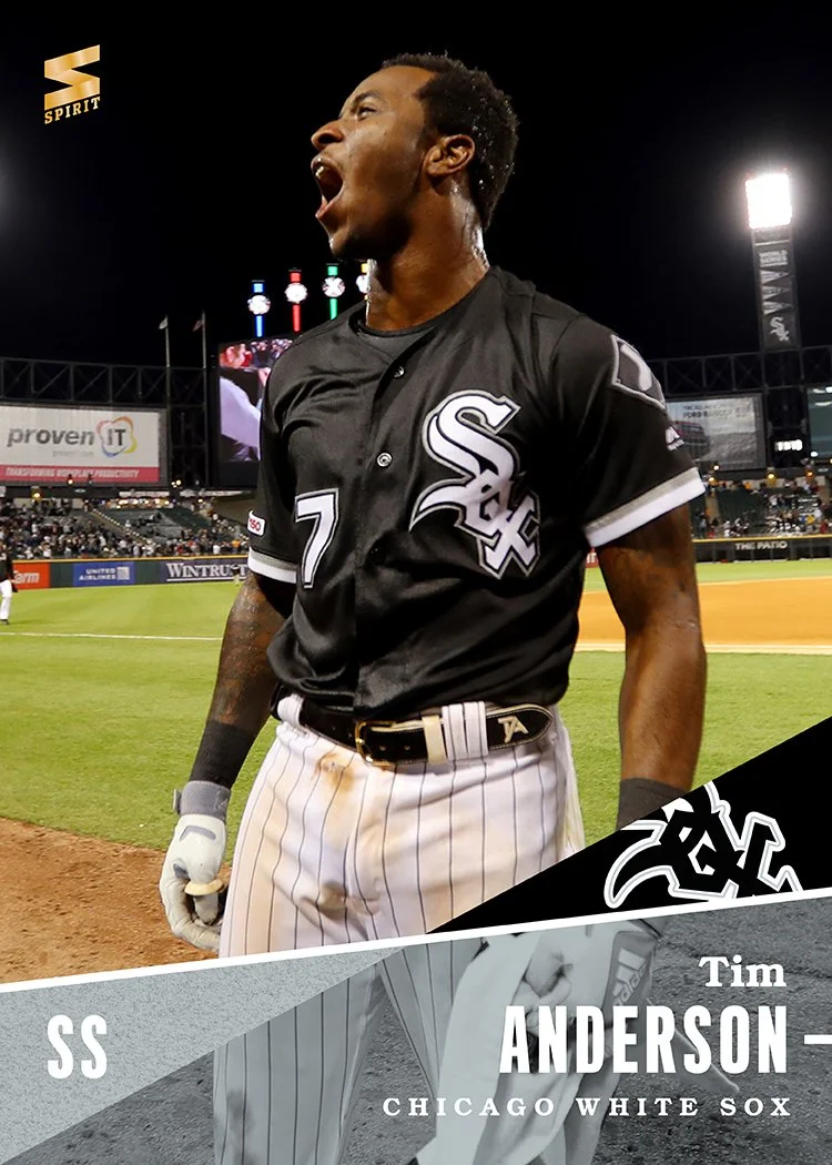
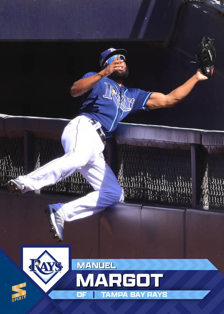
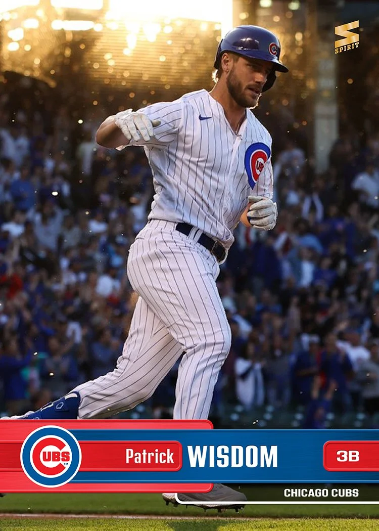
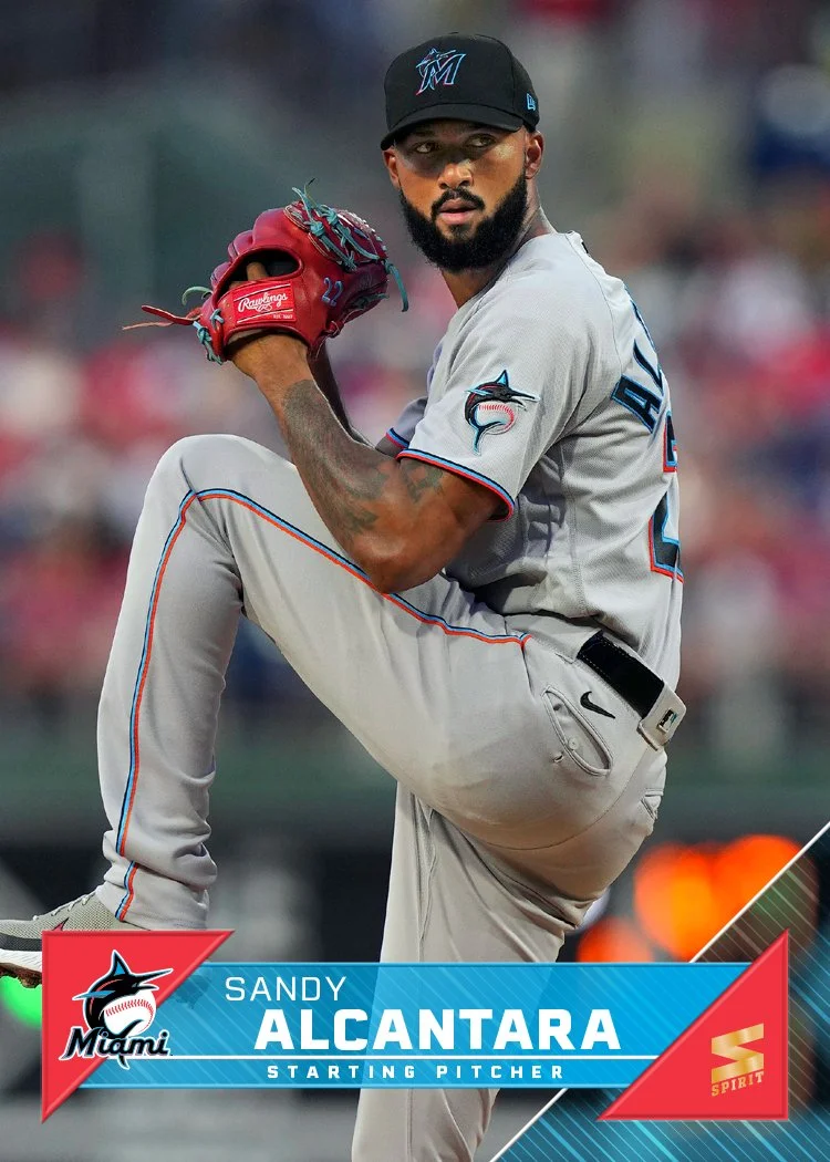
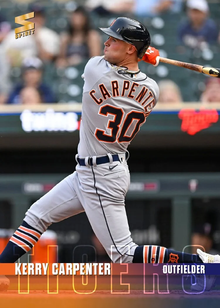
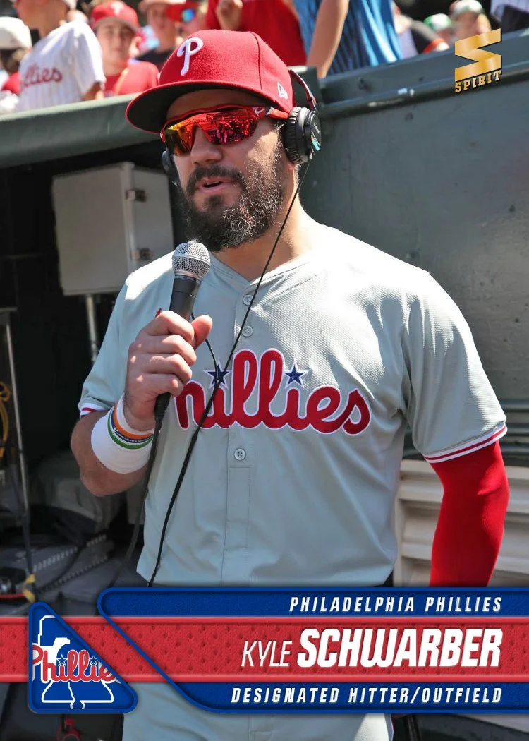
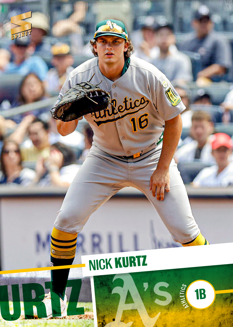
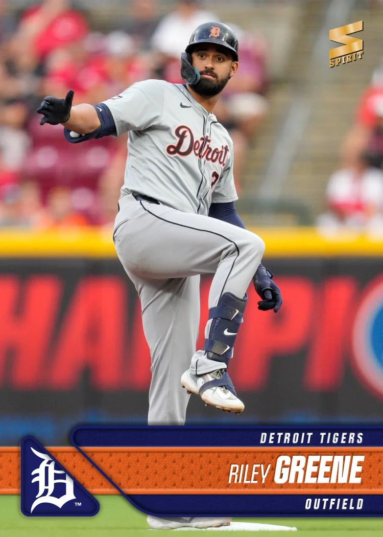
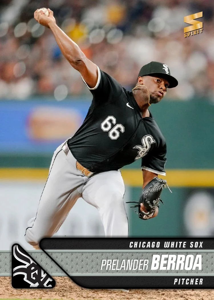
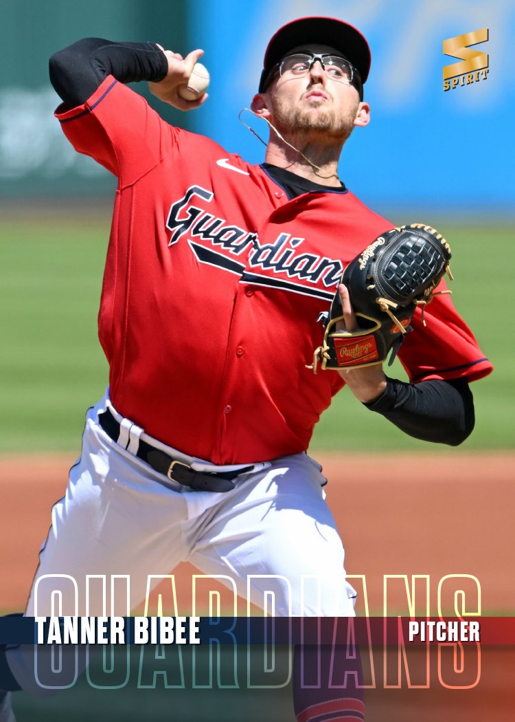
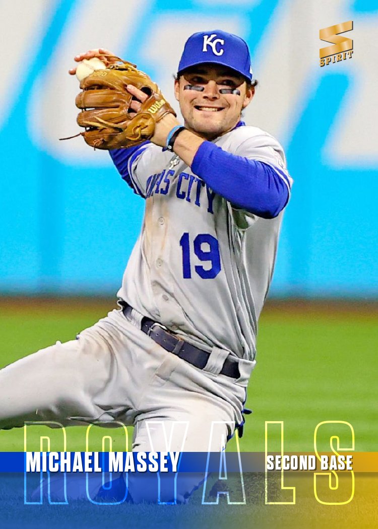
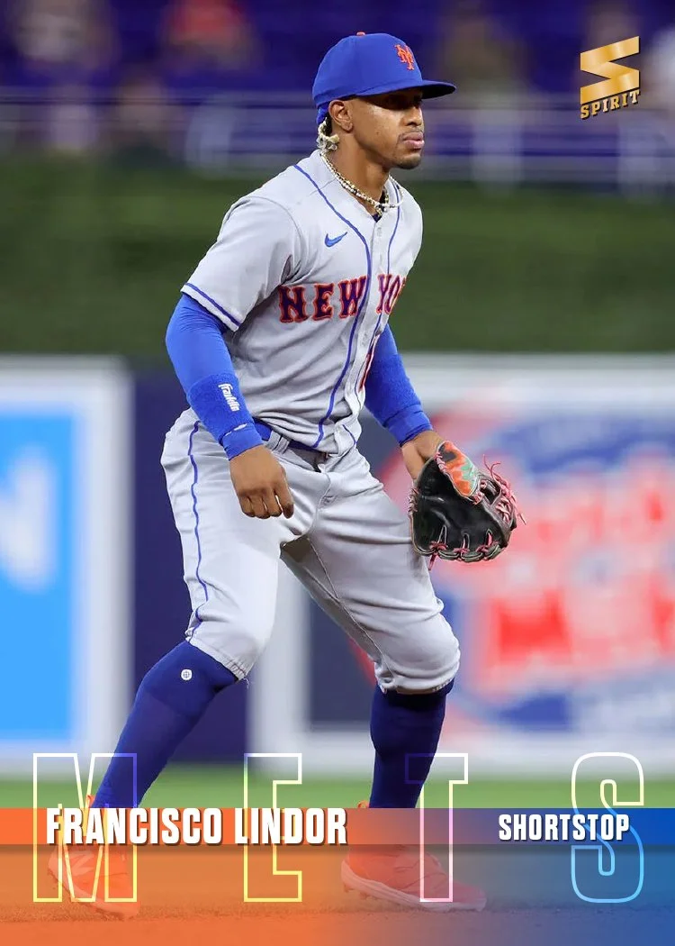
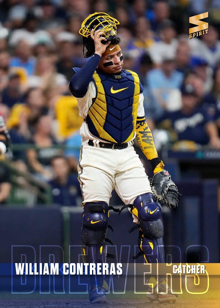
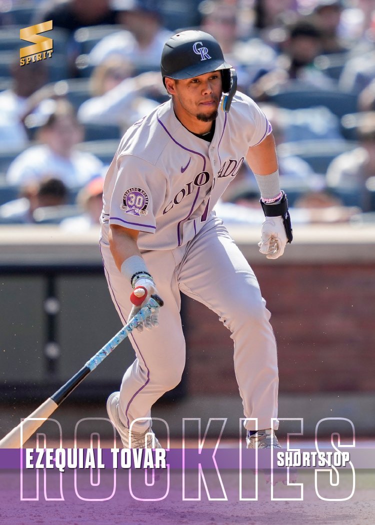
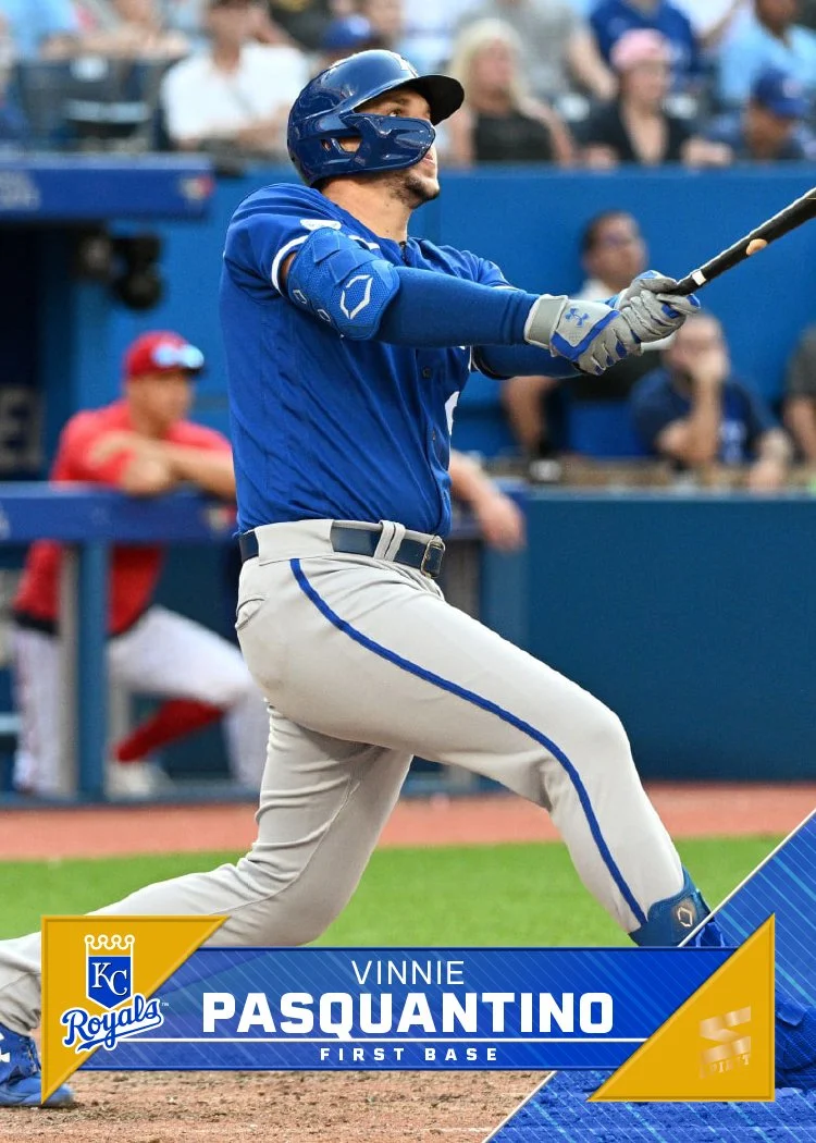
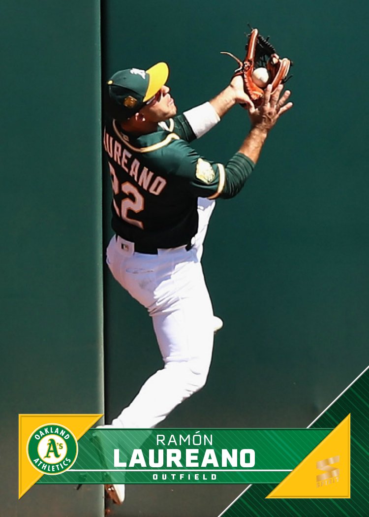
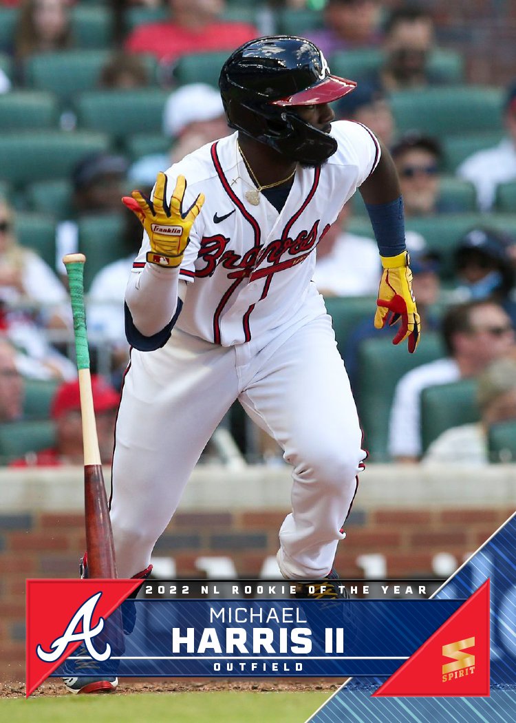
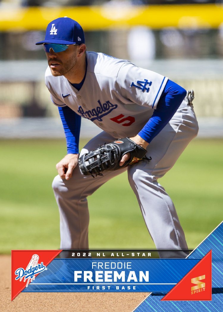
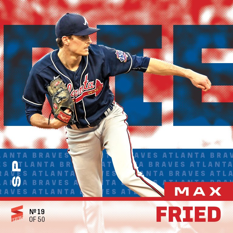
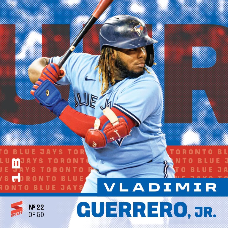
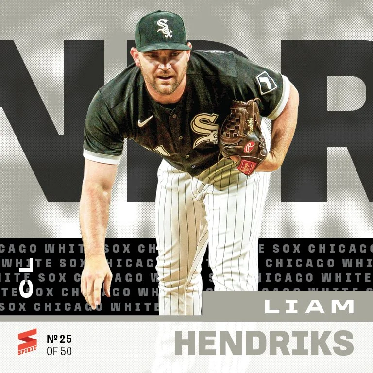
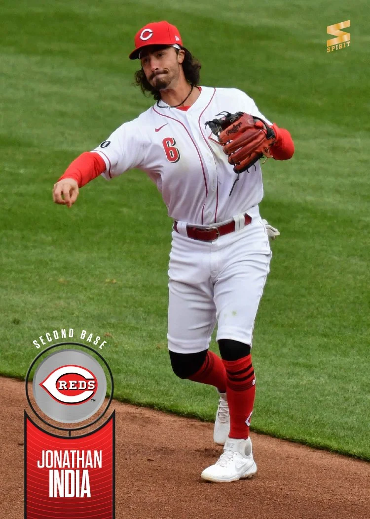
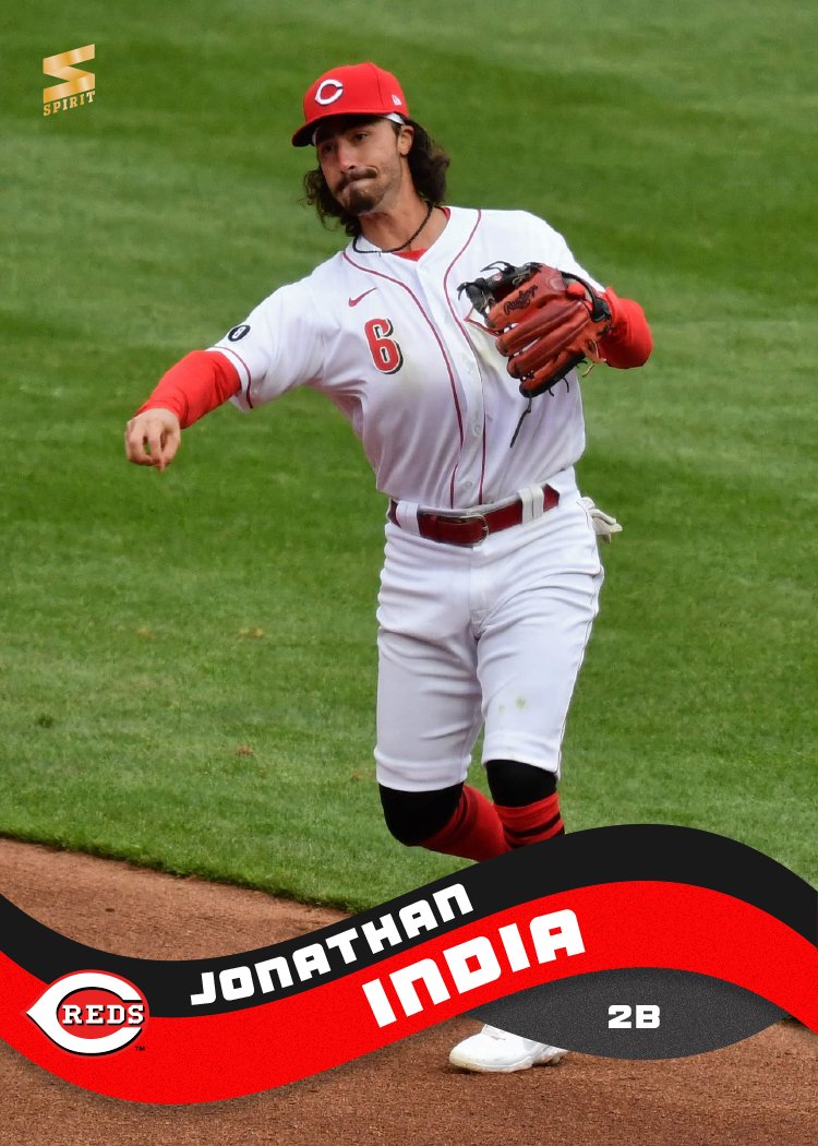
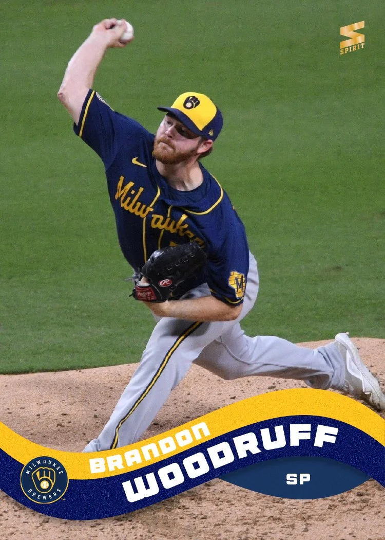
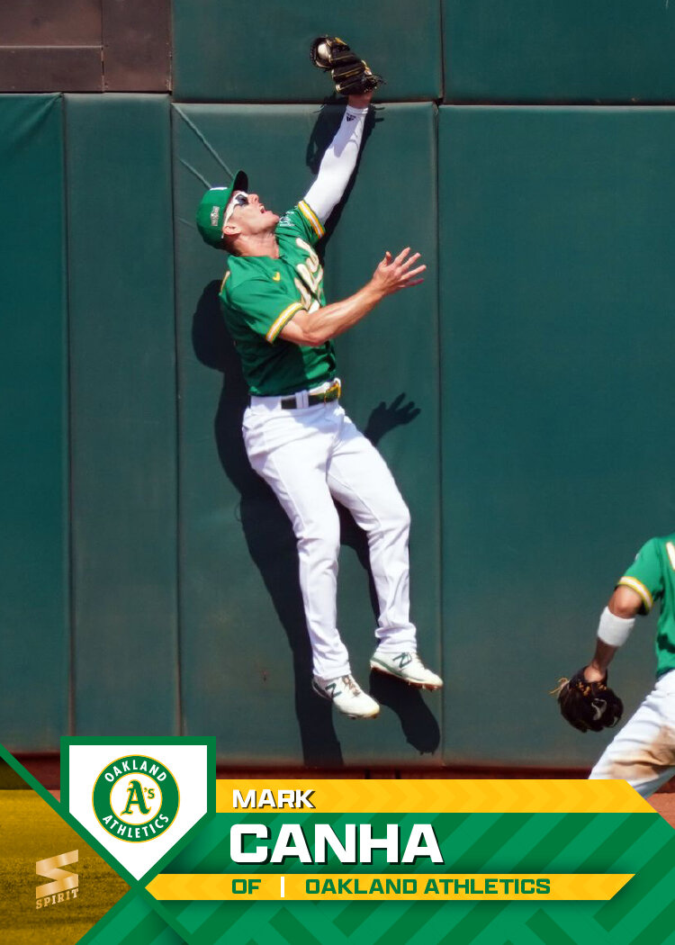
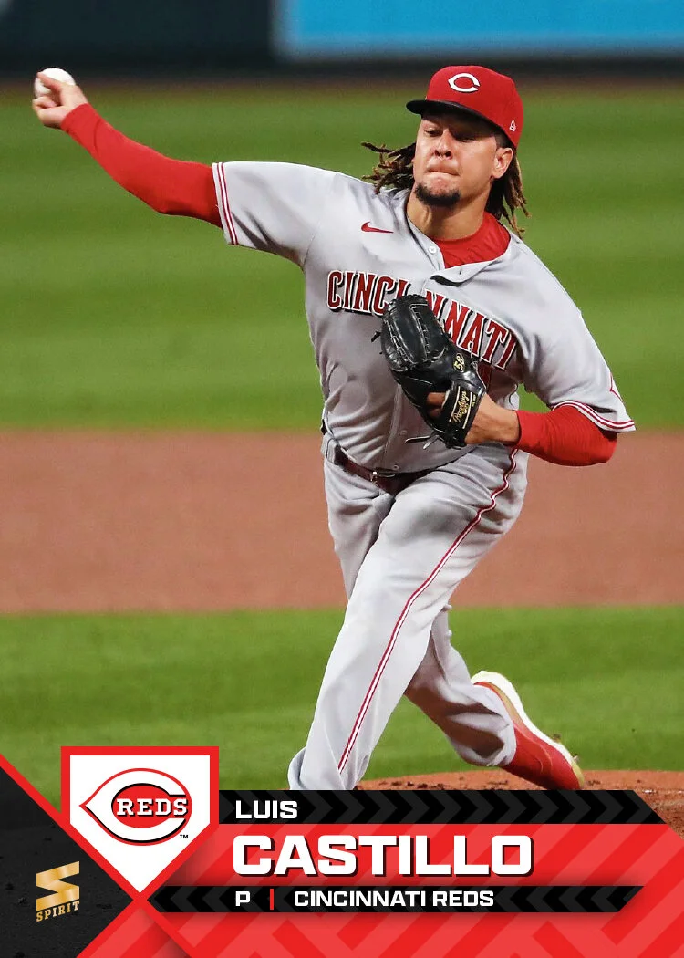
After last year’s clean, tight lockup, this year’s design is a bit bolder and messier (but still kinda clean). Not sure if you’d call this 90s-inspired or late aughts, but it definitely is a step away from 2025 vibes. Cap logos on a team-color gradient is the biggest element while the clean text and position keep things readable. The bottom left corner has a bold, grungy reappearance of the last name (and more for Jung Hoo Lee) over a white overlay to help balance the right side.
I guess there’s a bit of a “ticket” aesthetic happening with the slight angle. That may have been a subconscious inspiration. I just wanted to break a bit from the modern, tech-y space I’ve been working with lately. I think it’s a good direction but still fits in with the Spirit lineage.


