With the owners finally getting serious about making progress to stop the lockout, there’s a bit of a hopeful vibe going in regards to the 2022 MLB season. Even though I’d be perfectly happy to lose games if it means the players getting a fairer deal, it seems like the wheels are moving and things may actually get resolved somewhat soon. All of this is to say that I’ve been working towards my 2022 Spirit set design.
This is year number 11 for me in doing this fake card company. And as you can expect, having just a singular person in charge of all the design decisions can lead to a bit of burnout. Maybe not burnout so much as the well getting a little bit shallow. While I’m not tied to 70 years of history and nostalgia like Topps, there are a few consistent guidelines I’ve imposed on myself through the years to help rein in the brainstorming a bit. For the Spirit flagship set, it’s been stuff like full-bleed photos, design elements that use actual team colors, and a solid composition that’s interesting enough without having to lean on “effects”. On that last bit, I do add some textures/effects to the design but only afterwards to help the cards look contemporary to the era instead of flat like the “golden era” of cards.
All told, I ended up with 4 different designs to weigh and ultimately choose. They all have their merit but none of them were jumping out at me, screaming “THIS IS THE ONE.” So, I made a Twitter poll in an attempt to narrow down the good and the bad. Let’s go through them one by one.


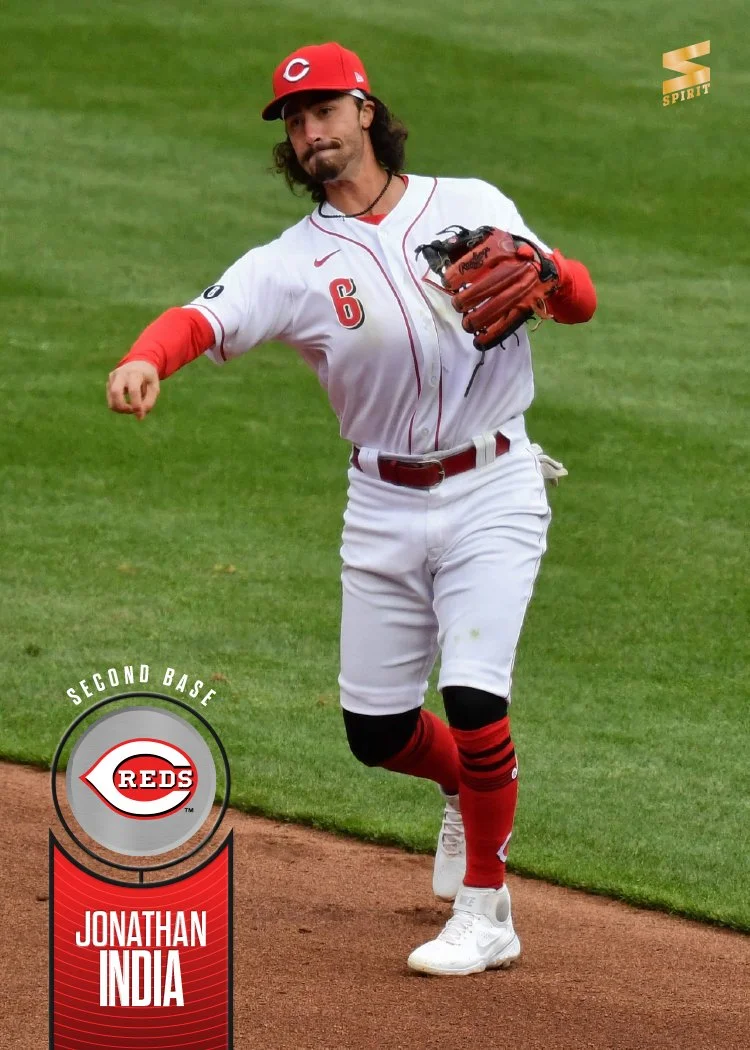
The first crack at it was this one I dubbed “metal tabs” in said Twitter poll. There were a few Spirit designs that are somewhat similar to the basic bones here. It’s a bar across the bottom of a full-bleed photo with team colors added to the shapes, team logo and the player name plainly but tastefully included. The rounded edges to the color blocks give this a little bit of a late 90s/early 00s feel, especially the screened accolades tab on the bottom right for applicable players. Compositionally, I’m really happy with how I’ve resolved the task of included all of these informational elements. The only flourishes are the metal textures and the beveling around them I added to make everything a little more contemporary. It’s a solid design but there must’ve been something missing because I kept on plugging away with others after putting a bow on these.

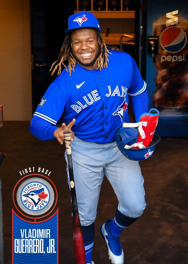

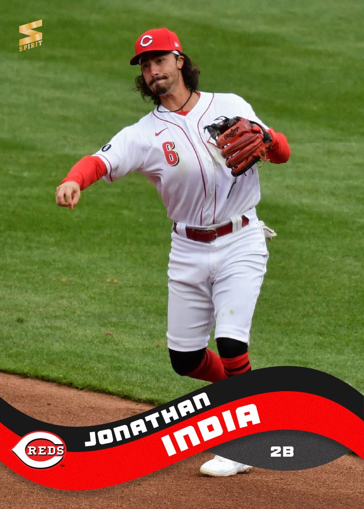
My next stab (“target practice”) was the simplest of the bunch. I took a page out of the 92 Stadium Club playbook and had just the smallest little imposition of design rising up from the bottom corners. Keeping with the Spirit standards, the tab became the team primary color. I added a little circle tab for the logo and connected both elements to make it look like a little spinner thingy. For the names, I had to find a typeface that was somewhat condensed to begin with since the tab wasn’t super wide. I went with one that had a variety of weights and widths (Dharma Gothic) because, as you can seem from the Vladito card, there are some really long names that would show up across the whole set. It definitely looks better on TUCKER and INDIA, but it passes on GUERRERO, JR. With the tab already crowded, I had to use the circle for the player position and didn’t find a good spot for the accolades. This was the winner on the Twitter poll, which totally took me by surprise. Mostly because this is the least designed of the group.


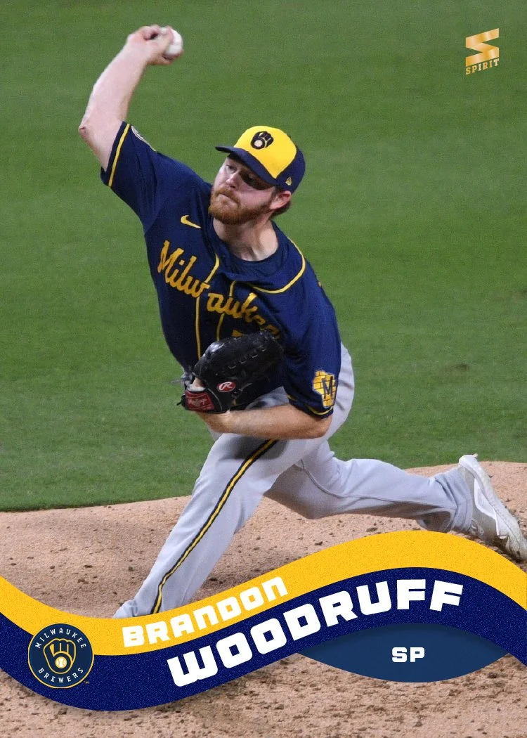
The third bunch here (“take off”) was what I figured would win the Twitter poll. It ended up getting the fewest votes… So it may be time to pack it up, Ross. I guess I might have been unduly influenced by the knowledge that this one took me the most time to design. Not the final product, but the journey from idea to finished design. There’s still a lot I favor here. It does the best job balancing the colors. The names are more readable here than the previous two designs. I dunno, it just scratches that itch for me of being nice and compact without being boring. The accolades treatment really works for me, too. Maybe people didn’t like it because it looks like something else I can’t place? Who knows. The only thing that jumps out at me is the fact the design elements reach the two bottom corners, which is something I’ve done more than once before.


Finally, we have “bubble waves,” which is the outlier of vibes in the group. It’s unabashedly more playful than the other entries, with the big colorful waves rolling off the left and right edges. The big blocky text for the names is different, too, as the other cards featured more condensed typefaces. So while this is definitely not a Spirit flagship design, it did prove to be popular enough that I’ve already decided it fits perfectly with the Clubhouse feel. You’ll be seeing it on this blog in the future, with some modifications to fit that line even more appropriately.
With all of that to chew on, there’s still some work to do before I “officially” unveil the 2022 Spirit flagship design. I’m not sure if I should do with the masses and tweak the “target practice” design or go with one of the others by executive order. Regardless of which path I take, there’s still another 26 teams to make cards for along with a card back or two. And while progress has been made by the MLB and MLBPA, I’m guessing there will be plenty of time before I make that official post. See ya then!