2023 Pennant

Finishing up my 2023 designs is Pennant, the “retro” set in the Spirit family. I went with a 70s-ish look for this year’s design and for the first time kept the color palette limited to around 8 colors rather than doing team-specific colors like I usually do. While there is some overlap from team-to-team (I mean, there are so many red and blue MLB teams), I was able to keep teams in the same division from having a duplicate palette.

The photos also have undergone a treatment making them look less modern. It helps put the design in the right era and really drives home the “retro” feel in relation to the rest of the Spirit releases.

2023 Clubhouse

Before the 2024 designs start to drop, here’s a look at my 2023 Clubhouse set. This is meant to be the “fun” set for low-budget collectors. I tried to ramp up the fun here by featuring as many out-of-the-ordinary photos as I could.

I think the Randy Arozarena one is probably my favorite, though the Ha-Seong Kim one is pretty great, too. Design-wise, these are meant to “connect” from card to card as you can see in the grid up there. The colored circles will line up at the edges, à la 1990 Topps. That means that not every, say, Mets card will have the logo on the right side. The next card in the checklist would have it on the left, then right, and so on. I just did the teams like this so you get the gist.

The player names arch along with the logo slice which is nice to have instead of on a straight line like usual. The position and team name do run next to it on the secondary color block to help balance the palette a little.

Overall, I think these strike the right balance between being fun but not too crazy, with a big assist from the photography. Bright and colorful without anything too over the top. I’d have been a big fan of something like this as a kid.

2023 Spirit Base

Sneaking this in before the ball drops on the year, here’s a look at my 2023 Spirit base design for every team.

As it’s tradition by now, the design features a full-bleed photo the visual elements color-coded by team. The look on this year is sort of a triangular scroll with the player name position in the middle with the team logo on the left wedge and the Spirit logo on the right wedge. I added a bigger triangle to the bottom right corner to help balance the composition and also add even more team-identifying elements.

Like last year, I had a few different designs I tried out before arriving at this one. Here are the ones that didn’t make the cut.

The last two here were riffs off the same basic hook with the last one winning out. Ultimately, though, it couldn’t top the design I chose in the end.

I’ll try to do some more design dumps before the new year to show I haven’t been completely slacking. Hopefully 2024 will allow me more time to get back on the horse here.

Free Idea Here for the Taking, Topps

So even though the 2022 MLB season is still a long ways from wrapping up, I’ve been looking ahead to 2023 (and not just because the Giants have been a frustrating mess to watch and almost certainly won’t be participating in the expanded postseason this year). See, we’re already past the time when Topps usually reveals the design for the following season’s flagship set. It’s a nice way to break out of the slag of seeing the current year’s design through he numerous releases on which it will be featured (S1, Opening Day, S2, Chrome, Update).

But when Fanatics signed an exclusive deal with MLB to produce cards (among other stuff I believe), it basically meant the end of business-as-usual for Topps and their baseball card stranglehold. While Fanatics did end up acquiring Topps and allowing their legacy to continue, there haven’t been that many noticeable changes in the landscape after the deal was struck. I imagine that’s mostly due to the fact that Topps’ original deal was running through 2022 and the calendar hasn’t turned over yet. But like I mentioned before, “next year” usually starts in the middle of this year when it comes to baseball cards. As it stands here in mid-August, we still haven’t seen what’s in store for 2023.

One thing that’s been pointed out by a few people online is that Topps has followed a pattern of utilizing inset photos on their design every 20 years starting with the 1963 set.

Now, I don’t know if this was intentional on their part, and I’m sure the people around Topps weren’t there in 2003 or 1983, so there’s no guarantee this pattern will continue for the 2023 design. Something tells me that even if the people making design decisions for Topps are aware of the pattern, it’s not going to weigh too much (if any at all) in what they think a 2023 Topps card should look like. BUT, there’s an understanding amongst collectors that the 2023 flagship design should have an inset photo. As a designer, I like having parameters like that as it works as both a bit of a challenge and also some guardrails. So I figured I’d try my hand and making a “contemporary” card design that fit into the legacy.

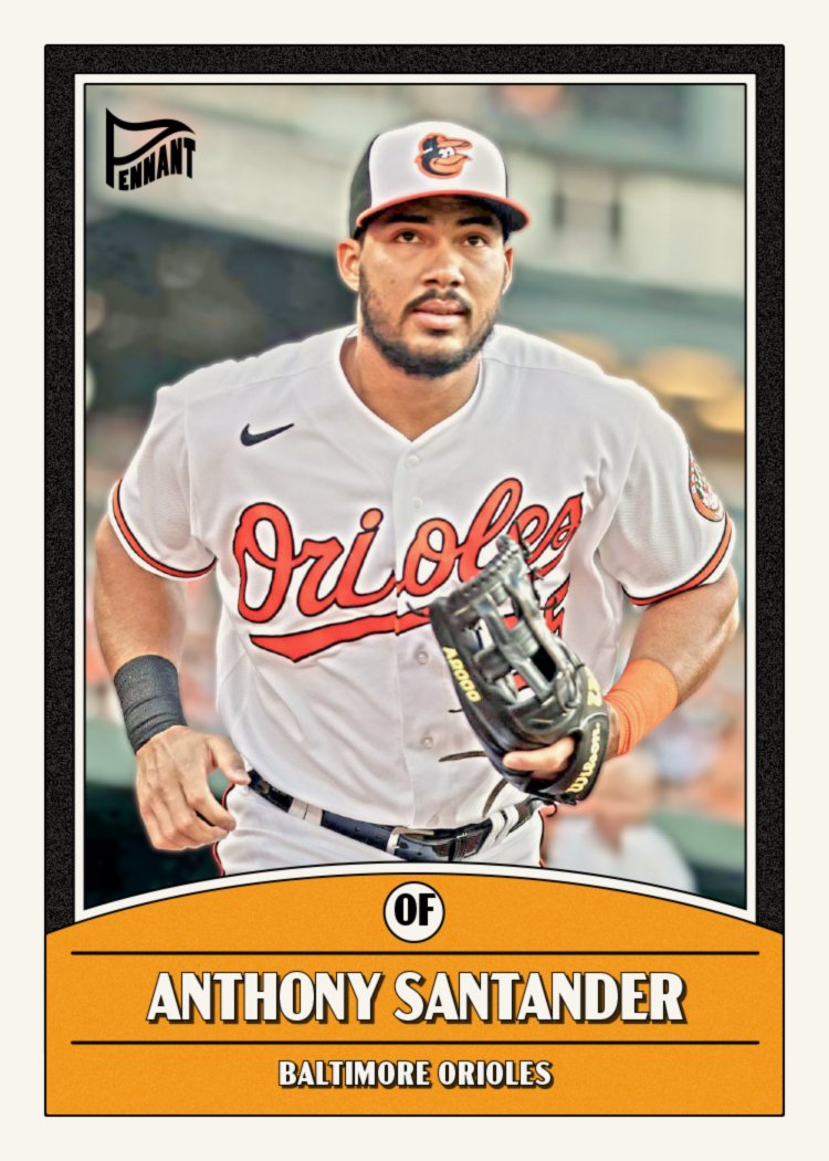
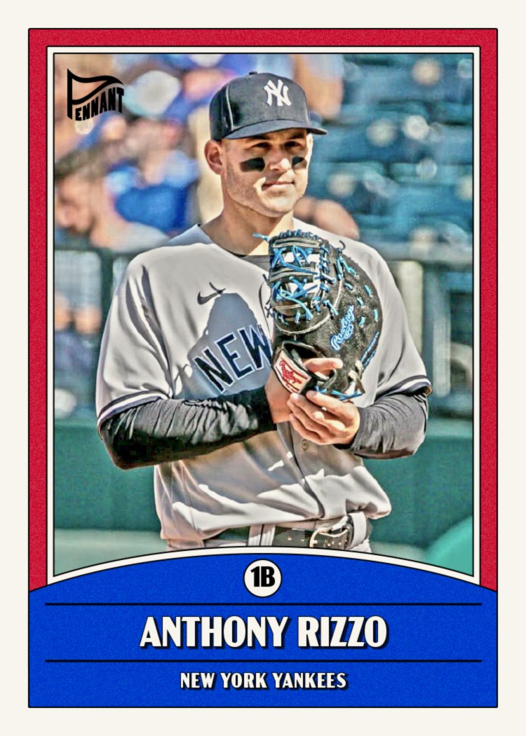
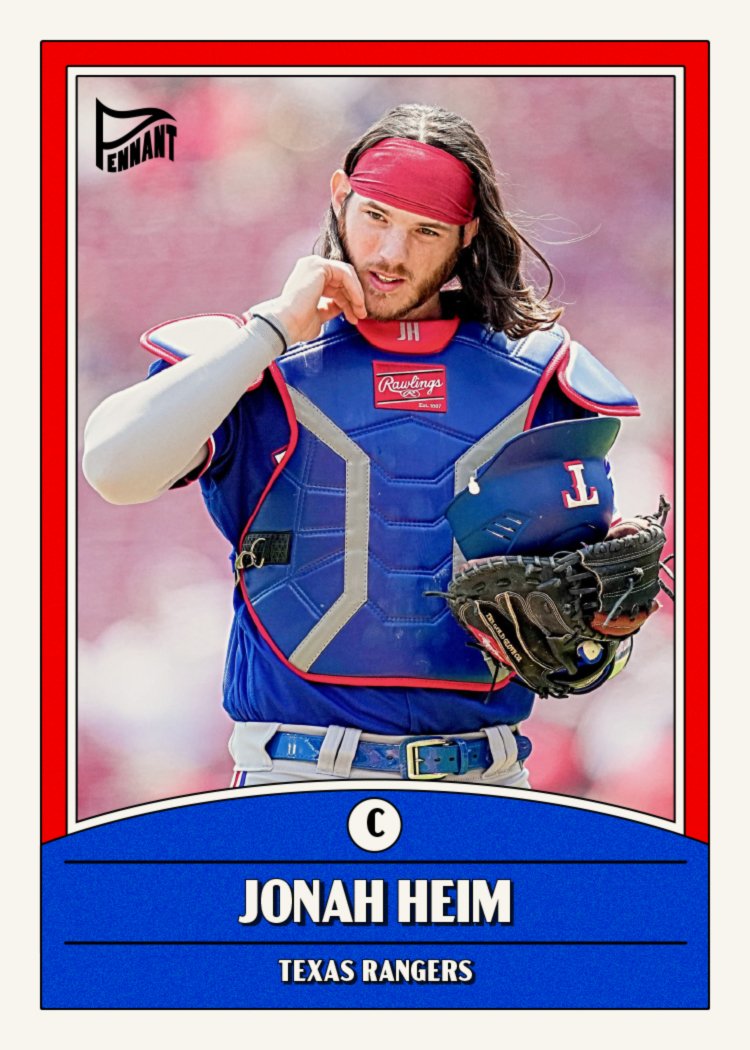
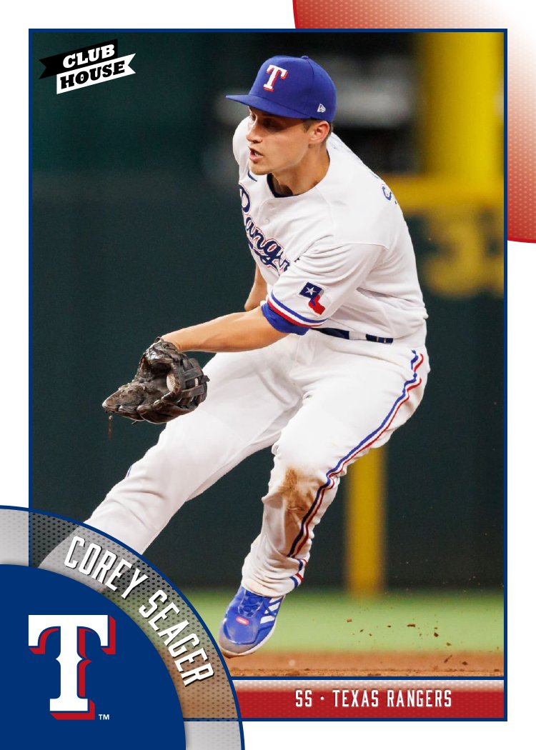
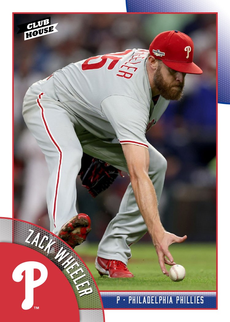
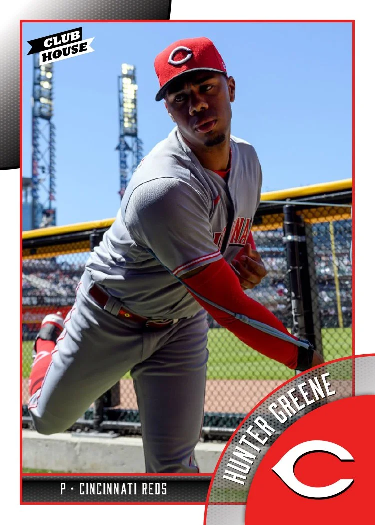
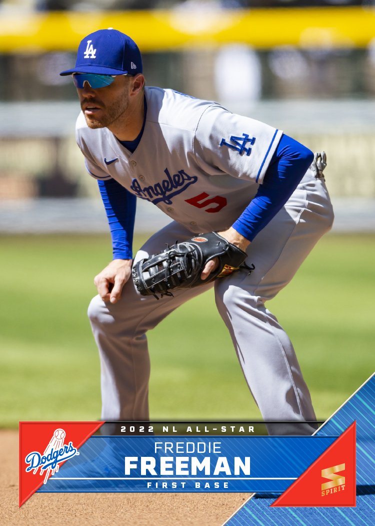
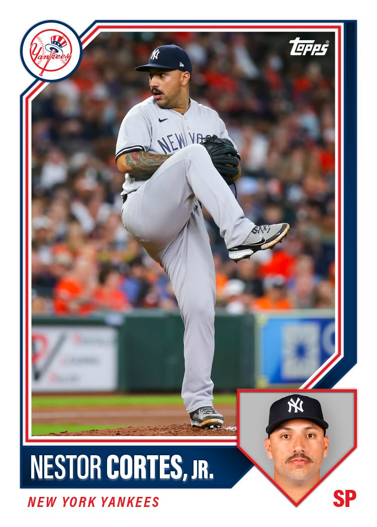
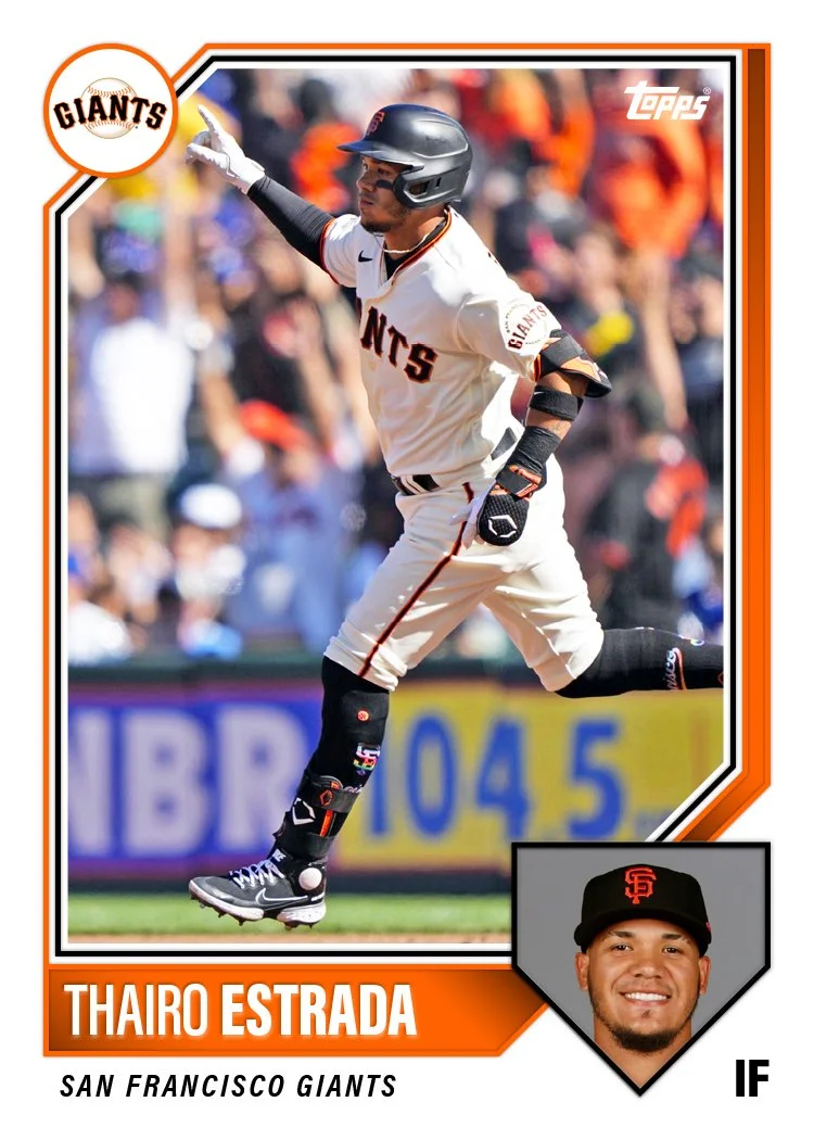
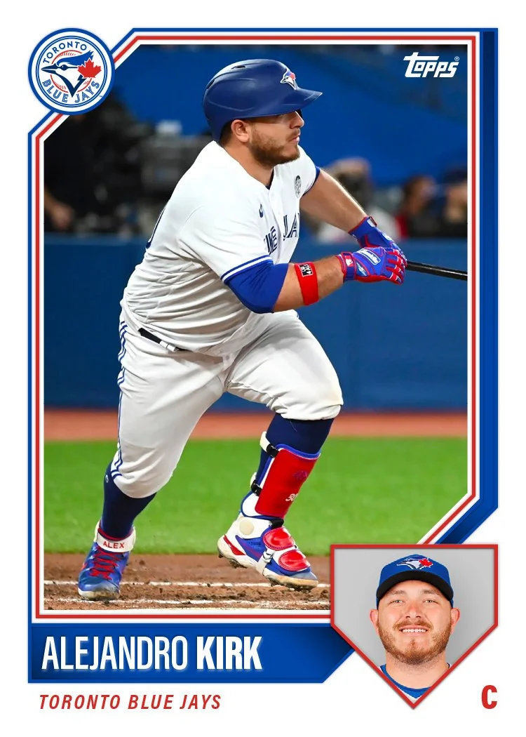
I decided to try different shapes for each design just to explore the options. While 1963 and 1983 both had just circle inset photos, they went with a general baseball field shape for 2003 which I think works really nice as an obviously baseball identifier. On design 1, I used another common baseball shape (home plate) that works well with portraits. The rest of the design has elements of 1987 Topps (beveled top left border with team logo) as well as some double-stroke borders from various other years.

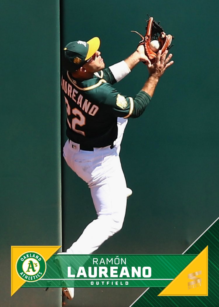
Design 2 has an inset shape that recalls Hall of Fame plaques though isn’t the exact same shape. I didn’t notice it until someone pointed it out to me on Twitter but this design is very reminiscent of the 1992-93 NBA Hoops set. I was a little embarrassed but then I remembered how awesome that design is and got over it.

I tried a diamond/base shape for design 3 but it doesn’t lend itself to mugshots too well. Perhaps if it were bigger it wouldn’t cut off as much of the photo, but then it would end up throwing everything else off balance. The little bowtie shape to the left and right of the portrait also led to some challenges. I filled one side with the team logo but the position side doesn’t work as well.

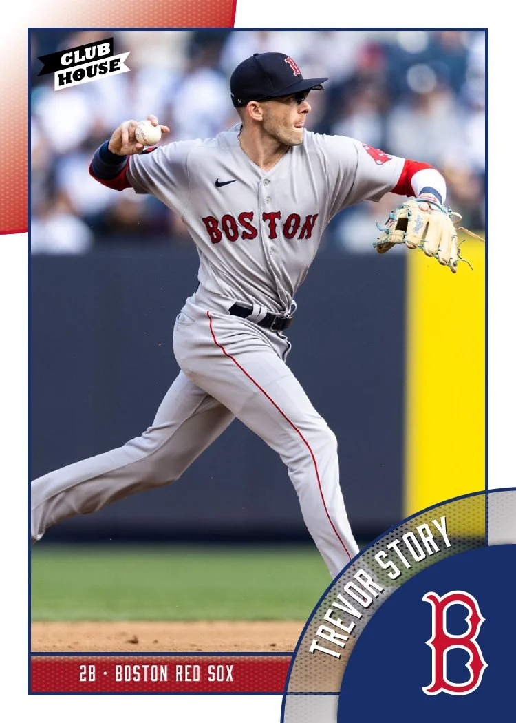
And on design 4, I went with a plain old circle because sometimes the obvious choice is the best choice. The rest of the design is pretty basic with a diagonal space for the name/position adding a little dynamism and keep it from retreading 1983’s ground. After I had the basic compositions down, I added some “effects” since Topps can’t not do that. Nothing too obnoxious, just enough to add some depth.

After sharing these with fellow card designers to get some feedback, design 1 emerged as the best of the batch. With some minor tweaks, I built a card for each team to see how the different logos/colors work with the design.

I know these would look more legit if I did some major cropping and HDR-ing of the photos but these don’t look too far off from a possible Topps release. Definitely something closer to what I wish their releases looked like. I’m curious to see how these stack up to what we do end up seeing from the first Topps/Fanatics flagship set.