Free Idea Here for the Taking, Topps

So even though the 2022 MLB season is still a long ways from wrapping up, I’ve been looking ahead to 2023 (and not just because the Giants have been a frustrating mess to watch and almost certainly won’t be participating in the expanded postseason this year). See, we’re already past the time when Topps usually reveals the design for the following season’s flagship set. It’s a nice way to break out of the slag of seeing the current year’s design through he numerous releases on which it will be featured (S1, Opening Day, S2, Chrome, Update).

But when Fanatics signed an exclusive deal with MLB to produce cards (among other stuff I believe), it basically meant the end of business-as-usual for Topps and their baseball card stranglehold. While Fanatics did end up acquiring Topps and allowing their legacy to continue, there haven’t been that many noticeable changes in the landscape after the deal was struck. I imagine that’s mostly due to the fact that Topps’ original deal was running through 2022 and the calendar hasn’t turned over yet. But like I mentioned before, “next year” usually starts in the middle of this year when it comes to baseball cards. As it stands here in mid-August, we still haven’t seen what’s in store for 2023.

One thing that’s been pointed out by a few people online is that Topps has followed a pattern of utilizing inset photos on their design every 20 years starting with the 1963 set.

Now, I don’t know if this was intentional on their part, and I’m sure the people around Topps weren’t there in 2003 or 1983, so there’s no guarantee this pattern will continue for the 2023 design. Something tells me that even if the people making design decisions for Topps are aware of the pattern, it’s not going to weigh too much (if any at all) in what they think a 2023 Topps card should look like. BUT, there’s an understanding amongst collectors that the 2023 flagship design should have an inset photo. As a designer, I like having parameters like that as it works as both a bit of a challenge and also some guardrails. So I figured I’d try my hand and making a “contemporary” card design that fit into the legacy.

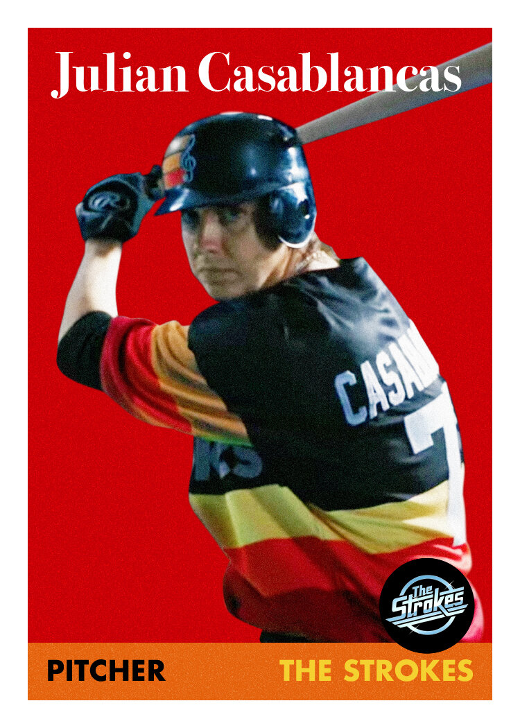
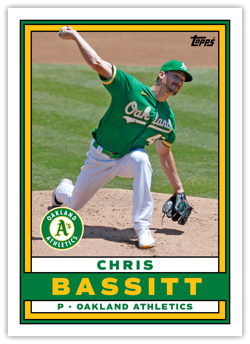
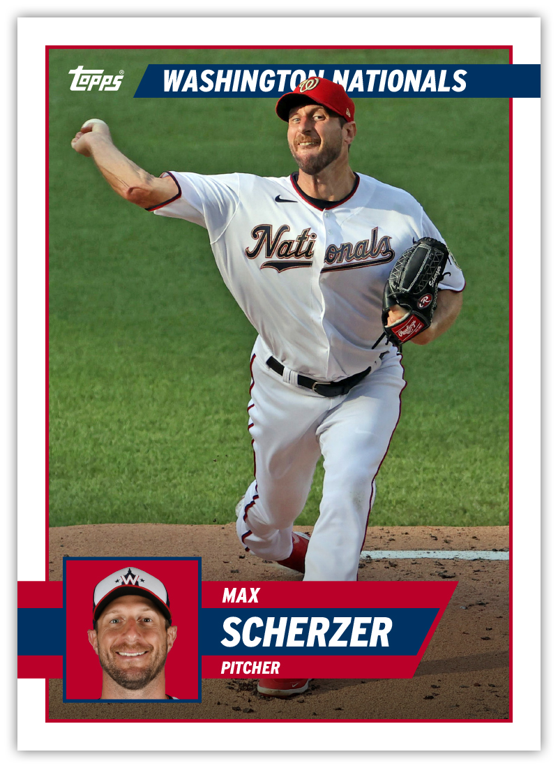
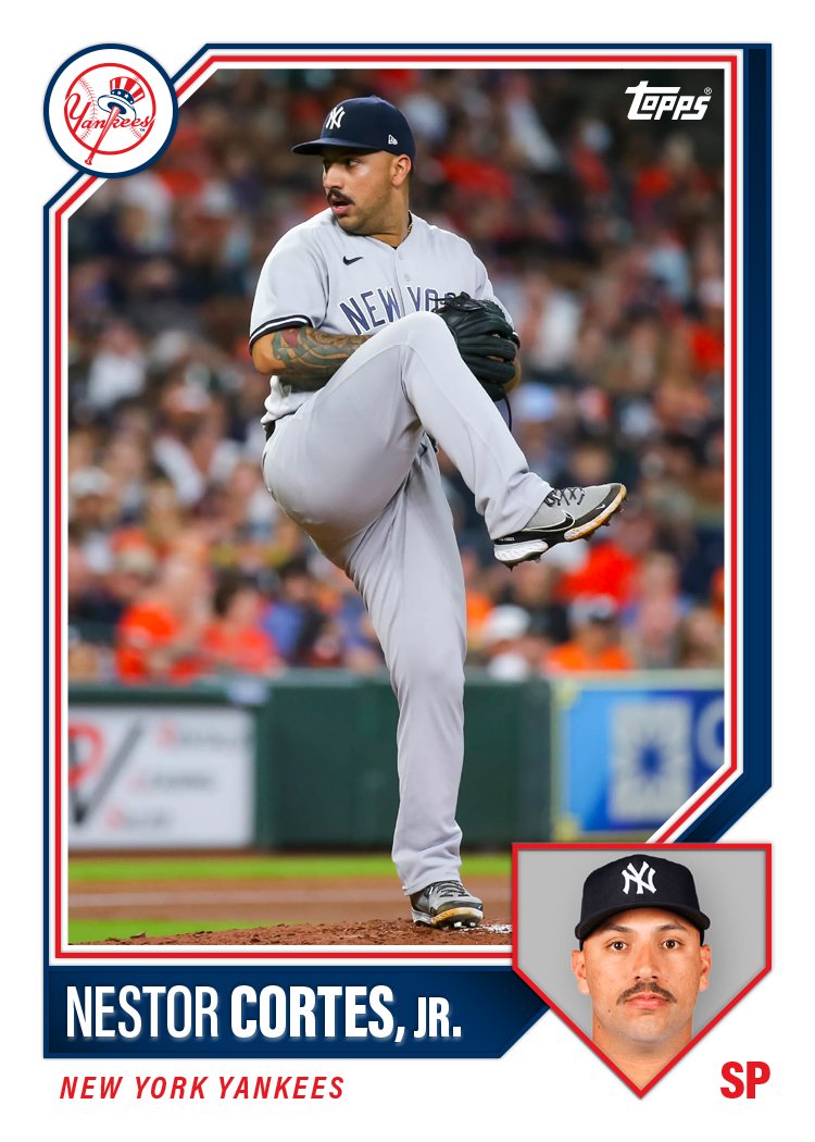
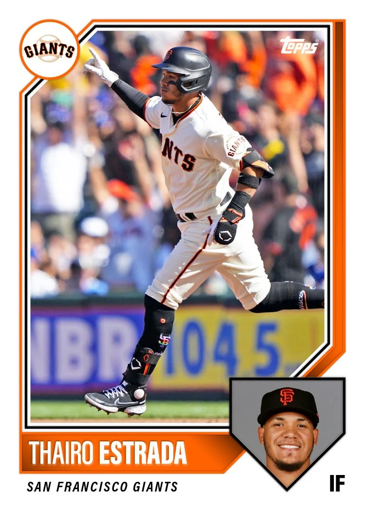
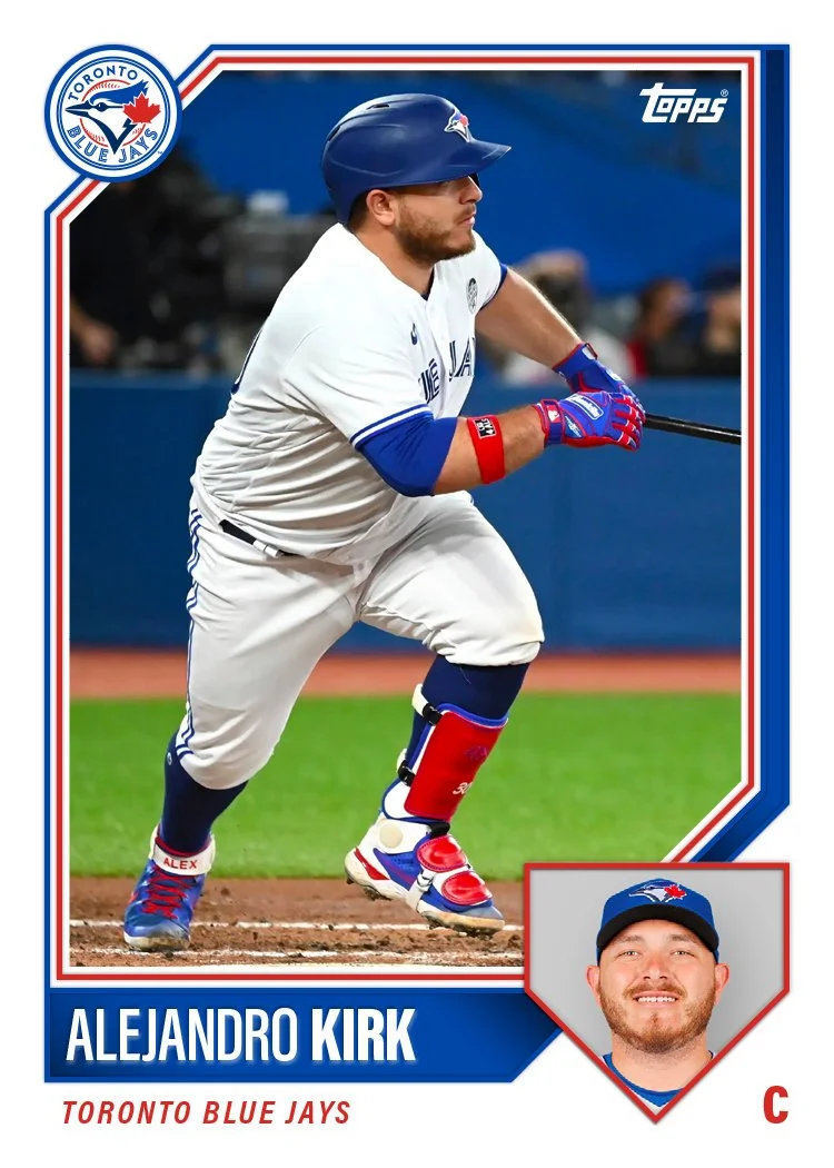
I decided to try different shapes for each design just to explore the options. While 1963 and 1983 both had just circle inset photos, they went with a general baseball field shape for 2003 which I think works really nice as an obviously baseball identifier. On design 1, I used another common baseball shape (home plate) that works well with portraits. The rest of the design has elements of 1987 Topps (beveled top left border with team logo) as well as some double-stroke borders from various other years.

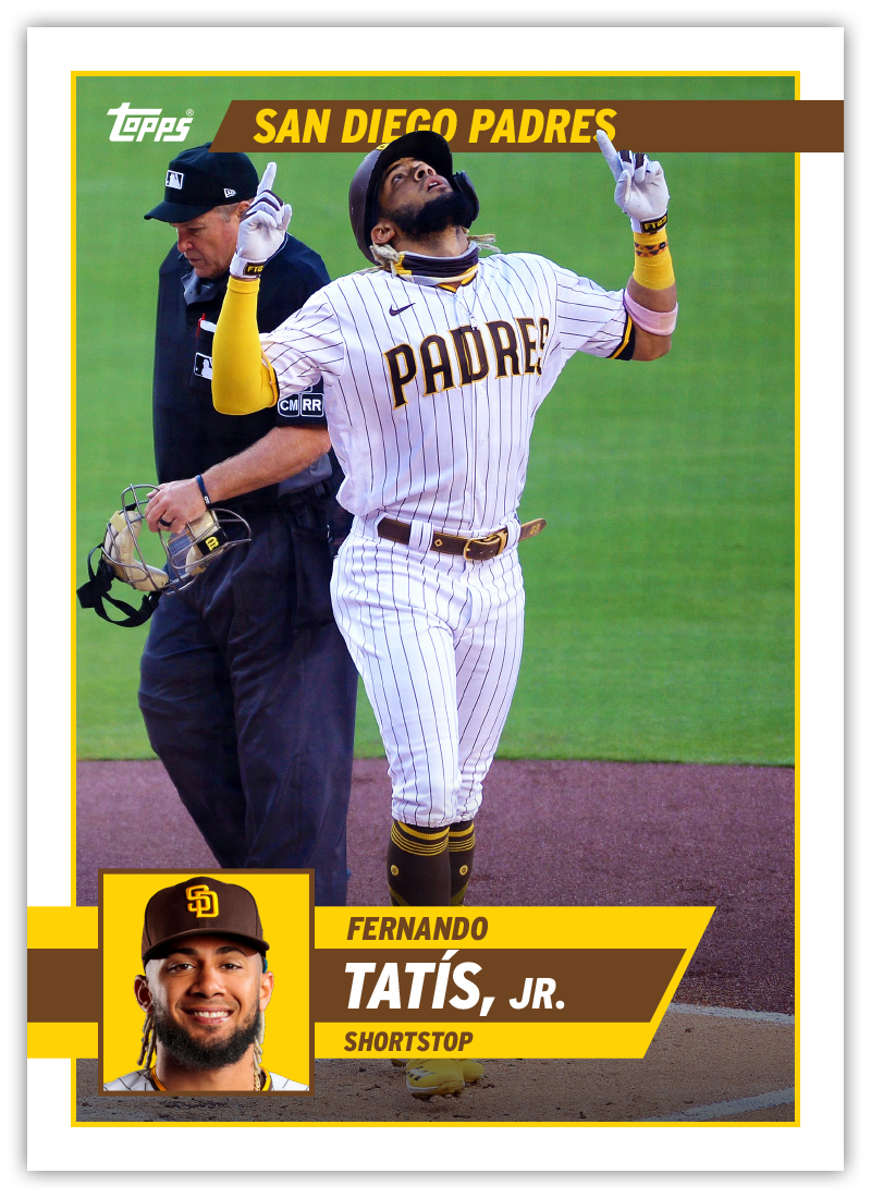
Design 2 has an inset shape that recalls Hall of Fame plaques though isn’t the exact same shape. I didn’t notice it until someone pointed it out to me on Twitter but this design is very reminiscent of the 1992-93 NBA Hoops set. I was a little embarrassed but then I remembered how awesome that design is and got over it.

I tried a diamond/base shape for design 3 but it doesn’t lend itself to mugshots too well. Perhaps if it were bigger it wouldn’t cut off as much of the photo, but then it would end up throwing everything else off balance. The little bowtie shape to the left and right of the portrait also led to some challenges. I filled one side with the team logo but the position side doesn’t work as well.

And on design 4, I went with a plain old circle because sometimes the obvious choice is the best choice. The rest of the design is pretty basic with a diagonal space for the name/position adding a little dynamism and keep it from retreading 1983’s ground. After I had the basic compositions down, I added some “effects” since Topps can’t not do that. Nothing too obnoxious, just enough to add some depth.

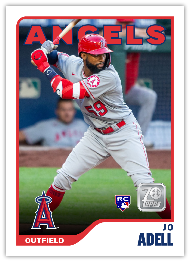
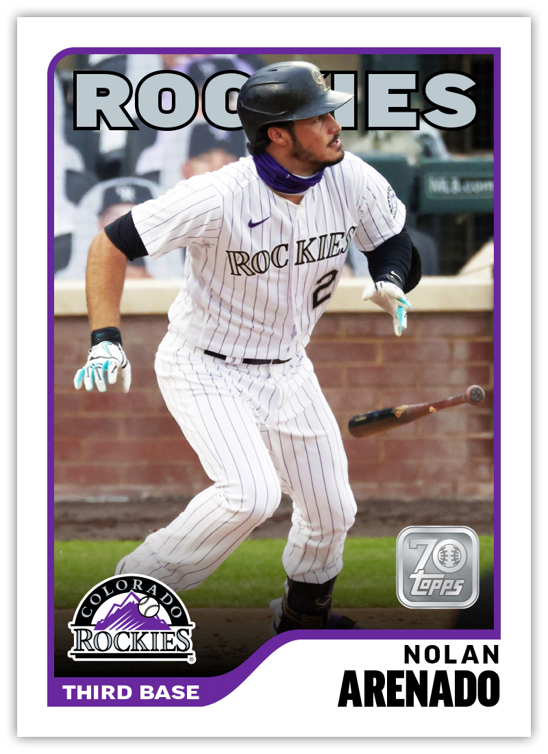
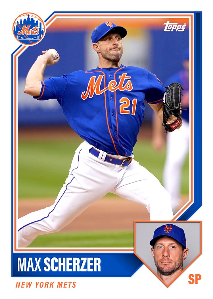
After sharing these with fellow card designers to get some feedback, design 1 emerged as the best of the batch. With some minor tweaks, I built a card for each team to see how the different logos/colors work with the design.

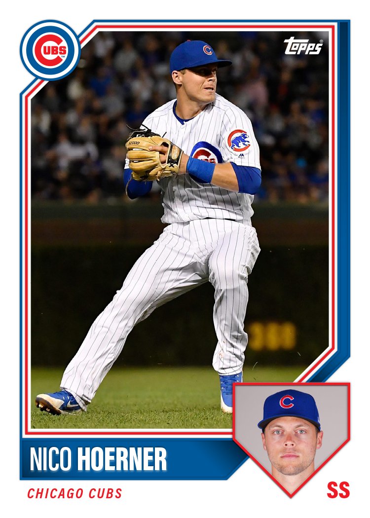
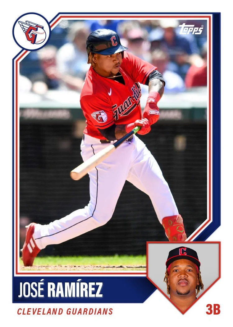
I know these would look more legit if I did some major cropping and HDR-ing of the photos but these don’t look too far off from a possible Topps release. Definitely something closer to what I wish their releases looked like. I’m curious to see how these stack up to what we do end up seeing from the first Topps/Fanatics flagship set.

The Adults Are Batting

One of the very first things I learned about my wife when we started dating was her undying love for The Strokes. They are her all-time favorite band. She knows the lyrics to every song, the tracklist of every album, and a nearly-alarming amount about the band members themselves. I gained some major brownie points by singing along with “Reptilia” when it came up on shuffle on an early date. That combined with her obvious nerdiness for the band gave me clearance to open up to her about my nerdiness for baseball and baseball cards. Though she accepts them both, she still likes to tease me about it.

The Strokes put out a new album this spring, The New Abnormal. Before the release, they had played a few songs live, recordings of which had made their way to YouTube. One that I liked in particular was called “Ode to the Mets,” to which my wife says “of course you like the baseball song.” I used this as an opportunity to point out that, like her husband, her lifetime crush (Julian Casablancas) is a baseball fan. I was able to help her get her eyes back in place after they completely rolled out of her skull.

While my fandom will never rival hers, I was excited when the album was officially released in April and really cherished the chance to digest and experience a new album together with her. We learned the songs together, hummed melodies around the apartment, listened in the car and just kind of soaked the whole thing up during our quarantine. Through this weird and weary year, The Strokes shifted from being “her” thing to being “our” thing, with The New Abnormal being the artifact of that transition.

Fast-forward to yesterday when The Strokes posted an official video for “The Adults Are Talking” to their YouTube page. Suddenly, the “tequila sunrise”-inspired Strokes jersey we saw Julian wearing on Saturday Night Live made sense. The video shows the band squaring up against a team of Terminator-style robots on a baseball diamond. Though the whole thing is obviously green-screened, it’s impressively accomplished, including the guys’ athletic maneuvers. Julian, being the frontman, gets the most screentime as both the pitcher and the baserunner sliding into home for the climax. I suspect it’s also because he’s probably the most comfortable on a baseball field.

Now that Bivi and I have fully bonded over The Strokes, I took this as an opportunity to merge our nerd-realms and make some cards using stills from the video. As mentioned above, Julian gets most of the screentime and also the only frames good enough to take stills from. Luckily there’s one of him on the mound and also at the plate, so there’s a little bit of variety. I mimicked 58 Topps and 78 Topps pretty faithfully and then did a pair that evoke 84 Topps and 87 Topps without total replication. With those jerseys (and the image quality), I figured throwbacks were better than trying to do something modern.

I showed these to my wife and she loved them. She told me Julian would love them and I need to tag him on Twitter and this and that. I love her enthusiasm and optimism that he would see/like these. But more than that, I love how I was able to make something that so perfectly encapsulates the two of us and how dorky we are together.

Now I just need for the band to put those jerseys up on their merch site and I’ll have Christmas covered.

Every Day Is a Holiday

Today is National Baseball Card Day, according to Topps anyway. As I’m sure you’re aware if you’ve made your way to this blog, I’m a big fan of baseball cards — even as an adult. The main call for NBCD is to get collectors into hobby shops and buy cards. Topps facilitates this by providing shop owners “free” packs to distribute to customers for coming in and/or buy cards. Well, since there’s a pandemic going on, the idea of going to a card shop today seems particularly dubious. Still, I try to not be a scrooge for any holiday, let alone one that caters to my interest in particular. So here’s how I celebrated today.

Earlier this week, Topps unveiled the design for their 2021 flagship release. In addition to disappointing many “collectors” by revealing Jo Adell rookie cards won’t be in any 2020 product, the reception was overwhelmingly sour. I found a lot of issues with the design and tried my hand at rectifying them a bit to meet in the middle of what Topps decided on and what I consider to be “good”. The finished product still has a few flaws but I’d call it a definite upgrade.

Well, since that day, I’ve been in a card designing mood, leading me to spend my Saturday putting together a few more design ideas for what some might consider a more traditional baseball card look. So here are 4 new designs (2 cards of each) that I think bring to mind some of the rich history of baseball card design without ripping anything off entirely. Hopefully these bridge the gap between traditional and modern.