Before the 2024 designs start to drop, here’s a look at my 2023 Clubhouse set. This is meant to be the “fun” set for low-budget collectors. I tried to ramp up the fun here by featuring as many out-of-the-ordinary photos as I could.
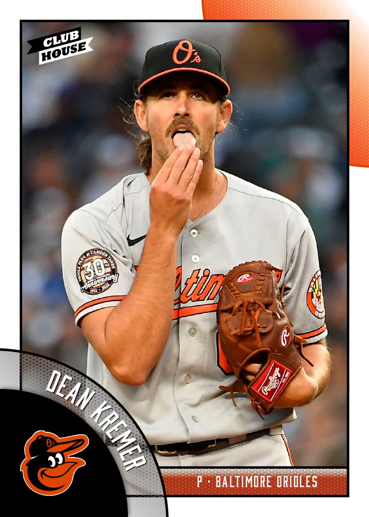
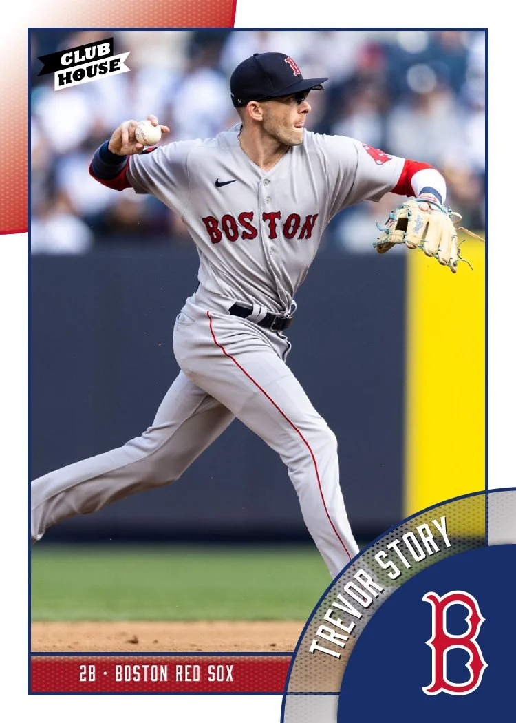


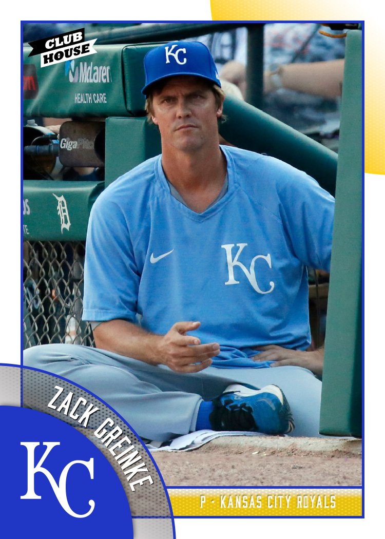


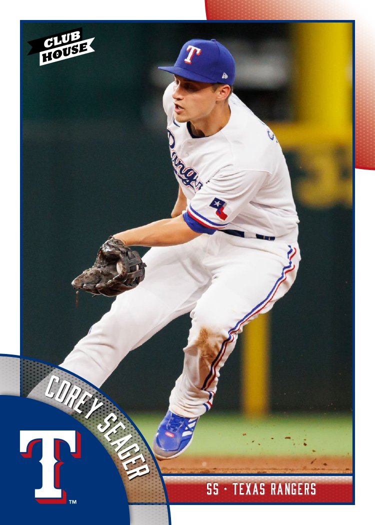


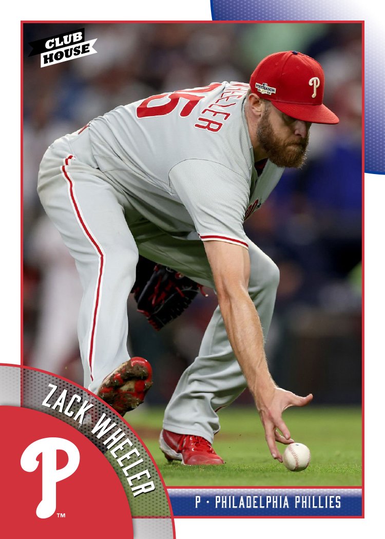


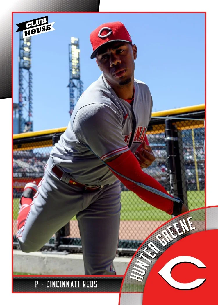


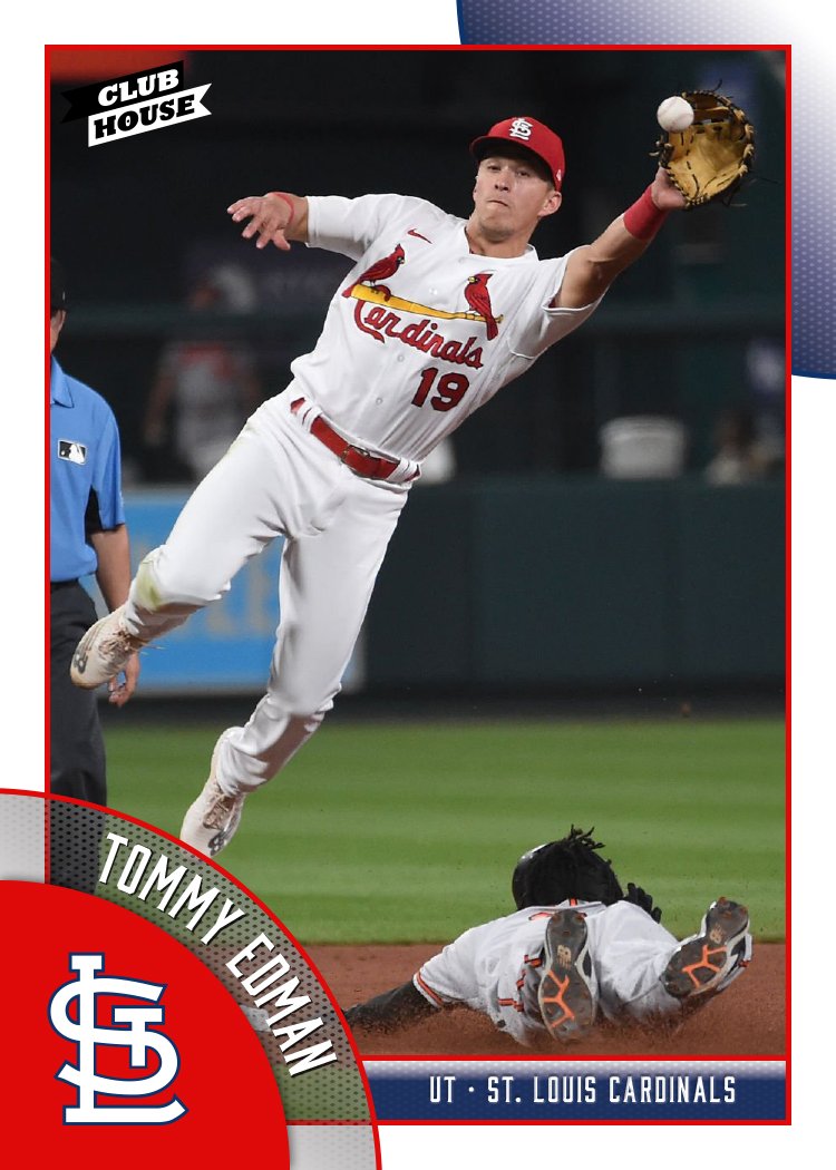


I think the Randy Arozarena one is probably my favorite, though the Ha-Seong Kim one is pretty great, too. Design-wise, these are meant to “connect” from card to card as you can see in the grid up there. The colored circles will line up at the edges, à la 1990 Topps. That means that not every, say, Mets card will have the logo on the right side. The next card in the checklist would have it on the left, then right, and so on. I just did the teams like this so you get the gist.
The player names arch along with the logo slice which is nice to have instead of on a straight line like usual. The position and team name do run next to it on the secondary color block to help balance the palette a little.
Overall, I think these strike the right balance between being fun but not too crazy, with a big assist from the photography. Bright and colorful without anything too over the top. I’d have been a big fan of something like this as a kid.