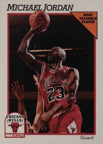
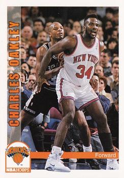
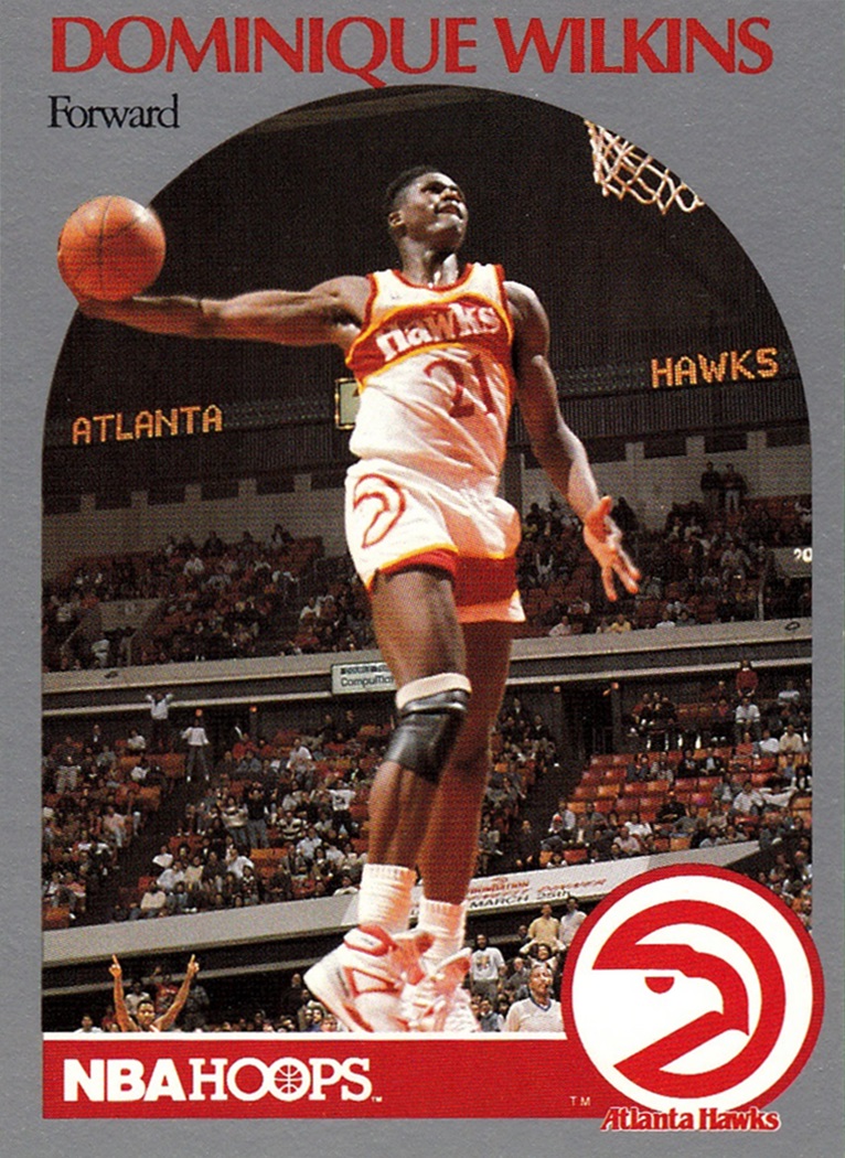
While baseball and MLB is basically my only connection to the greater sports landscape these days, back in my youth in the early 90s, I was just as plugged into the NFL and NBA. So in addition to a ton of junk wax baseball cards, I had a good number of basketball and football cards. Even as I got older and my free time shifted from collecting to…other things, I was still a big NBA fan and hung around the hobby in that tent a little longer. Since my return to the hobby as an adult, I’ve been a 99% baseball collector, buying a pack of NBA or NFL cards here and there mostly just to check out the designs and such. And while those sparks haven’t been enough to reignite the flame in collecting other sports, I will forever hold a soft spot for that early 90s era of collecting.
A while back, for no reason in particular, it crossed my mind to make a baseball version of the 1991-92 NBA Hoops design. Unlike my project to redesign the Topps cards from the 00s, this was purely an exercise in mimicry. Bringing it to baseball was enough of a change for me. It came about so effortlessly, I decided to move on to 1992-93 Hoops. Then backwards to 1990-91 Hoops. Then I couldn’t stop.


Other than changing the NBA Hoops logo (MLB Hacks…like swings…), these are as precise as I could recreate the designs. There’s something about the progression from year to year that really gives me the warm fuzzies. No huge shifts between years, just building off of what came before and making changes/improvements to set them apart. It’s something I’d LOVE to see with Topps flagship designs these days.
I’m not sure how much of it is nostalgia, but I consider all four of these designs to be really solid when looking through an objective lens. Even something as simple as having a shape mimicking the basketball lane/free throw area is perfectly suited. No need for shiny effects to compensate for less-than-solid composition.
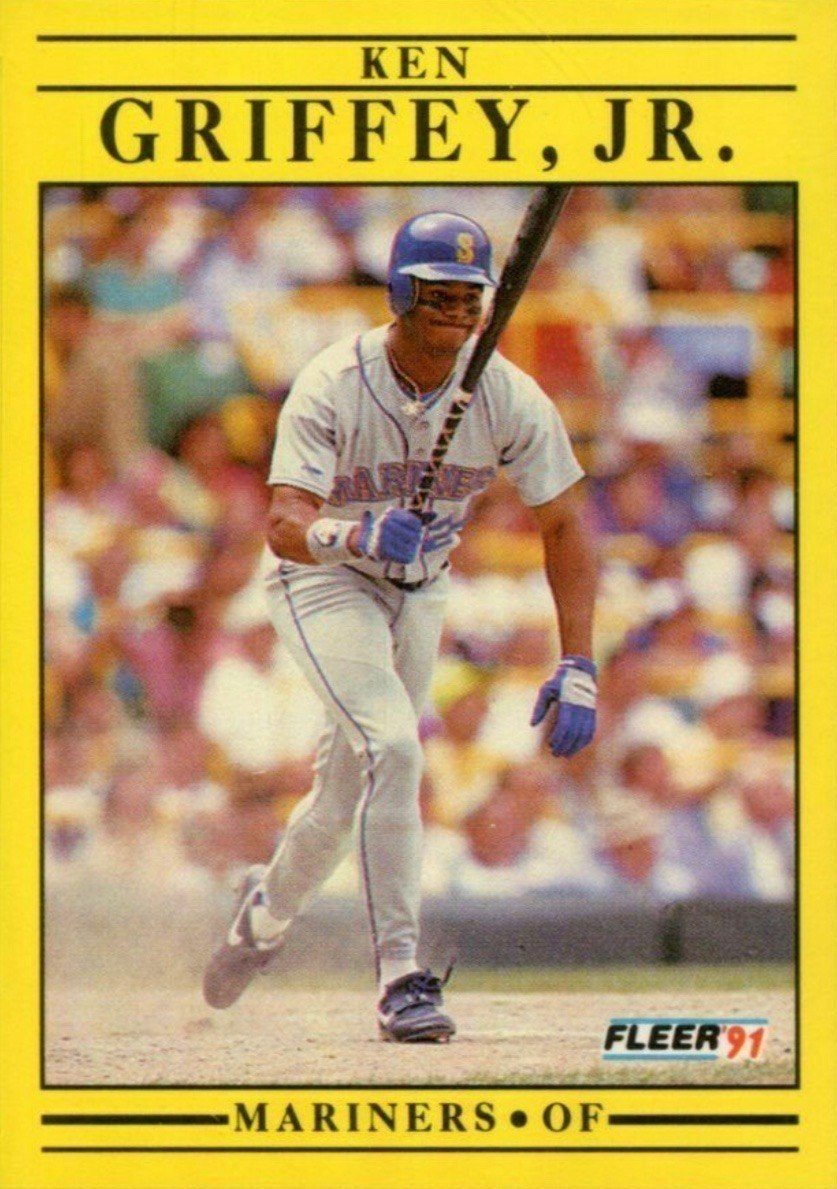
Where NBA Hoops had really hit its stride on the design side and figured out what exactly the set was year after year, the opposite could be said for Fleer. Just like on the baseball side, Fleer put out one of the most notoriously ugly designs in 1991. Not much can be said on its behalf. But man, nostalgia is a hell of a drug.


After tackling the Hoops suite, that 1991-92 Fleer design came calling and I could not resist that siren song. Reconstructing the design was a fun little exercise — one I thought may soften my criticism and warm my opinion of the set. Alas, my assessment remains hard and cold. I still enjoyed the hell out of it. So much that I took care of the less-offensive 1990-91 Fleer design. At the time, I had considered the Hoops and Fleer sets that year to be equals. Looking back now, I can see how the 90-91 Fleer was a quasi-knockoff of the 89-90 Hoops look. I wonder if they heard that feedback at the time and the 90-91 move was a drastic one to establish a difference between the two sets. Or maybe they were just rollin’ differently at Fleer back then. As you can see, the following year’s set is a solid argument that was the case.
I did have to make a change to the 1992-93 Fleer design since one of the prominent elements they used was the pimpled basketball surface. The closest I could come for baseball was a really leathered baseball texture. I think it fulfills its purpose here. Seeing the chronology of all for designs side-by-side up there, it really accentuates how abruptly Fleer turned the page for the 1993-94 design. After going ALL OUT the previous two years, they came with a “less is more” approach in 1993-94. Even as a kid, I could perceive the shift from loud and almost childish to something more cool and confident in its restraint. As a designer now, I could call it lazy as it almost exclusively leans on Photoshop’s “outer glow” effect. But I’ll instead give them credit for knowing when to say when. And honestly, there’s something to be said for another designer doing something I would shoot down in the brainstorming processes and having it actually turn out pretty successful.
I should probably make a note about the Flipz name I went with to replace Fleer on these. Trying to stick with an f-word that wasn’t much longer presented a bit of a challenge. Between bat flips and glove flips, there’s enough baseball parlance to sell me on it. Plus we’re flipping sports here. Hate me for the Z if you want, but it was better than “Flips” to my eyes.
So after doing four cards for two different product lines, I feel satisfied enough to not delve any further into this exercise. For now. (I mean, Skybox….)