I’ve done the “flagship.” I’ve done the “retro.” I’ve done the “low-end.” Now it’s time for the “high-end” set in Spirit’s lineup of releases. Deluxe is back once again, kicking off with the base design.


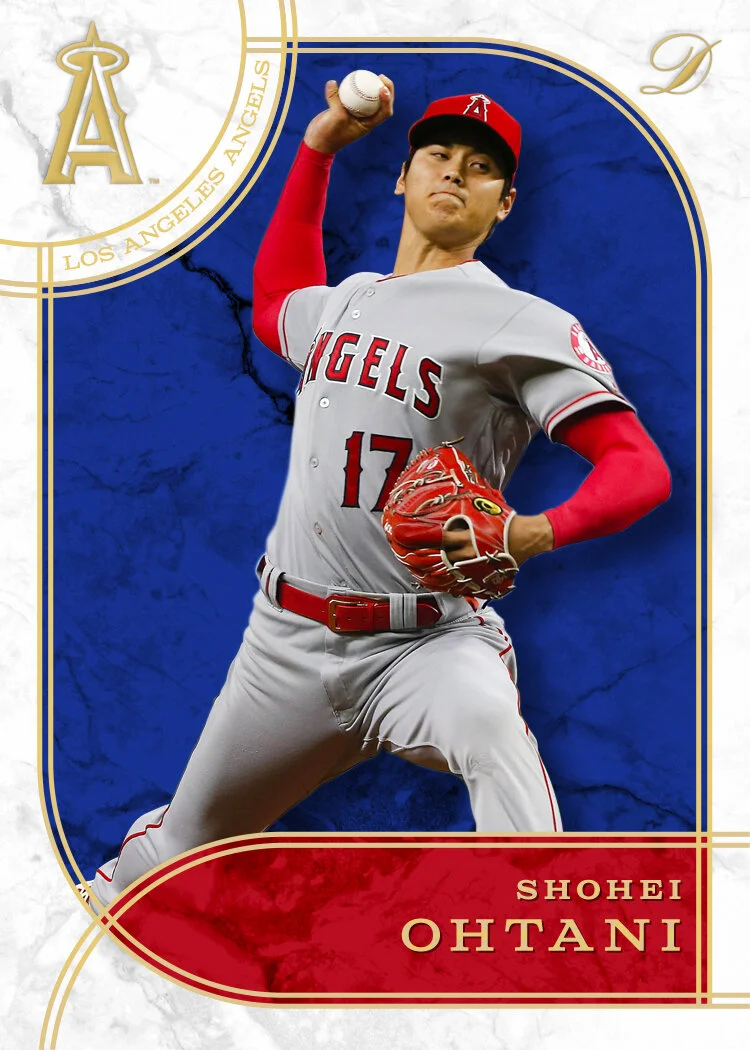

This is the first time I’ve done a primarily white design for Deluxe. The marble texture adds some interest there and calls back to a fancy set from the past. The colored marble behind the player makes for a good contrast to the both the borders and the player photos. The whole thing is trimmed out in gold foil with it running around the border and also the player name and team name/logo in the upper left corner.
I didn’t go into ornate-overload like Topps frequently does for stuff like Tribute, Tier One and the like. Probably a little more “overdone” than I normally do but I still pulled back a bit from what could have been done. I’ve tried to keep some variety to the Deluxe designs over the years so this year’s look is definitely different from previous seasons. Still plenty of color to catch the eye help differentiate each card. Imagining these with a thick gloss surface and they’d really pop.