The Aughts were a bit of a lost decade for me when it comes to collecting. I didn’t buy a single card from the turn of the century until sometime in 2010. Though I dropped out of the hobby in the mid 90s, the early half of that decade found me VERY involved. Upon my return in 2010, I found myself checking up on what I had missed and became very overwhelmed. It was like trying to process an ancient book written in Latin, Aramaic, Mandarin and Klingon all at once. As a kid, I wasn’t all that interested in cards from the past (mostly because they were inaccessible to a kid) and just dove into what was current and upcoming at the time. I followed mostly the same tack as an adult. Though with the monetary barrier no longer in place, I did sample a few things from the previous decade. A lot came from random stuff in those retail repacks or whatever happened to be leftover for clearance at Walmart or Target. Just enough to get a taste but nowhere near comprehensive.
Thanks to the internet, I’ve been able to fill in the gaps here and there in the subsequent years. Whether stuff popping up on my Twitter timeline, random sale/trade threads on forums or simply just on the Cardboard Connection chronicle, I’ve seen enough of the decade to know that I missed out on a LOT of ugly designs. Being one who rarely misses out on an opportunity to pick apart card design, I felt compelled to put my mouse where my mouth is and do some “remixes”. I’ve done this in the past on my old blog and randomly on Twitter when the mood struck me. Here, I’m doing an organized stroll through the decade of Topps flagship designs I missed out on their first time around.
There are no hard-fast rules as to what I’m changing/keeping with each design. Foil, colors, fonts, structure, etc., are all open for reinterpretation. I will say that the aim is to not do anything radically different but to keep with the spirit and point of the original design (so much as I can determine a point exists). This isn’t a Project 2020 or Project 70 thing. I’m not looking to futz up everything to the point it’s nearly beyond recognition.
With that introduction, here’s my first entry: Topps 2000.

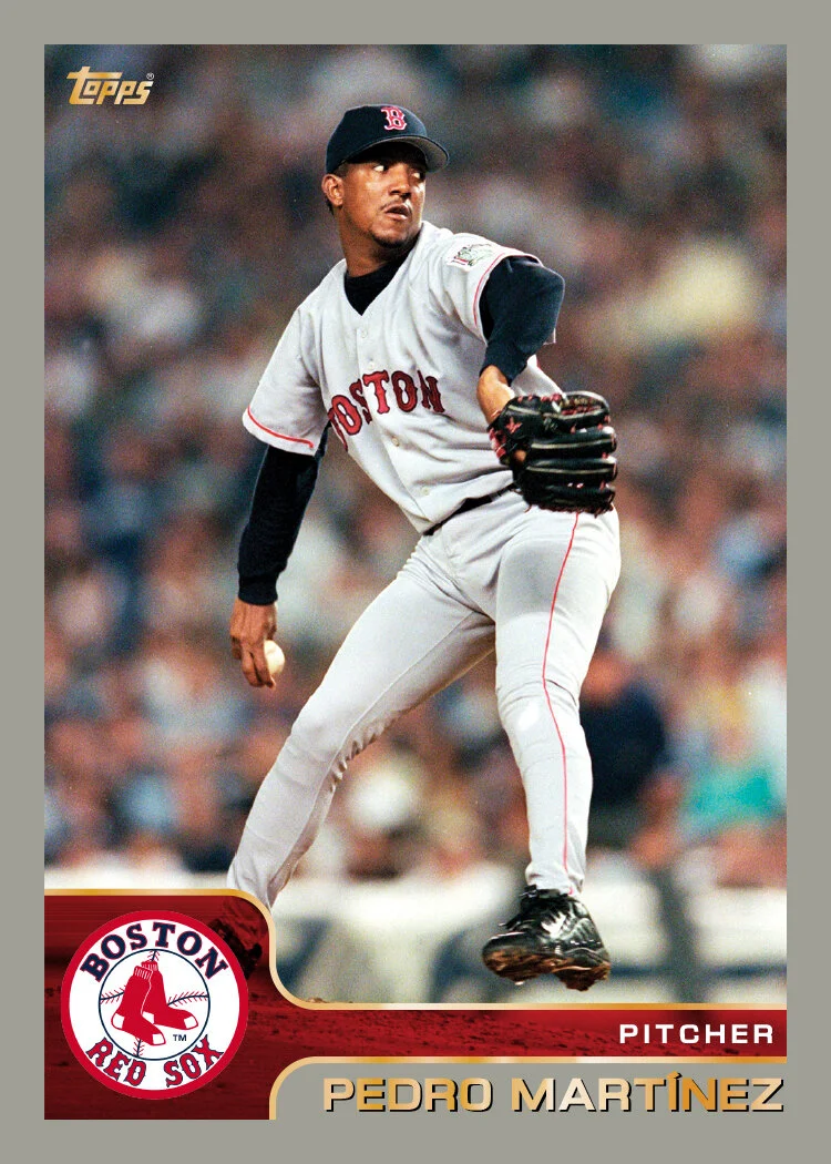

If you need a refresher on what the original 2000 design looks like, here you go. I kept this one pretty similar with the border color and basic construction the same. I decided to make the weird color shape a little more logical, leaving a uniform shape in the bottom left corner to better accommodate the team logo. One of my bigger beefs with the original was the tiny little tacked-on logo floating up above a color block that served no purpose other than to house “TOPPS 2000,” which is redundant since the logo already exists in foil in the upper corner. On the OG, the player name is in foil on top of a semi-transparent block, allowing a bit of the photo to show through. Unfortunately, that causes some legibility issues on some cards where that part of the photo is dark. To fix that, I extended the solid border so it’s behind the name, providing plenty of contrast to be read. I did keep the overlay element but shifted it to the team color bar. The original has colorized brushed metal texture there which I didn’t think was compelling enough to keep around. The team colors leave enough contrast for the player position in white, no matter the background photo. I kept some of the foil flourishes but now the add emphasis to the other elements instead of having to do much on their own.
Overall, this one’s not too different. Just a little tidier and more “purposeful” if that’s the word. Honestly, the original 2000 design was probably one of the better ones of the 00s. Stay tuned for 2001.