2022 Spirit Award Winners

Other than when I’m remixing/tweaking previous designs, I try to do my best at being original when making new cards. Sure, there are a lot of intentional nods and references to other designs, but I usually shy away from blatantly lifting someone else’s work and calling it “my” design. But when I saw this tweet from MLB on Twitter, I couldn’t help but think what a good card design it would make.

It’s a nice presentation of two players on two different teams showing them on equal footing. Though I didn’t do it on last year’s set, I have utilized a 2-up design for the Award Winners insert in past years. This seemed like the perfect way to interpolate this graphic into a card.

Putting the AL and NL Gold Glove and Silver Slugger winners at each position back-to-back fits perfectly. I designated the AL side as blue and the NL side as red, screening back the league logos in the big color boxes on the bottom. I really liked how the original graphic had the skyline/trees in there but I don’t think every MLB city lends itself to that conceit as well as NY and LA do. Other than adding the player names at the bottom and some gold/silver to the scheme, it follows the “inspiration” pretty closely. I did run into the issues of finding photos that fit together as well as the Cole/Trout combo. The Devers/Riley card works beautifully but when it came to finding fielding photos for the Gold Glove guys, it was a bit more challenging since great fielding isn’t always well-confined to a vertical frame. Minor quibbles.

2022 Spirit All-Rookie Team

Next insert up for the 2022 Spirit set features the All-Rookie Team from the 2021 season. This is basically the Spirit version of the Topps Rookie Cup cards except they’re inserts instead of just the base card with an extra graphic to crowd the design. (This wasn’t always the case with the Rookie Cup cards but as Topps’ flagship designs have gotten busier recently, adding another little element can really be overkill).

The design here is pretty sparse with just a horizontal player photo with the background cut out and screened back in the team colors. And of course the bit All-Rookie Team text separating the two planes. I original had the “ALL-ROOKIE” fill just the regular full-color portion of the photo but it looked a little frazzled with contrasts and stuff, making the actual words hard to read. Instead, I decided to go with a partially-colored photo fill you see here.
As for the full checklist, it may look a bit familiar:

  • C - Tyler Stephenson

  • 1B - Bobby Dalbec

  • 2B - Jonathan India

  • 3B - Patrick Wisdom

  • SS - Wander Franco

  • OF - Randy Arozarena

  • OF - Adolis García

  • OF - Dylan Carlson

  • DH - Ryan Mountcastle

  • SP - Alek Manoah

  • SP - Shane McClanahan

  • SP - Trevor Rogers

  • SP - Luis García

  • SP - Ian Anderson

  • RP - Emmanuel Clase

  • RP - Garrett Whitlock

All of the guys from the Topps Rookie Cup squad make an appearance here. I decided to pad it out a bit more with more starters and relievers since there was a strong crop last year.

There are also autograph variations of these inserts. The open space between the ART text and the player name/position on the bottom is a perfect spot for an autograph
2022 Spirit Base (Take Two)

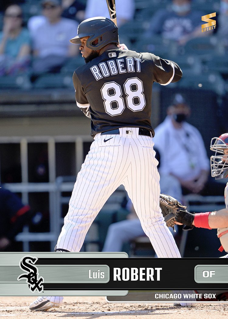
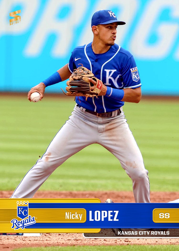
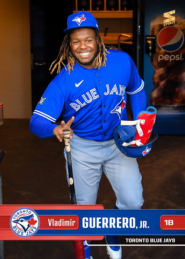
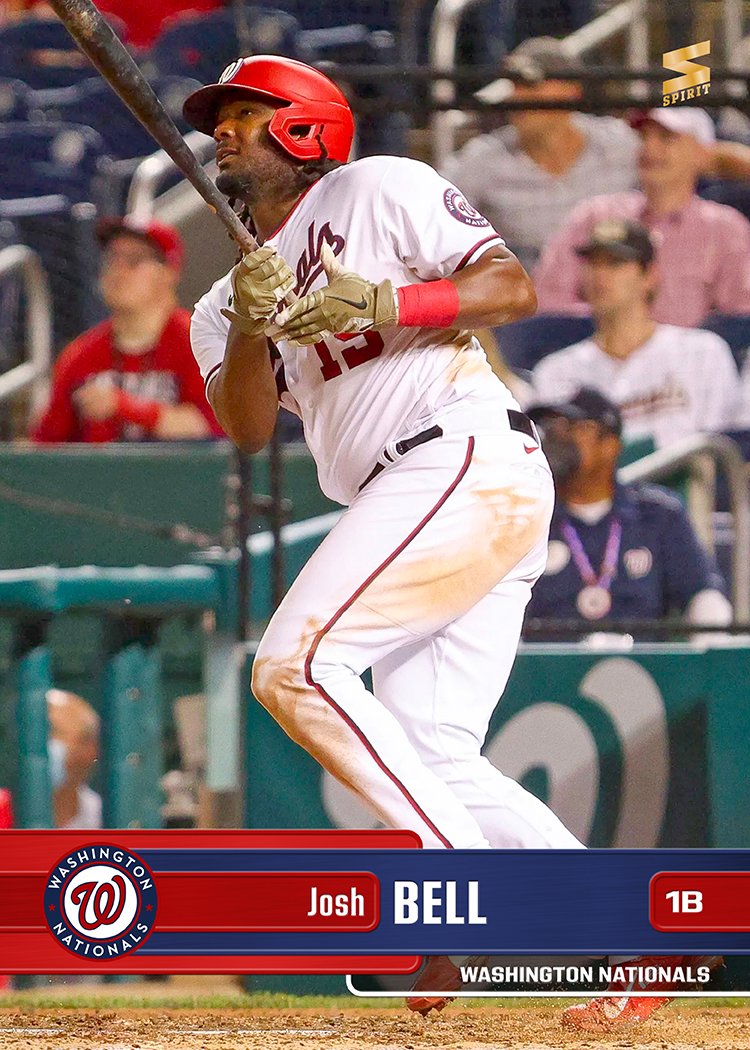
We’re less than a week away from the actual Opening Day for the 2022 season. It’s been a long and tenuous journey but we’re finally (almost) there. A couple months ago, when the lockout was crushingly rolling along, I was desperate from some positive baseball vibes and posted my initial ideas for the 2022 Spirit Base set design.

Since I was a bit on the fence about which design worked best as the continuation of the Spirit “brand” I had established for a whole damn decade now, I also put out a call for feedback which was thankfully received. Even though the design that people had the most enthusiasm for wasn’t the one I ultimately ended up choosing, it was still a valuable exercise. It helped confirm for me which design I thought worked best but also moved me to make some tweaks that I resulted in a better final product.

I went with the “metal tabs” because it simply looks the most “Spirit” in my mind. Colorful, clean design elements, full-bleed photos, team logos, and all the pertinent information presented in a concise, satisfying manner. The aforementioned tweaks are subtle but definitely an improvement. If you need help, I extended the bar holding the player’s first name all the way to the left edge, adding a little bit of a two-tone look. The other one is the dark screened bar on the bottom right that was seen on the first draft for players that obtained some notable accolade in 2021. As I was building the cards, the non-award ones looked empty and imbalanced. So I decided to keep them around for everyone and just have the full team name listed. I know it may seem like overkill to have team logos and the team name both here but I think it’s handy for the instances where the logos don’t share all the details to newcomers (Pirates, Guardians, Braves for example).

As per usual, the card backs contain the same design motif as the front. I decided to pare down the biographical info, cutting stuff like college and draft info and use that real estate for stats instead.

Here’s to an exciting 2022 season! May your favorite players rake/deal, stay healthy and not become an embarrassment for their fans or the league at large.